Designing dashboards to visualize data
When working with business processes that deal with data, one of the main goals for organizations is to gain insights. Knowing where your operations are failing or where there is a market opportunity is vital, so having an easy way to interact with data is very important.
Dashboards are a Dataverse feature that gives you the ability to display a mix of graphs, grids of data, and web resources in one place. Let's give more value to the help desk solution by including a ticket dashboard.
How to do it…
- Let's create the charts that we are going to use in our dashboard. Starting from our solution, click on the
Ticketstable, and from the toolbar, click on Edit. - Go to the Charts tab and click on Add chart at the top; this will open a new configuration window to define the data that the graph will use, the type, and the data visualization rules.
- First, choose the view that will filter the data, then select the legend entries, which are the series of your graph, and finally, the horizontal axis, which will categorize your data. Let's create three charts using the following configurations; after completing each one, click on Save & Close:
- Standard settings for all charts:
View: Active tickets
Legend Entries: Ticket
- Chart name:
Ticket by Priority– Pie chart:Horizontal Axis: Priority
- Chart name:
Ticket by Project– Pie chart:Horizontal Axis: Project
- Chart name:
Ticket by Ticket Status– Column chart:Horizontal Axis: Ticket Status
- Standard settings for all charts:
- Now that we have defined the charts, we can place them on our dashboard. From the solution, edit the model-driven app, and on the Dashboards component, click on Create New and select Classic Dashboards. On the dialog that opens, click on 3-Column Overview Dashboard. We will use this layout as a template:

Figure 2.17 – Dashboard layouts
- In the dashboard designer, set the name of your dashboard and then start placing the sections' elements. Click on each placeholder, and from the top toolbar, select the desired resource.
- For the top section, select the first placeholder and click on CHART. Then, in the dialog, choose
Ticketas Record Type andActive ticketsfrom the View list, and pick one of the charts we created in step 3. Repeat this for the other two placeholders. - As for the lower section, click on the placeholder and select LIST. Choose
Ticketas Record Type andActive ticketsfrom the View list; this will display a grid of records for easy access. - Hit SAVE on the toolbar and close the window to return to the model-driven editor.
- To make our dashboard accessible in our application, we need to modify the sitemap by clicking on the pencil icon next to it.
- Let's update the
Ticketssubarea by changing the type to Dashboard and selecting our newest one from the Default Dashboard list. Click on Save and then on Publish.
How it works…
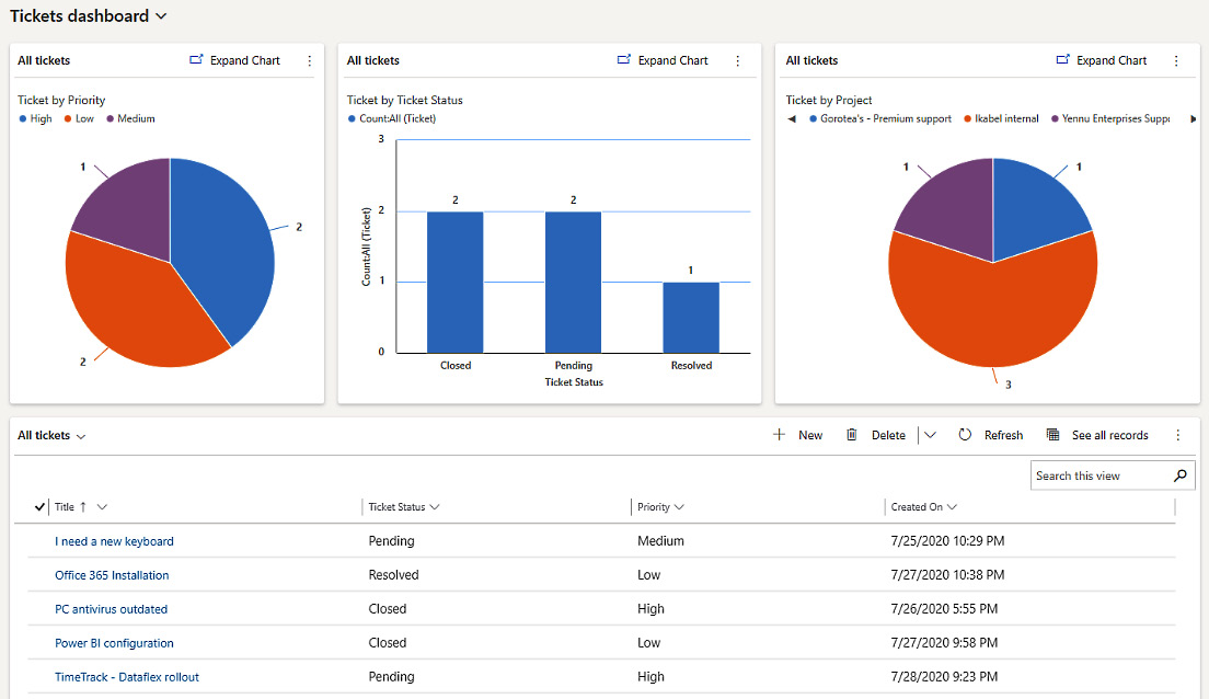
After completing the dashboard setup, we can see it working in our model-driven application by selecting it from our solution and then clicking on Play.
When the app opens, you will see the dashboard instead of the list of records we used to have. At a glance, this display gives insight into the current state of the help desk system.
If you don't see the changes immediately, you might need to do a hard refresh of your browser window. This behavior is due to the cache mechanism:

Figure 2.18 – Tickets dashboard


