Building graphical charts with frontend libraries
Most developers prefer rendering graphs and charts using frontend libraries rather than matplotlib, which requires complex Python coding to refine presentation and lacks UI-related features such as responsiveness, adaptability, and user interaction. This section will highlight the Chart.js, Bokeh, and Plotly libraries, which are all popular libraries with varying strengths and weaknesses as external tools for visualization.
Let’s begin with Chart.js.
Plotting with Chart.js
The most common and popular charting library used in many visualization applications is Chart.js. It is 100% JS, is lightweight, is easy to use, and has a straightforward syntax for designing graphs and charts. The following is the Chart.js implementation that displays the mean HPI values of certain countries:
<!DOCTYPE html>
<html lang="en">
<head>
  … … … … … …
  … … … … … …
  <script src='https://cdn.jsdelivr.net/npm/chart.js'></script>
</head>
<body>
    <h1>{{ title }}</h1>
    <form action="{{request.path}}" method="POST" enctype="multipart/form-data">
      Upload XLSX file:
      <input type="file" name="data_file"/><br/>
      <input type="submit" value="Upload File"/>
  </form><br/>
  <canvas id="linechart" width="300" height="100"></canvas>
</body>
<script>
  var linechart = document.getElementById("linechart");
  Chart.defaults.font.family = "Courier";
  Chart.defaults.font.size = 14;
  Chart.defaults.color = "black";
Chart.js is available in three sources:
- Node.js: By running npm to install the chart.js module.
- GitHub: By downloading the https://github.com/chartjs/Chart.js/releases/download/v4.4.0/chart.js-4.4.0.tgz file or the latest release available.
- Content delivery network (CDN): By referencing https://cdn.jsdelivr.net/npm/chart.js.
Based on the HTML script, our implementation opted for the CDN source.
After referencing Chart.js, create a <canvas> tag with the width and height that fits your plot. Then, create a Chart() instance with the node or 2D context of <canvas> and some configuration options. Moreover, set new and appropriate values to global default properties such as the font name, font size, and font color:
  new Chart(linechart,{
      type: 'line',
      options: {
          scales: {
            y: {
              beginAtZero: true,
              title: {
                display: true,
                text: 'Mean HPI'
              }
            },
            x: {
              offset: true,
              title: {
                display: true,
                text: 'Countries with HPI'
              }
            }
          }
      },
      data: {
          borderWidth: ,
          labels : [
            {% for item in labels %}
              "{{ item }}",
            {% endfor %}
          ],
The data property provides the x-axis labels, data points, and connecting lines. Its datasets sub-property contains the look-and-feel details of the plots with the actual data. Both the label and data lists are context data supplied by its view function:
          datasets: [{
              fill : true,
              barPercentage: 0.5,
              barThickness: 20,
              maxBarThickness: 70,
              borderWidth : 1,
              minBarLength: 5,
              backgroundColor: "rgba(230,112,16,0.88)",
              borderColor : "rgba(38,22,6,0.88)",
              label: 'Mean HPI values',
              data : [
                {% for item in values %}
                  "{{ item }}",
                  {% endfor %}
              ]
            }]
        }
      });
</script>
</html>
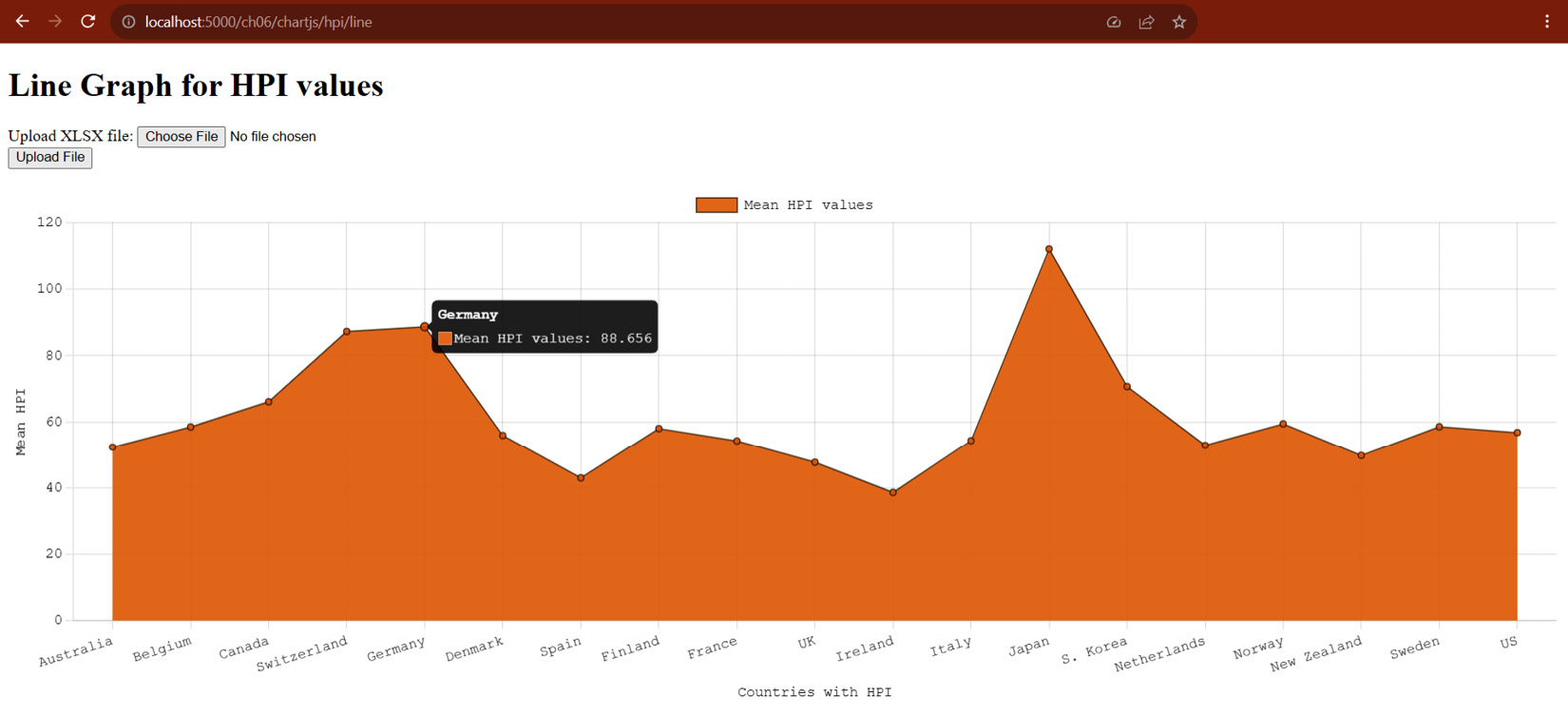
Now, Chart.js can also build multiple line graphs, varieties of bar graphs, pie charts, and doughnuts, all using the same setup as the given line graph. Running the view function with the given Chart.js script will render a line graph, as indicated in Figure 6.17.

Figure 6.17 – A line graph for HPI values per country
Chart.js supports responsive web design and interactive results, such as the given line graph that provides us with some information during mouse-over on every line dot. Despite its popularity, Chart.js still utilizes HTML canvas, which cannot render efficiently large and complex graphs. Also, it lacks other interactive utilities present in Bokeh and Plotly.
Let us now create graphs using a module friendlier to Python, Plotly.
Creating graphs with Plotly
Plotly is also a JS-based library that can render interactive charts and graphs. It is a popular library for various statistical and mathematical projects that require interactive data visualization and 3D graphics effects and can seamlessly plot DataFrame datasets.
To utilize its classes and methods for plotting graphs, install the plotly module through the pip command:
pip install plotly
The following view function uses Plotly to create a grouped bar graph about the price and bedroom preferences of buyers categorized according to their furnishing status preference:
import json
import plotly
import plotly.express as px
@rendition_bp.route("/plotly/csv/bedprice", methods = ['GET', 'POST'])
async def create_plotly_stacked_bar():
    if request.method == 'GET':
        graphJSON = '{}'
    else:
        … … … … … …
        try:
            df_csv = read_csv(uploaded_file)
            fig = px.bar(df_csv, x='Bedrooms', y='Price', color='FurnishingStatus', barmode='group')
            graphJSON = json.dumps(fig, cls=plotly.utils.PlotlyJSONEncoder)
        except:
            raise FileSavingException()
    return render_template('plotly.html', graphJSON=graphJSON, title="Stacked Bar Graph of Bedroom vs Price per Furnishing Status")
Plotly has a plotly.express module, which provides several plotting utilities that can set up build graphs with DataFrame as input, similar to matplotlib’s methods. In the given create_plotly_stacked_bar() view function, the goal is to create a grouped bar chart using the bar() method from the plotly.express module with the DataFrame object’s tabular values derived from the uploaded CSV file. The result is a Figure in dictionary form containing the details of the desired plot.
After creating the Figure, the view function will pass the resulting dictionary to the Jinja2 template for rendition and display using Plotly’s JS library. However, JS can only understand the dictionary details if they are in JSON string format. Thus, use the json.dumps() method to convert the dictionary fig to string.
The following is the Jinja template that will render the graph using the Plotly JS library:
<!doctype html>
<html>
    <head>
        <title>Plotly Bar Graph</title>
    </head>
    <body>
        … … … … … …
        {%if graphJSON == '{}' %}
            <p>No plot image.</p>
        {% else %}
            <div id='chart' class='chart'></div>
        {% endif %}
    </body>
    <script src='https://cdn.plot.ly/plotly-latest.js'></script>
    <script type='text/javascript'>
            var graphs = {{ graphJSON | safe }};
            Plotly.plot('chart', graphs, {});
    </script>
</html>
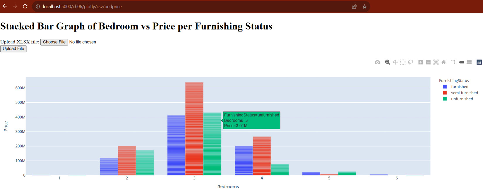
The HTML script must reference the latest Plotly library from CDN. Then, a JS script must interpolate the JSON-formatted Figure from the view function with a safe filter to spare it from HTML escaping. Also, the JS must apply the plot() method of the Plotly class library to render the figure through the HTML’s <div> component. Figure 6.18 shows the bar graph generated by the create_plotly_stacked_bar() view function and displayed by its Jinja template.

Figure 6.18 – A bar graph created by Plotly
Like Chart.js, the chart provides information regarding a data plot when hovered by the mouse. However, it seems that Chart.js loads faster than Plotly when the data size of the DataFrame object’s tabular values increases. Also, there is limited support for colors for the background, foreground, and bar shades, so it is hard to construct a more original theme.
The next JS library supports many popular PyData tools and can generate plots directly from pandas' DataFrame, Bokeh.
Visualizing data using Bokeh
Bokeh and Plotly are similar in many ways. They have interactive and 3D graphing features, and both need module installation. However, Bokeh is more Pythonic than Plotly. Because of that, it can transact more with DataFrame objects, especially those with large datasets.
To utilize the library, first install its module using the pip command:
pip install bokeh
Once installed, the module provides a figure class from its bokeh.plotting module, which is responsible for setting up the plot configuration. The following view implementation uses Bokeh to create a line graph showing the UK’s HPI values through the years:
from bokeh.plotting import figure
from bokeh.embed import components
@rendition_bp.route('/bokeh/hpi/line', methods = ['GET', 'POST'])
def create_bokeh_line():
    if request.method == 'GET':
        script = None
        div = None
    else:
        … … … … … …
        try:
            df = read_excel(uploaded_file, sheet_name=1, skiprows=[1])
            x = df.index.values
            y = df['UK']
            plot = figure(max_width=600, max_height=800,title=None, toolbar_location="below", background_fill_color="#FFFFCC", x_axis_label='Period by Quarter ID', y_axis_label='Nominal HPI')
            plot.line(x,y, line_width=4, color="#CC0000")
            script, div = components(plot)
        except:
            raise FileSavingException()
    return render_template('bokeh.html', script=script, div=div, title="Line Graph of UK's Nominal HPI")
After creating the Figure instance with the plot details, such as max_width, max_height, background_fill_color, x_axis_label, y_axis_label, and other related configurations, the view function can now invoke any of its glyph or plotting methods, such as vbar() for plotting vertical bar graph, hbar() for horizontal bar graph, scatter() for scatter plots, and wedge() for pie charts. The given create_bokeh_line() view utilizes the line() method to build a line graph with x and y values derived from the tabular values.
After assembling the Figure and its plot, call the components() function from bokeh.embed to wrap the plot instance and extract a tuple of two HTML embeddable components, namely the script that will contain the data of the graph and the div component that contains the dashboard embedded in a <div> tag. The function must pass these two components to its Jinja template for rendition. The following is the Jinja template that will render the div component:
<!DOCTYPE html>
<html lang="en">
    <head>
        <meta charset="utf-8">
        <title>Bokeh HPI</title>
        <script src="https://cdn.bokeh.org/bokeh/release/bokeh-3.2.2.js"></script>
    </head>
    <body>
         … … … … … …
        {%if div == None and script == None %}
            <p>No plot image.</p>
        {% else %}
        {{ div | safe }}
        {{ script | safe }}
        {% endif %}
    </body>
</html>
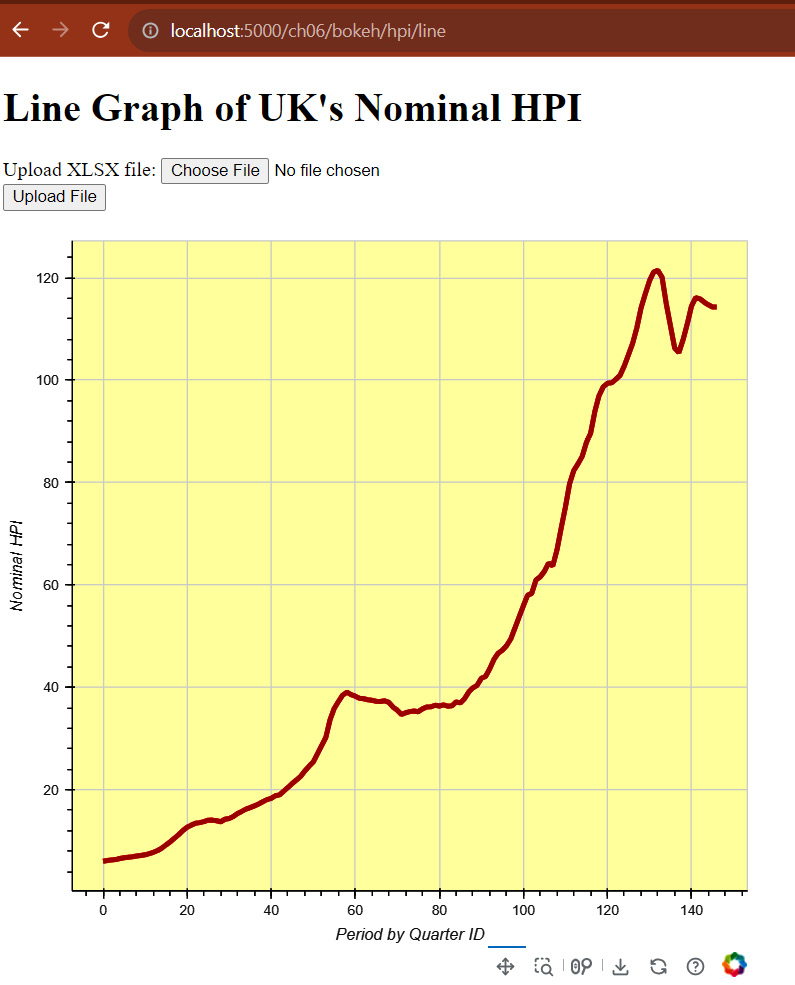
Be sure to have the latest Bokeh JS library in your HTML script. Since both div and script are HTML-embeddable components, the template will directly interpolate them with the filter safe. Figure 6.19 shows the outcome of rendering the create_bokeh_line() view function using the datasets:

Figure 6.19 – A line graph created by Bokeh
Compared to that of Plotly and Chart.js, the dashboard of Bokeh is so interactive that you can drag the plot in any direction within the canvas. It offers menu options to save, reset, and wheel- or box-zoom the graph. The only problem with Bokeh is its lack of flexibility when going out of the box for more interactive features. But generally, Bokeh has enough utilities and themes to build powerful embeddable graphs.
From the degree of interactivity of the graphs and charts, let us shift our discussions to building real-time visualization approaches with Flask.


