Bootstrap – a popular mobile first CSS framework
If we want to create responsive mobile first web applications, we usually don't want to start from zero and re-implement common patterns and components; we would rather want to reuse some well-tested, existing components.
Bootstrap is a very popular HTML and CSS framework built by former Twitter employees for easy, fast, and modern frontend development; it provides loads of responsive CSS and LESS layouts as well as a huge collection of HTML and JavaScript components. Thanks to its MIT license, it can be used in open source and commercial software.
The current stable version 3.3.5 includes LESS styling with these features:
- Containers and grids (static and fluid)
- Responsive helpers (hiding and showing elements on different breakpoints)
- LESS mixins and variable declarations
- Styles for common components such as forms, input fields, and tables
- Icons, HTML, and JavaScript components
Note
A complete list of features can be found on the Bootstrap website at http://getbootstrap.com/.
The new version 4 (which is currently in the alpha stage) will be shipped with SASS layouts and loads of other great features and improvements:
Note
There also exists an official fork for the SASS precompiler on GitHub at https://github.com/twbs/bootstrap-sass.
- All units are in
remanem - A new
xlgrid tier is added - Optional flexbox support
- A Reboot module is available to reset default browser styles
Note
A complete list of new features can be found on the Bootstrap blog at http://blog.getbootstrap.com/2015/08/19/bootstrap-4-alpha/.
Throughout this book, we will use Bootstrap 3.3.5 version (with LESS) for all the examples and explanations if they are not stated differently. We will also give some hints about the latest version where it is appropriate.
Including Bootstrap
Make sure you have the Bower package manager installed; this can be done by running the following command from the terminal:
npm install -g bower
Note
More information about the Bower package manager can be found on its website at http://bower.io/.
Throughout this book, we will make use of only the CSS components of Bootstrap and thus we only need to include the bootstrap.css file to our project. There are multiple ways of doing so:
- Use the package manager called
bower(recommended)—First, fetch the library by running the following command from the terminal—bower install bootstrap#3.3.5. Then, link the minified CSS file from the bower_components/ directory in theheadsection of the web page:<link rel="stylesheet" href="bower_components/bootstrap/dist/css/bootstrap.min.css">. - Use a Content Delivery Network (CDN), such as MaxCDN (this requires an active Internet connection while developing). Simply include the minified CSS file from the CDN in the
headsection of the web page:<link rel="stylesheet" href="https://maxcdn.bootstrapcdn.com/bootstrap/3.3.5/css/bootstrap.min.css">. - Manually, download the 3.3.5 release from GitHub (https://github.com/twbs/bootstrap/releases) and unzip it into the libs/ directory. Then, link the minified CSS file from the libs/ directory in the
headsection of the web page:<link rel="stylesheet" href="libs/bootstrap/dist/css/bootstrap.min.css">.
I strongly recommend using the bower package manager to manage your frontend dependencies (or similar ones, such as npm or component). However, in the examples of this book, we will link Bootstrap directly from MaxCDN for simplicity reasons; therefore, all examples in the source of the book require an active Internet connection.
Finding additional resources
The ultimate resource for Bootstrap is the documentation that can be found at http://getbootstrap.com/getting-started/. Here, you will also find examples and templates using the Bootstrap framework.
For more detailed information and examples, I recommend reading the Unraveling Bootstrap 3.3 book by Istvan Novak.
Understanding grid layouts
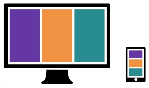
A popular component to organize elements in an application or visualization is a grid layout. For responsive design in particular, we are mostly interested in grid layouts that adapt their columns to the screen resolution of the client. In the following figure, there's an example of a responsive grid layout with three columns per row on a desktop device and one column per row on a mobile device:

Simple Responsive grid, left: desktop, right: mobile
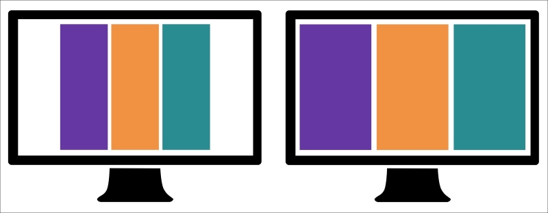
We then distinguish two different types of responsive grids that adapt the number of columns to the screen resolution of the client:
- Normal grids with a fixed width per breakpoint (see following figure on the left)
- Fluid grids that always scale to the full width of the current breakpoint (see the following figure on the right)

Grid types—left: grid with fixed width, right: fluid grid
It's actually quite simple to build a grid system yourself; let's first take a look at how to create a fluid grid layout, and afterwards, we will better understand how we can use Bootstrap components to get things done quickly and properly.
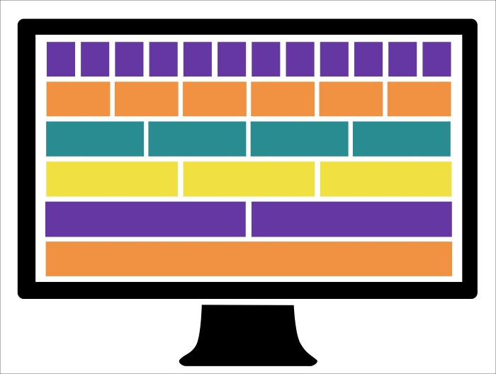
If we think about a grid as a (flexible) table layout, we need two basic components: rows and columns. A popular approach is to use the 12-column grid where we divide the width of a row into 12 columns and define column combinations that sum up to the full width of 12. The following figure illustrates some of these combinations: 12 columns of width 1, 6 columns of width 2, 4 columns of width 3, and so on. Also other combinations that sum up to 12 are allowed, such as 2, 6 and 4 or 1, 10 and 1 and many more.

Grid layout with 12 columns
Let's start and build the .row class that spans to the full width of the parent element:
.row {
  position: relative;
  width: 100%;
}
Next, we want to create column classes .col-1, .col-2, .…, and .col-12 that define the width of the column in the percent relative to the width of the row. We define a text wrap with the float attribute and add padding for the cells. The float attribute indicates that the block element should not appear in the original flow but "float" on the left side. By doing so, we align the elements in the same line instead of placing them into the normal text flow:
[class*="col-"] {
  float: left;
  padding: 1em;
}
.col-1 {
  width: 8.33333333%;
}
.col-2 {
  width: 16.66666667%;
}
.col-3 {
  width: 25%;
}
.col-4 {
  width: 33.33333333%;
}
.col-5 {
  width: 41.66666667%;
}
.col-6 {
  width: 50%;
}
.col-7 {
  width: 58.33333333%;
}
.col-8 {
  width: 66.66666667%;
}
.col-9 {
  width: 75%;
}
.col-10 {
  width: 83.33333333%;
}
.col-11 {
  width: 91.66666667%;
}
.col-12 {
  width: 100%;
}
In the preceding code, we see that we can use the wildcard attribute selector called [class*="col-"] to select all the columns at once (all the classes that contain the col- letters). The widths have to be defined as per column type.
The only problem in the previous example is that, by default (box-sizing: content-box), the padding size of the columns adds up with the width property to determine the computed width of the element. The total width of all elements plus the padding sizes would give a number bigger than 100% of the parent element. Using the box-sizing: border-box property, we can disable this behavior and the computed width of the element equals the width property:
[class*="col-"] {
  -webkit-box-sizing: border-box;
  -moz-box-sizing: border-box;
  box-sizing: border-box;
}
Finally, we need to clear the text-wrapping property of the columns after each row. We can do this by adding a clearfix pseudo element after each .row class:
.row:after {
  content: " ";
  display: block;
  clear: both;
}
This is already a nice implementation of a basic grid system. Let's test this layout and create an HTML page with the following content:
<div class="row">
  <div class="col-1">.col-1</div>
  <div class="col-1">.col-1</div>
  <div class="col-1">.col-1</div>
  <div class="col-1">.col-1</div>
  <div class="col-1">.col-1</div>
  <div class="col-1">.col-1</div>
  <div class="col-1">.col-1</div>
  <div class="col-1">.col-1</div>
  <div class="col-1">.col-1</div>
  <div class="col-1">.col-1</div>
  <div class="col-1">.col-1</div>
  <div class="col-1">.col-1</div>
</div>
<div class="row">
  <div class="col-2">.col-2</div>
  <div class="col-2">.col-2</div>
  <div class="col-2">.col-2</div>
  <div class="col-2">.col-2</div>
  <div class="col-2">.col-2</div>
  <div class="col-2">.col-2</div>
</div>
<div class="row">
  <div class="col-3">.col-3</div>
  <div class="col-3">.col-3</div>
  <div class="col-3">.col-3</div>
  <div class="col-3">.col-3</div>
</div>
<div class="row">
  <div class="col-4">.col-4</div>
  <div class="col-4">.col-4</div>
  <div class="col-4">.col-4</div>
</div>
<div class="row">
  <div class="col-6">.col-6</div>
  <div class="col-6">.col-6</div>
</div>
<div class="row">
  <div class="col-12">.col-12</div>
</div>
If we add a little bit of coloring (the complete example can be found in the code files of the book) and open the HTML page in the browser, we get a layout similar to the following figure:

Browser output of simple grid layout
Let's take a look at the responsive grid system provided by Bootstrap, which looks very similar to the one that we have just created. Bootstrap defines Media Queries for four device types (the so-called grid tiers) and their corresponding typical viewport widths (in pixel) for the responsive breakpoints:
- Default for extra small devices (
xs) such as phones ≥768pxfor small devices (sm) such as tablets and phones in landscape mode≥992pxfor medium devices (md) such as desktops≥1200pxfor large devices (lg) such as large desktops and TVs
Note
In Bootstrap 4, the breakpoints are now defined in em units:
- Default for extra small devices
≥34emfor small devices≥48emfor medium devices≥62emfor large devices≥75emfor extra large devices
The grid requires three different components:
- It requires a
containerelement with the class called.containerfor fixed widths or.container-fluidfor fluid containers - It requires a
rowelement with the class.row - It requires one or more
columnelements:.col-xs-1,.col-xs-2, …,.col-xs-12.col-sm-1,.col-sm-2, …,.col-sm-12.col-md-1,.col-md-2, …,.col-md-12.col-lg-1,.col-lg-2, …,.col-lg-12
Note
Bootstrap 4 adds another .col-xl-* class for extra large devices.
Let's take a look at some code. First, we need to include the Bootstrap CSS to the header of the web page:
 <!DOCTYPE html>
<html>
  <head>
    <link rel="stylesheet" href="https://maxcdn.bootstrapcdn.com/bootstrap/3.3.5/css/bootstrap.min.css">
    <title>Simple Grid System</title>
    ...
  </head>
  <body>
    ...
  </body>
</html>
Now, we can add the grid layout according to the previous example, but this time, we need to wrap it in a fluid container:
<div class="container-fluid">
  <div class="row">
    <div class="col-lg-1">.col-lg-1</div>
    <div class="col-lg-1">.col-lg-1</div>
    ...
  </div>
  <div class="row">
    ...
  </div>
</div>
If we open the web page and look at the output of the web browser, we see an example similar to the following figure:

Browser output of grid layout with Bootstrap
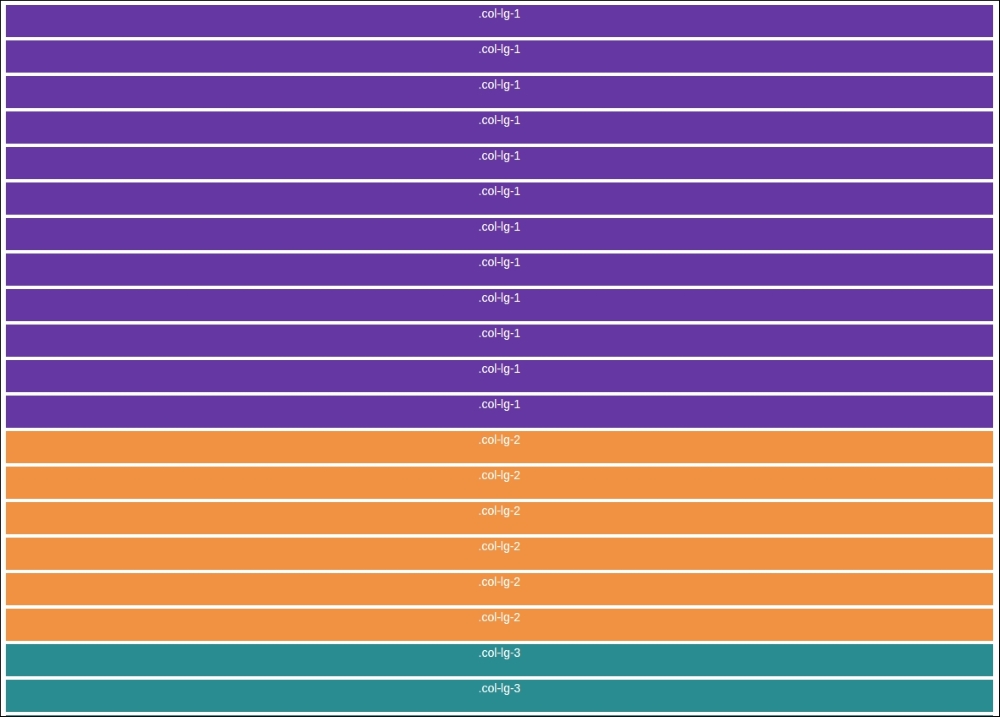
We remark that the preceding figure looks very similar to the grid layout that we created in the beginning of this section. The only small difference in the code was the .container element to wrap the rows and the usage of the .col-lg-* classes. However, Bootstrap's grid is responsive, and the columns are arranged according to the breakpoints and the browser width. If we reduce the size of the browser window smaller than 1200px, we see that the grid jumps into a different layout. We can see this effect in the following figure:

Browser output of grid layout with window size smaller than 1200px
The reason for this is that the browser window is no longer in the state of a very large device (greater than 1200px) and has jumped to a smaller state. Therefore, the col-lg-* columns are not applied anymore, and they appear in the full width of the row. We can now start to define certain column combinations to create a flexible responsive grid:
<div class="container-fluid">
  <div class="row">
    <div class="col-lg-3 col-md-6 col-sm-12"></div>
    <div class="col-lg-3 col-md-6 col-sm-12"></div>
    <div class="col-lg-3 col-md-6 col-sm-12"></div>
    <div class="col-lg-3 col-md-6 col-sm-12"></div>
  </div>
  <div class="row">
    ...
  </div>
</div>
Hiding elements on different screen resolutions
Bootstrap also provides very handy and responsive utility classes to hide elements on certain browser widths. The classes are named according to the Media Query breakpoints:
.hidden-xs.hidden-sm.hidden-md.hidden-lg
Hiding an element on a phone in portrait mode is as simple as adding a class to the element; let's take a look at the following example:
<ul class="nav">
  <li><a href="#menu">Menu</a></li>
  <li class="hidden-xs"><a href="#link">Link</a></li>
</ul>
The classes for showing elements on certain browser widths come for each breakpoint in three different variations depending on the CSS display property of the element:
.visible-*-block.visible-*-inline.visible-*-inline-block
Note
The reason for these additional types is undesired line breaks and behaviors that occur when the display mode changes from none to block. Therefore, Bootstrap forces the user to specify the display property via the class name.
For these three blocks, all the breakpoint classes are available:
.visible-xs-*.visible-sm-*.visible-md-*.visible-lg-*
Displaying an element only on a specific device width is also very simple:
<ul class="nav">
  <li><a href="#menu">Menu</a></li>
  <li class="visible-xs-block"><a href="#link">Link</a></li>
</ul>
Note
Bootstrap 4 provides only the .hidden-*-down and .hidden-*-up classes across all the breakpoints to the hide elements of certain device types.
Using Bootstrap's Media Queries in LESS
Bootstrap's stylesheet is written in LESS and we can make use of the predefined breakpoints and Media Queries easily.
Note
LESS is a CSS-like preprocessor language used to write stylesheets that support nesting, variables, functions, mixins, and much more. LESS files are compiled to CSS files during the development via the LESS compiler. If you've never heard about LESS, it is a good time to check it out via http://lesscss.org/.
Make sure you have the LESS compiler installed; this can be done by running the following command from the terminal:
npm install -g less
First, we create a style.less file and import Bootstrap's variables.less file at the beginning of the file. This enables us to reuse Bootstrap's declarations for colors, dimensions, and configurations throughout this file:
/* style.less */
@import "bower_components/bootstrap/less/variables.less";
Now, we can use Bootstrap's Media Query breakpoints in our LESS file. Let's add some device-specific padding to all the div containers:
/* Extra small devices */
/* No media query since this is the default in Bootstrap */
div {
  padding: 4em;
}

/* Small devices */
@media (min-width: @screen-sm-min) {
  div {
    padding: 8em;
  }
}

/* Medium devices */
@media (min-width: @screen-md-min) {
  div {
    padding: 16em;
  }
}

/* Large devices */
@media (min-width: @screen-lg-min) {
  div {
    padding: 24em;
  }
}
Now, we use the LESS compiler to compile the stylesheet with CSS by running the following command in the terminal:
lessc style.less style.css
The resulting CSS looks similar to this:
/* Extra small devices */
/* No media query since this is the default in Bootstrap */
div {
  padding: 4em;
}
/* Small devices */
@media (min-width: 768px) {
  div {
    padding: 8em;
  }
}
/* Medium devices */
@media (min-width: 992px) {
  div {
    padding: 16em;
  }
}
/* Large devices */
@media (min-width: 1200px) {
  div {
    padding: 24em;
  }
}
Perfect! This means that we can now use the predefined breakpoints in our LESS styles.
Sometimes, it is also necessary to limit your styles to a narrow set of devices. Therefore, one can also use the max-width Media Queries in LESS. Again, the following code snippet is taken from the Bootstrap documentation at http://getbootstrap.com/css/#grid-media-queries:
@media (max-width: @screen-xs-max) { ... }
@media (min-width: @screen-sm-min) and (max-width: @screen-sm-max) { ... }
@media (min-width: @screen-md-min) and (max-width: @screen-md-max) { ... }
@media (min-width: @screen-lg-min) { ... }
This can be useful when we want to define styles for a single device type rather than all the devices with a screen width greater than or equal to the defined one.


