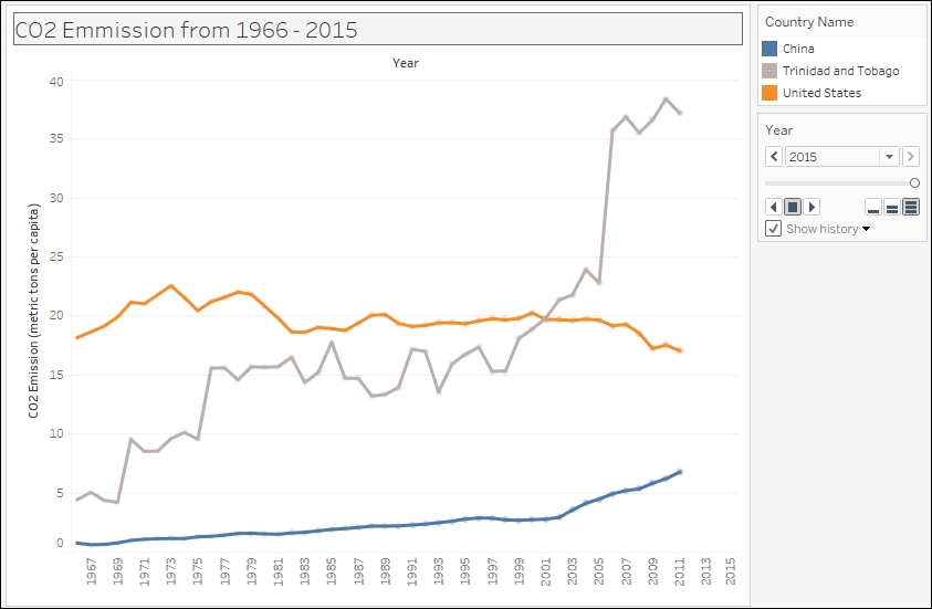
Creating a motion chart
In this recipe, we will create an animated chart that shows how population has changed over the years for a few selected countries.

Getting ready
To follow this recipe, open B05527_03 - STARTER.twbx. Use the worksheet called Motion Chart, and connect to the CO2 (Worldbank) data source.

How to do it…
The following are the steps to create a motion chart:
From Dimensions, drag Year to the Columns shelf.
From Measures, drag CO2 Emission to the Rows shelf.
Right-click on the CO2 Emission axis, and change the title to
CO2 Emission (metric tons per capita).
In the Marks card, click on the dropdown to change the mark from Automatic to Circle.
From Dimensions, drag Country Name to Color in the Marks card.
From Dimensions, drag Country Name to the Filter shelf.
Under the General tab of the Filter window, while the Select from list radio button is selected, select None.
Select the Custom value list radio button, still under the General tab, and add China, Trinidad and Tobago, and United...


