Designing visually appealing charts and dashboards
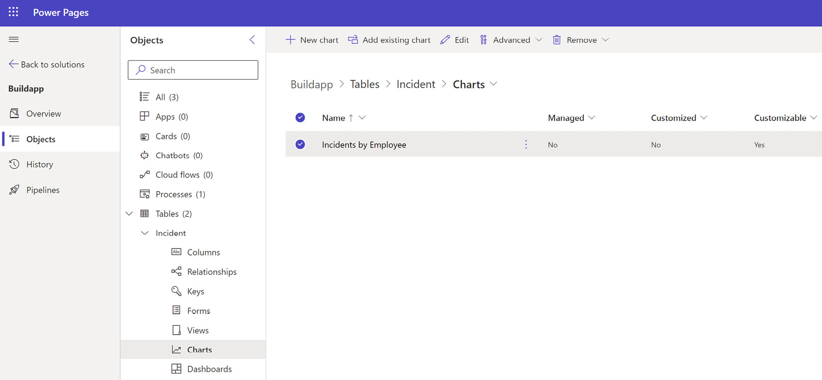
Designing visually appealing charts and dashboards is essential for effectively conveying data insights and providing an engaging user experience. Sarah learned to put her charts into a solution and they are found under charts in a table. To get a chart ID, open the chart in the chart designer and copy the GUID from the URL. Figure 11.4 shows where Sarah’s timesheet charts are:

Figure 11.4 – Location of charts in a solution
Figure 11.4 shows there is a + New chart button where Sarah can create new charts for that table, and this opens the chart designer.
Let’s look at some key considerations and guidelines to keep in mind.
Color schemes
Choose a color scheme that is visually pleasing and enhances the readability of the data. Use contrasting colors to differentiate data points and highlight important information. Consider the use of color gradients or shades to represent data...


