Search icon CANCEL
Subscription
0
Cart icon
Your Cart (0 item)
Close icon
You have no products in your basket yet
Save more on your purchases! discount-offer-chevron-icon
Savings automatically calculated. No voucher code required.
Arrow left icon
Explore Products
Best Sellers
New Releases
Books
Videos
Audiobooks
Learning Hub
Newsletter Hub
Free Learning
Arrow right icon
Arrow up icon
GO TO TOP
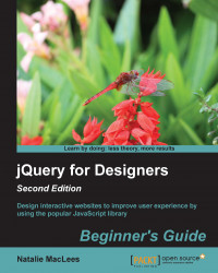
jQuery for Designers Beginner's Guide Second Edition

You're reading from   jQuery for Designers Beginner's Guide Second Edition Design interactive websites to improve user experience by using the popular JavaScript library

Arrow left icon
Product type Paperback
Published in Jul 2014
Publisher
ISBN-13 9781783284535
Length 398 pages
Edition 1st Edition
Languages
Tools
Concepts
Arrow right icon
Author (1):
Arrow left icon
Natalie Maclees Natalie Maclees
Author Profile Icon Natalie Maclees
Natalie Maclees
Arrow right icon
View More author details
Toc

Table of Contents (15) Chapters Close

Preface 1. Designer, Meet jQuery FREE CHAPTER 2. Enhancing Links 3. Making a Better FAQ Page 4. Building an Interactive Navigation Menu 5. Showing Content in Lightboxes 6. Creating Slideshows and Sliders 7. Working with Responsive Designs 8. Getting the Most from Images 9. Improving Typography 10. Displaying Data Beautifully 11. Reacting to Scrolling 12. Improving Forms A. Pop Quiz Answers Index

Chapter 7. Working with Responsive Designs

The last couple of years have seen a rise in the popularity of an approach to designing websites called responsive design. Coined by Ethan Marcotte, the term refers to websites that respond to the viewport size of your website visitor. You can learn more about responsive design in Marcotte's article at http://alistapart.com/article/responsive-web-design. Whether site visitors are viewing your website on a mobile device, a tablet, a netbook, or a huge desktop screen, the website detects the viewport size and responds by adjusting layouts, font sizes, image sizes, and more to optimize the website for that particular viewport size.

While most of the magic of responsive design happens with media queries and other CSS, JavaScript can help to enhance the experience even further for our website visitors. Some elements and layouts aren't easily adapted to the viewport size with just CSS. JavaScript can fill in and help us take our...

lock icon The rest of the chapter is locked
Register for a free Packt account to unlock a world of extra content!
A free Packt account unlocks extra newsletters, articles, discounted offers, and much more. Start advancing your knowledge today.
Unlock this book and the full library FREE for 7 days
Get unlimited access to 7000+ expert-authored eBooks and videos courses covering every tech area you can think of
Renews at $19.99/month. Cancel anytime
Banner background image