Application icon
The following is a screenshot of Apple's iTunes with a dozen of app icons. The images, not text titles, compel the attention of the viewer:

It is hard to overestimate the value of an application icon for the mobile application, especially for the game. This is one of the most powerful elements of its identity. Generally, people don't read the name of the application on the App Store; they set their eyes on the icon. It has to tell a whole story to them: what is the genre the game based on? Does the game have beautiful graphics? What is the main element of the gameplay? Who is the main character? Is it funny? Many more questions are answered by small graphic images. As the Chinese proverb says:
"One picture is worth ten thousand words."
In our case, we can paraphrase: one app icon is worth dozens of letters in the application name.
Some people try to steal graphic ideas of famous and popular titles trying to ride on someone else's success. That's a pathetic concept. First of all, that is not right from an ethical point of view (don't forget about copyright issues too); also, that behavior can play a nasty trick on your game, because it would look like a secondary class product with a lack of any new and original idea not worth spending money on. Nobody loves copycats. So, that can be a hard strike on your image.
Nevertheless, you may or even have to learn from successful examples. Nobody can stop you from adopting some ideas, but you have to interpret them by yourself. Even a simple story can be told in a thousand ways. Your intonation is very important. Borrowing of some graphic trends can help to embed your game into App Store universe easily and will not make you look like a white crow. Although it is good to be pretty trendy, is bad to be a copy. For example, if there are many applications with glossy graphics and bright colors, you can use that approach, but if there are many icons with the same composition or main element (for example, many match-three applications are using a large image of a crystal or color ball, racing games are using finish flags or wheels, and so on), it is always better to introduce something unique. Otherwise, your icon will sink into the ocean of identical images. So, the application icon can be based on trendy methods (graphic style and colors), but you must pay more attention to details. If everyone around is putting one image of a bubble or ball, you have to put two, three, or add unique and bright special effects (fire, sparkles, and so on). Are there many images of car wheels in racing arcades? You should put an image of a front light of a car. Are all games about zombies using an image of zombie head? Not a problem, use a leg with a caricature bone or an arm! You need to have your own voice. Wherein, you do not to use too unusual tone in order to sound overly original.
To choose the main element of the icon, you need to ask yourself: "what (or who) is your game about?" The answer should be short and clear; otherwise the answer is wrong. It is good to break your game into the logical fragments and try to reflect some of them in icons, searching for good combinations. Use the main gameplay element first, one of the bonuses after that. Does one of the bonuses look great in the game? If the answer is yes, try to use that fragment of the artwork in the icon.
It's desirable to use a graphic style related to the artwork of your game in the icon. If the game is using the cartoon style for images, the app icon is cartoonish too; more realistic game graphics need a photo—a realistic icon.
There is an interesting trend in icon design for iOS: designers trying to compose the image in the peculiar shape of the icon. Its rounded corners are used as a natural contour of a drawn object, so the final result looks like a truly 3D image. Such icons are amazing; they are real works of art. Most appreciated works on Dribbble are usually the icons in such graphic style. They have a giant potential to inspire you. The only problem is the fact that many of those icons were created for portfolios only, they look great, but they are not commercial examples serving real applications. Partly, it can be explained by the fact that such icons usually are only object based; they illustrate a thing, for example, a treasure box or a piece of cake (there are tons of icons portraying sweets), so they are very static. But application icons often need to display a simple scene, to illustrate some motion and interaction of elements or simply to show more than one object. This is why such wonderful pieces of pixel art become dismissed and turn into decorations of portfolios. However, it would still be great to use such an icon for your game if conditions were appropriate. The following are two examples of such graphics:

iOS 7 brings some new aesthetics into application icon design—graphics became flat, there is more interest in simple and smooth shapes and clean colors rather than in photo-realistic illustrations, rich textures, and so on. Most artworks look like vector graphics with solid fill or delicate gradients—the main color accent is made on a bright background; central element of compositions are emphasized by the so-called diagonal shadows; they are pretty long, tilted by 45 degrees, and have no blur effect (or its volume is minimum). Such elements can be generated in Adobe Illustrator by using Blend Tool. You only need to create a primary shape of the shadow, then it should be cloned and its copies are shifted right and down by diagonal trajectory. The opacity level of the copy must be defined as zero; after that, it can be connected with the primary shape by Blend Tool; the number of interpolations can be adjusted via the tool's menu. Another important approach is color; a palette used in iOS 7 is a bit different from the previous era, it is clean and usually has ambivalent visual characteristics; for instance, shades can lie between red and orange, or green and blue.
You should try to avoid including any large portions of text in the icon, particularly the name of the game itself or it will be a sign of bad taste. The application name inside the icon looks silly, because there is an actual name below the icon at the home screen displayed by the system, and together they form a visual tautology. There is another reason too: the long text will be unreadable, being scaled down, notably on pre-Retina devices (don't forget that icons for the first iPhone had a width of 60 pixels).
The only exceptions to the text inside the icon are short service words (up to 4 to 6 letters in length) helping to differentiate one version of the same application from another. I'm talking about such designations such as:
- HD: This is the high-resolution edition for Retina iPad.
- Free/Lite: This is the gratis version of the application.
- PRO/Lux: Usually, this is a denotation for the ad-free version of a free application. It may include extra content too.
If your game is a sequel, its index number can be included in the application icon too; people need to know that this is something new, not the game they've already played before. Furthermore, several icons with indexes on them make it clear that this is not a single game, but a small franchise. This can increase the attractiveness of your title.
Some developers think global and design special graphic elements, uniting app icons of all their applications. They get something like a corporate rule for all the images they produce. That can be a unique background, an element of composition, or a special frame for the application icon. The frame is one of the most common ways to make your game unique, it is easy to create and use, and it can hold the text designations.
You need to think deep about the colors you will use in your app icon. Each color has its own power and psychological meaning. One of the pioneers of abstract art, an art theorist and Russian painter, Wassily Kandinsky, in his book Concerning the Spiritual in Art (1911) notes that cool colors (blue or violet ones, for example) are concentric, they are directed inside an object and move away from a viewer, but warm colors are eccentric; they are directed outside, moving to the viewer:

At the practical level, this means that a main element, painted a bright and warm color, can create a feeling being jumped up from the icon frame (now remember the app icon of the illustrious Angry birds, displaying a red bird). It is an extroverted type of graphic, so it is ideal for games with a pretty fast gameplay, with a lot of action, characters and game elements, in other words it serves various types of arcades, action-oriented puzzles, shooters, races, and so on. Whereas cool and dark colors being used as backgrounds help the main element to shine and be more attractive (roughly speaking, cool backgrounds move away from the viewer, but the warm main elements move toward the viewer, so their speeds are added together resulting in a vivid image). The icon can have only cool and dark colors too; this is good for more static and solitary games with more complicated rules. Blue is an intellectual and introvert color. Violet is a slightly spiritual and mystic color. It is interesting to note that the combination of a cold main element with a warm background is not very common practice because the structure of such elements is not properly stable. So, it is better to make cool (or dark) graphic compositions solid: with cool background and cool foreground; warm elements can be used only as small emphasis points because they are much more active.
Note
Jon Hicks is the talented designer known for rendering the Firefox logo, working on the MailChimp logo, Skype's emoticons, and many other amazing projects. He also is author of the book The Icon Handbook published by Five Simple Steps. On this book's official website, http://iconhandbook.co.uk/reference/chart/, there is a very useful chart, showing specifications on most popular formats of icons, including iOS, Android, Blackberry, and so forth.
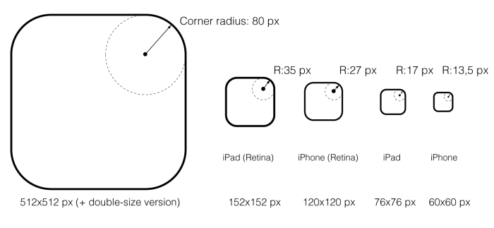
Now, let's talk about the craft. The application icons should be rendered very meticulously and professionally. There are several types of image sizes to be included in a final package; it is worth noting that former guidelines were revisited after introduction of iOS 7 in 2013 and icons became a little bit bigger (as did their radiuses). The smallest ones are the legacy of first generations of iOS devices: 60 pixels for iPhone and 76 pixels for iPad. They need attention to each pixel; this is not pixel art, but some aspects of images should be edited at pixel level. The next generation of iOS devices introduced double-sized icons: 120 x 120 pixels and 152 x 152 pixels. But the most challenging is the icon artwork that is used by iTunes, which can have dimensions up to 1024 x 1024 pixels! It's funny when you recall that nearly ten years ago many desktop computers used a screen resolution equal to 1024 x 768 pixels, which was less than the modern single icon has become.
The following screenshot shows the template used for the app icon used in the Rail Maze 2 game developed by Spooky House Studios UG (haftungsbeschränkt):

A special template can be created in Adobe Illustrator to work with app icons. It includes one artboard, a layer with a background (for comfort previewing), several placeholders for icons situated in the layer called content, a grid of slices, and finally the layer called cover with special masks with rounded corners. Some of the most important parts are slices; though they were invented for web design, helping to prepare website's images, they can be used for icon design too. Their major advantage is their ability to slice the artboard on fragments; each of them is saved (via the Save for web option) as a separate file. Moreover, you can control the names of such files by using the Slice Options... panel (Object | Slice | Slice Options...); there is the textfield marked Name. By default, a slice's name is generated automatically (a document name plus some digital indexes), but you can enter the name manually. It is useful to add a shortcut for the Slice Options panel; by default, it has no shortcuts, but it can be done through the special menu in Adobe Illustrator: Edit | Keyboard Shortcuts.... The slices have their nuances; try to draw them in the Pixel Preview mode or periodically pay attention to the Transform panel; the slice should have the exact dimensions without fractions, the coordinates should be integers too. In other cases, some errors with dimensions of exported files can occur; for instance, instead of 60 x 60, you would get 60 x 59 or something like that. Adobe Illustrator automatically creates a folder named Images, where the all saved slices are stored (there can be some graphic garbage too because some slices simply cut out parts of background).
It is important to remember that the application icon in iOS doesn't support transparency; they are opaque square images. Now, famous rounded corners are made by the operating system itself, so you should not include those corners in your artwork!
Tip
Always move from small sizes to larger ones.
This means that first of all the smallest icons should be created, then they can be scaled up and the level of detail can be increased. So, create the iPhone icon of 60 x 60 pixels, try it on device, ask some people about their opinion, check all the details again, make sure that is your image in 100 percent, and then finally start working on the iTunes icon. It will require from you a lot more portraying effort, and proper high-resolution textures and illustrations will be needed. But the effort is worth it because there is nothing like a tasty, well-crafted, and beautiful artwork on your iTunes' page. Yummy!
There are some naming rules for final files. The official iOS App Programming Guide from Apple in the chapter App Icons gives such a description:
Icon.png: This is the name for the app icon on the iPhoneIcon@2x.png: This is the name for the app icon on the iPhone with Retina displayIcon-72.png: This is the name for the app icon on the iPadIcon-72@2x.png: This is the name for the app icon on the iPad with Retina displayiTunesArtwork: This is the name for the app icon on the App StoreiTunesArtwork@2x: This is the name for the high resolution app icon on the App Store
