Top 5 features you need to know about
In this section we'll learn about some core features you'll need to know in order to be a competent responsive designer. We'll cover technical things like what media queries are, and different approaches you'll need to be comfortable with, to make good decisions on what kind of responsive designer you want to be.
The power of CSS Media Queries
Media queries are the backbone of RWD. In this section we'll get familiar with what they are and what they can do. You'll use them often, but you won't have to memorize everything that they're capable of. It means that you should be familiar with what they can do in case the need ever arises.
Media types
Media queries are no joke. So far you've only learned about max-width, but there are seemingly endless ways of targeting various devices. It gets as abstract as writing media queries for braille readers and, get this, the scanning type of projection devices. Finally, you can serve a different batch of CSS for both progressive and interlace TVs!
I'll spare you the possibilities as they're available online if you search for MDN Media Queries and we'll just focus on the media queries you'll actually use.
Firstly, you should know there is a list of media types you can target explicitly. Things like projectors and TVs are supported, but the two you'll mostly work with are screen and print. In fact, you'll mostly target print explicitly, and that's just if you feel like your content will be frequently printed and you'd like to remove things like sidebars from the printed page.
Media type defaults to all, so when you don't explicitly call a media type, for instance, screen, it will default to target screens (mobile screens, desktop screens, and so on) anyway.
There isn't a lot of knowledge available on the speech, braille, and aural media types at this point (they seem more like preparation material for the W3C's vision of the accessible future of the web), but for now you can use display: none on extraneous content that would make a screen reader repeat redundant content on various pages (like a logo's alt text) to help a visually impaired user access the actual content of the page.
You'll only use media type queries for fringe cases or if you're the type of web designer who consistently goes above and beyond client expectations to make sure that every single device functions amazingly—the downside being this kind of attention to detail is incredibly hard to maintain.
To avoid confusion and to put it simply, don't be swayed into thinking media types like handheld will consistently target what you're looking for. Instead, just target vaguely without media types. For instance:
@media (max-width: 700px) { … }Is better than:
@media handheld { … }Logical operators
You can use and, not, and only with media queries to achieve even more control. You can even concatenate conditions with commas, which is equivalent to the or operator. An example of a logical operator in place would be:
@media (min-width: 500px) and (max-width: 700px) {
    body {
        background: yellow;
    }
}
It will render a page that the body background color will change to yellow only between 500 px and 700 px.
A more useful example would be targeting an iPhone's orientation to display or hide a login form:
@media (max-width: 320px) and (orientation: portrait) {
    form.login {
        display: none;
    }
}
Note
We target the iPhone by using its width and also specify the orientation in case someone is using an even smaller phone on landscape.
Naturally, you could replace and with not and also portrait with landscape for the same effect; so the logical operators are pretty interchangeable. Just use whatever works best for the way you think logically.
You'll see a lot of code examples scattered around the Internet that use a lot of extraneous code. For instance, here is a popular snippet used to target iPad's in portrait mode:
@media only screen and (min-device-width: 768px) and (max-device-width: 1024px) and (orientation: portrait) {
    body {
        background: orange;
    }
}
Note
device-width will specify that this is exclusively used for devices, which is essentially any mobile device. To see how this works on your desktop, simply remove -device from each operator.
Essentially, we're only targeting non-desktop devices that are between 768 px and 1024 px in portrait mode. That is, only iPad tablets in portrait mode.
It's nice we have that kind of power, but this kind of targeting raises some concerns. We are almost literally only targeting iPads in portrait mode. Shouldn't desktop monitors at 800 x 600 resolutions get the same kind of usable rearrangement of elements? Why are we cutting off our media query for people below 768 px? Should we be using device-width at all? Why not just use width? Why are we specifying screen? As a developer, you should always try to remove as much cruft from your code as you can to make your code as flexible as possible. While having the power to target so radically is nice, it's also completely unnecessary and perhaps even hindering.
A much better approach to this situation would be to simply say, "When any device sees my site below 1024 px, I want my layout to rearrange to provide them with a nice experience. Once the width of the device falls to phone territory, I want to change it again."
@media (max-width: 1024px) {
    body {
        background: orange;
    }
}
@media (max-width: 768px) {
    body {
        background: yellow;
    }
}
Note
When any device hits 1024 px width, change the background color to orange; when it drops below that (into mobile territory), change the background to yellow.
Using this kind of degradation, we're able to serve a much wider array of devices with a fraction of the code. This is much more flexible. Not only is this faster and easier, but do you see how being vague with your media queries is a real strength?
In summary, media queries can be extremely powerful, but best used as vaguely as you can—all that strength and nothing to do with it.
In our next section we'll get into some really exciting stuff including the different approaches you'll encounter while making responsive websites.
Different strategies to make responsive websites
Since Ethan Marcotte coined the term "responsive web design", people have been looking for the best way to do it, which has cumulated into the Goldilocks approach versus the Fluid approach, and Desktop-first versus Mobile-first. The only right answer is to do what you're most comfortable with and, as always, avoid dogma. In this section we'll go over the differences between each approach and even sample them so your RWD tool belt is well equipped.
The Goldilocks approach
In 2011, and in response to the dilemma of building several iterations of the same website by targeting every single device, the web-design agency, Design by Front, came out with an official set of guidelines many designers were already adhering to. In essence, the Goldilocks approach states that rather than rearranging our layouts for every single device, we shouldn't be afraid of margins on the left and right of our designs. There's a blurb about sizing around the width of our body text (which they state should be around 66 characters per line, or 33 em's wide), but the important part is that they completely destroyed the train of thought that every single device needed to be explicitly targeted—effectively saving designers countless hours of time.
This approach became so prevalent that most CSS frameworks, including Twitter Bootstrap 2, adopted it without realizing that it had a name.
So how does this work exactly? You can see a demo at http://goldilocksapproach.com/demo; but for all you bathroom readers out there, you basically wrap your entire site in an element (or just target the body selector if it doesn't break anything else) and set the width of that element to something smaller than the width of the screen while applying a margin: auto.
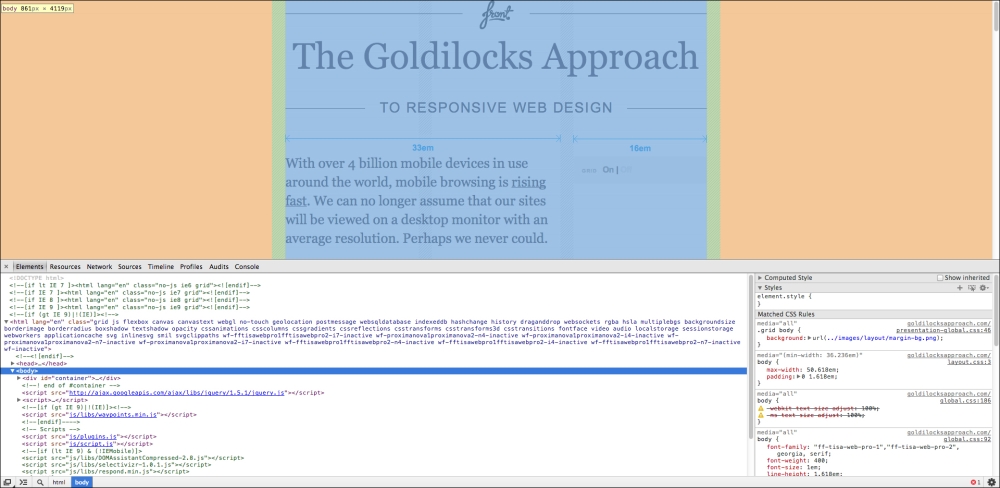
The highlighted element is the body tag. You can see the standard and huge margins on each side of it on larger desktop monitors.
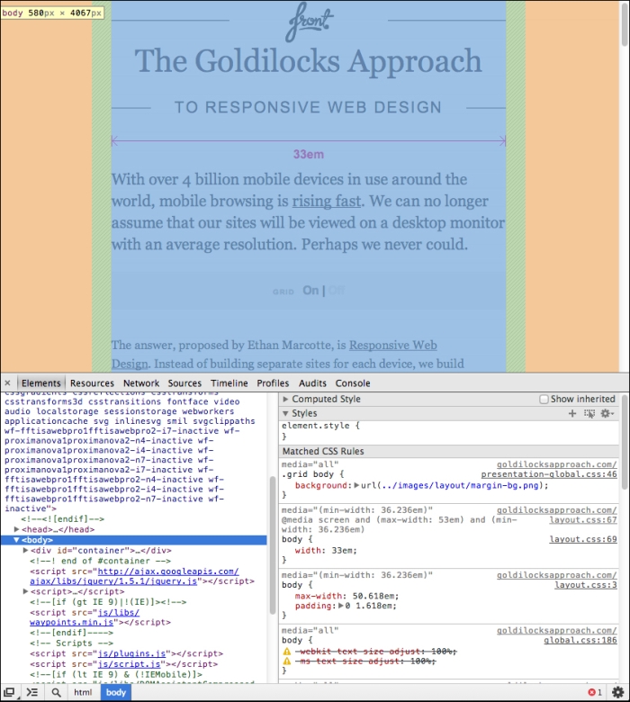
As you contract the viewport to a generic tablet-portrait size, you can see the width of the body is decreased dramatically, creating margins on each side again. They also do a little bit of rearranging by dropping the sidebar below the headline.
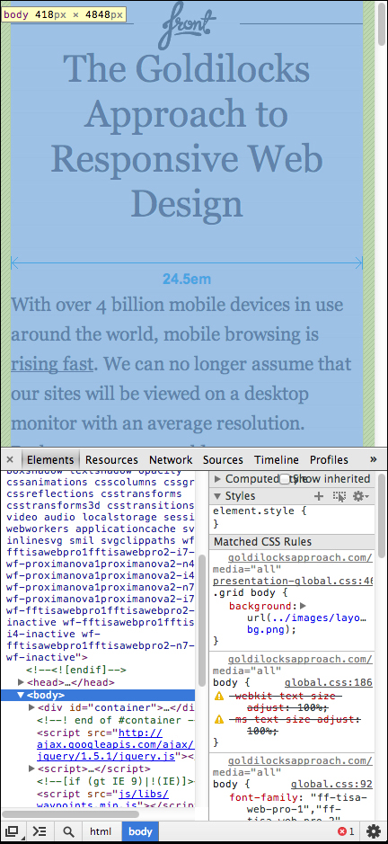
As you contract the viewport more to a phone size, you'll notice that the body of the page occupies the full width of the page now, with just some small margins on each side to keep text from butting up against the viewport edges.
Okay, so what are the advantages and disadvantages?
Well, one advantage is it's incredibly easy to do. You literally create a wrapping element and every time the width of the viewport touches the edges of that element, you make that element smaller and tweak a few things. But, the huge advantage is that you aren't targeting every single device, so you only have to write a small amount of code to make your site responsive.
The downside is that you're wasting a lot of screen real-estate with all those margins.
For the sake of practice, create a new folder called Goldilocks. Inside that folder create a goldilocks.html and goldilocks.css file. Put the following code in your goldilocks.html file:
<!DOCTYPE html>
<html>
    <head>
        <title>The Goldilocks Approach</title>
        <link rel="stylesheet" href="goldilocks.css">
    </head>
    <body>

        <div id="wrap">

            <header>
                <h1>The Goldilocks Approach</h1>
            </header>

            <section>
                <aside>Sidebar</aside>
                <article>
                    <header>
                        <h2>Hello World</h2>
                        <p>
                            Lorem ipsum...
                        </p>
                    </header>
                </article>
            </section>

        </div>

    </body>
</html>
Note
We're creating an incredibly simple page with a header, sidebar, and content area to demonstrate how the Goldilocks approach works.
In your goldilocks.css file, put the following code:
* {
    margin: 0;
    padding: 0;
    background: rgba(0,0,0,.05);
    font: 13px/21px Arial, sans-serif;
}
h1, h2 {
    line-height: 1.2;
}
h1 {
    font-size: 30px;
}
h2 {
    font-size: 20px;
}
#wrap {
    width: 900px;
    margin: auto;
}
section {
    overflow: hidden;
}
aside {
    float: left;
    margin-right: 20px;
    width: 280px;
}
article {
    float: left;
    width: 600px;
}
@media (max-width: 900px) {
    #wrap {
        width: 500px;
    }
    aside {
        width: 180px;
    }
    article {
        width: 300px;
    }
}
@media (max-width: 500px) {
    #wrap {
        width: 96%;
        margin: 0 2%;
    }
    aside, article {
        width: 100%;
        margin-top: 10px;
    }
}
Note
Did you notice how the width of the #wrap element becomes the max-width of the media query?
After you save and refresh your page, you'll be able to expand/contract to your heart's content and enjoy your responsive website built with the Goldilocks approach. Look at you! You just made a site that will serve any device with only a few media queries. The fewer media queries you can get away with, the better!
Here's what it should look like:
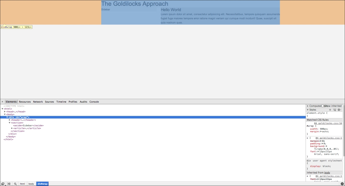
The preceding screenshot shows your Goldilocks page at desktop width. At tablet size, it looks like the following:
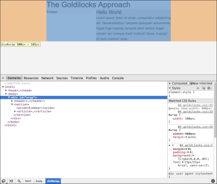
On a mobile site, you should see something like the following screenshot:
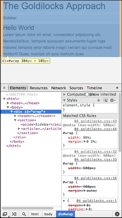
The Goldilocks approach is great for websites that are graphic heavy as you can convert just three mockups to layouts and have completely custom, graphic-rich websites that work on almost any device. It's nice if you are of the type who enjoys spending a lot of time in Photoshop and don't mind putting in the extra work of recreating a lot of code for a more textured website with a lot of attention to detail.
The Fluid approach
Loss of real estate and a substantial amount of extra work for slightly prettier (and heavier) websites is a problem that most of us don't want to deal with. We still want beautiful sites, and luckily with pure CSS, we can replicate a huge amount of elements in flexible code. A common, real-world example of replacing images with CSS is to use CSS to create buttons.
Where Goldilocks looks at your viewport as a container for smaller, usually pixel-based containers, the Fluid approach looks at your viewport as a 100 percent large container. If every element inside the viewport adds up to around 100 percent, you've effectively used the real estate you were given.
Duplicate your goldilocks.html file, then rename it to fluid.html. Replace the mentions of "Goldilocks" with "Fluid":
<!DOCTYPE html>
<html>
    <head>
        <title>The Fluid Approach</title>
        <link rel="stylesheet" href="fluid.css">
    </head>
    <body>

        <div id="wrap">

            <header>
                <h1>The Fluid Approach</h1>
            </header>

            <section>
                <aside>Sidebar</aside>
                <article>
                    <header>
                        <h2>Hello World</h2>
                    </header>
           <p>
                        Lorem ipsum...
                    </p>
                </article>
            </section>

        </div>

    </body>
</html>
Note
We're just duplicating our very simple header, sidebar, and article layout.
Create a fluid.css file and put the following code in it:
* {
    margin: 0;
    padding: 0;
    background: rgba(0,0,0,.05);
    font: 13px/21px Arial, sans-serif;
}
aside {
    float: left;
    width: 24%;
    margin-right: 1%;
}
article {
    float: left;
    width: 74%;
    margin-left: 1%;
}
Note
Wow! That's a lot less code already.
Save and refresh your browser, then expand/contract your viewport. Did you notice how we're using all available space? Did you notice how we didn't even have to use media queries and it's already responsive? Percentages are pretty cool.

Your first fluid, responsive, web design
We have a few problems though:
On large monitors, when that layout is full of text, every paragraph will fit on one line. That's horrible for readability.
Text and other elements butt up against the edges of the design.
The sidebar and article, although responsive, don't look great on smaller devices. They're too small.
Luckily, these are all pretty easy fixes. First, let's make sure the layout of our content doesn't stretch to 100 percent of the width of the viewport when we're looking at it in larger resolutions. To do this, we use a CSS property called max-width.
Append the following code to your fluid.css file:
#wrap {
    max-width: 980px;
    margin: auto;
}
What do you think max-width does?
Save and refresh, expand and contract. You'll notice that wrapping div is now centered in the screen at 980 px width, but what happens when you go below 980 px? It simply converts to 100 percent width. This isn't the only way you'll use max-width, but we'll learn a bit more in the Gotchas and best practices section.
Our second problem was that the elements were butting up against the edges of the screen. This is an easy enough fix. You can either wrap everything in another element with specified margins on the left and right, or simply add some padding to our #wrap element shown as follows:
#wrap {
    max-width: 980px;
    margin: auto;
    padding: 0 20px;
}
Now our text and other elements are touching the edges of the viewport.
Finally, we need to rearrange the layout for smaller devices, so our sidebar and article aren't so tiny. To do this, we'll have to use a media query and simply unassign the properties we defined in our original CSS:
@media (max-width: 600px) {
    aside, article {
        float: none;
        width: 100%;
        margin: 10px 0;
    }
}
We're removing the float because it's unnecessary, giving these elements a width of 100 percent, and removing the left and right margins while adding some margins on the top and bottom so that we can differentiate the elements.
This act of moving elements on top of each other like this is known as stacking.
Simple enough, right? We were able to make a really nice, real-world, responsive, fluid layout in just 28 lines of CSS.

On smaller devices, we stack content areas to help with readability/usability:
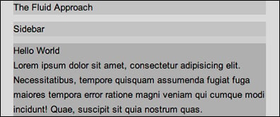
It's up to you how you want to design your websites. If you're a huge fan of lush graphics and don't mind doing extra work or wasting real estate, then use Goldilocks. I used Goldilocks for years until I noticed a beautiful site with only one breakpoint (width-based media query), then I switched to Fluid and haven't looked back.
It's entirely up to you. I'd suggest you make a few websites using Goldilocks, get a bit annoyed at the extra effort, then try out Fluid and see if it fits.
In the next section we'll talk about a somewhat new debate about whether we should be designing for larger or smaller devices first.
Desktop-first versus Mobile-first
The debate boils down to amount of work versus performance with just a hint of preference.
On powerful desktop computers, with their nice broadband connections, downloading something like the jQuery JavaScript library is almost negligible. It's so common that many people include it by default whether they make a lot of use it or not.
At the time of this writing, a minified copy of jQuery clocks in at around 84 KB. That's not a huge factor until you're downloading that from your dinky 3G smart phone while cutting into and out of single. Then it can be excruciating and even turn a lot of users away. How many times have you become frustrated at how slow a site was loading on your phone and started violently mashing your screen trying to get some response out of it?
The Mobile-first camp states that we should leave everything we possibly can, out (JavaScript libraries, media, fancy stuff) and only add it when it's absolutely necessary, or replace it where possible. This dramatically cuts down on page load times, but, as with any optimization, it requires more effort.
The Desktop-first camp states that since the majority of users browse the Internet on desktop computers (although there's some debate even about this), we should all design rich experiences with desktops in mind and just provide the bare minimum experience for mobile users.
As Joshua Johnson writes in his blog post, Mobile First Design: Why It's Great and Why It Sucks...
Let's look for a second at my arguments for and against a mobile first design approach. In the for category, we have straightforward and logical arguments that are difficult to downplay. In the against category, I have a lot of whining and personal hesitation. Which side do you think wins this battle?
The battle can be summed up as graceful degradation (Desktop-first) versus progressive enhancement (Mobile-first), only the degradation isn't always graceful.
Desktop-first
So far we've only been working with the Desktop-first approach. A tell-tale sign that you're approaching the subject from a Desktop-first angle is our media queries. Notice they are all max-width. Mobile-first tends to lean towards min-width.
We've been working with Desktop-first to avoid confusion, and because I believe most of you are following along with a large monitor—hardly anyone develops on a tablet or mobile device.
As we've already made a few sites using the Desktop-first approach, there isn't really a need to recreate another, but as an exercise, browse the CSS (you may need to run it through a CSS beautifier) on some of the responsive sites found at http://mediaqueri.es and see which ones were made with a Desktop-first approach. Most responsive sites are, but that's just because Mobile-first is relatively new in comparison. As time goes on, I suspect more and more sites will be Mobile-first.
Mobile-first
The major points to consider while making your site Mobile-first are:
JavaScript load
CSS load
Image load
Think about what is actually happening with your JavaScript. Is it a library? If so, do you need it on every page? Are you just making an alert box? Do you need to even load a library? Could you write that alert box script in pure JavaScript?
By going through that simple checklist you can get rid of a huge chunk of scripts and optimize your site for all devices. What if you really want a script for desktop but not for mobile? There's a way around that. A site called detectmobilebrowsers.com provides you with code in various languages to detect whether or not the user is on a mobile device. If they are, it typically returns true. With that knowledge, you can choose to load or not to load the script.
This is a finicky fix though. This script will need maintenance by someone, so that it is able to detect newer and newer browser agents. It seems to target everything now, but perhaps in the future, you'll have to maintain your own script. The other problem with this particular script is that the actual pure JavaScript function doesn't return a variable as true or false, it simply redirects to another page. Serving various sites dependent on a device is not responsive. In fact, it's very anti-responsive.
Let's modify the code a bit so that we get a simple true or false value if the agent is a mobile device: https://gist.github.com/CorySimmons/6140696.
Create a file called detect.js and save the Gist above to it. Hang on to that.
With this updated code, we can now use the isMobile variable to detect if the user is on a mobile browser. Nice! Let's jump right into making our first Mobile-first site.
Create a new file called mobile-first.html and add the following:
<!DOCTYPE html>
<html>
    <head>
        <title>Mobile First</title>
        <link rel="stylesheet" href="mobile-first.css">
    </head>
    <body>

        <div id="wrap">

            <header>
                <h1>Mobile First</h1>
            </header>

            <section>
                <aside>Sidebar</aside>
                <article>
                    <header>
                        <h2>Hello World</h2>
                    </header>
                    <p>
                        Lorem ipsum...
                    </p>
                </article>
            </section>

        </div>

        <script src="detect.js"></script>
        <script src="http://rkitover.github.com/load-js/load.js"></script>
        <script>
            if(isMobile == false) {
                load_jquery();
            }
        </script>
        <script>
            if(isMobile == false) {
                $('header').css('background', 'blue');
            }
        </script>

    </body>
</html>
We've added a load.js script that will make it possible to load CSS and JS within <script> blocks.
You'll notice detect.js is doing its job. It's detecting if the user is on a mobile browser, if they aren't, it sets isMobile to false. After that, we're using a neat, lightweight, script called load.js (https://github.com/rkitover/load-js) written by Rafael Kitover to load CSS and JS within a <script> block. That JS isn't available until the next <script> block, so we need to create a new <script> block and repeat our isMobile test to make sure we're not trying to use jQuery when it's not available.
Upload mobile-first.html to your web host and navigate to it. On desktops and laptops your headers should be blue as set by jQuery; on mobile devices, they will not be blue.
Let's review. We're loading a small detect.js script and the small load.js for every visitor. This detects if they are on a mobile device. If so, we don't load anything. If they aren't on a mobile device, we load and execute some jQuery.
There are a myriad of ways to load/not load JavaScript and it can get pretty abstract, but this is a great way for Mobile-first beginners to jump right in and see some massive savings on mobile page load time.
Back to the fun stuff! Create a file called mobile-first.css and add the following:
* {
    margin: 0;
    padding: 0;
    background: rgba(0,0,0,.05);
    font: 13px/21px Arial, sans-serif;
}
#wrap {
    max-width: 980px;
    margin: auto;
    padding: 0 20px;
}
aside, article {
    margin: 10px 0;
}
@media (min-width: 600px) {
    aside {
        float: left;
        width: 24%;
        margin-right: 1%;
    }
    article {
        float: left;
        width: 74%;
        margin-left: 1%;
    }
}
Notice that we're using min-width now instead of max-width.
Does this code look familiar? It should, it's just fluid.css rearranged a bit.
Tip
If you can make Desktop-first sites, you can rearrange the code a bit and turn it into a Mobile-first site fairly easily.
Notice it's a bit (two lines) smaller? That's because we're not overriding any CSS. We're building on the defaults. As the page grows, we morph our layout into something that looks better on desktops. We're progressively enhancing.
Save mobile-first.css and refresh mobile-first.html, expand and contract. Looks just like fluid.html, doesn't it? Except this time around, it's a bit faster. Two lines may not seem like much, but by using this approach you can eliminate hundreds, if not thousands (for bigger sites), of CSS that was before being rendered, then overwritten and re-rendered. This can make for some pretty big page load optimizations especially on mobile devices.
Finally, you should consider images. Images that are too big can make all your other efforts completely worthless, but we need images right? Well, maybe!
We can eliminate a lot of imagery altogether with some nice CSS. For instance, there are a countless number of CSS button generators out there. One of the more interesting projects is layerstyles.org, where you can effectively replicate the Photoshop Layers palette, create custom elements, and grab the CSS. Naturally, as you get better, you won't need fun tools like this. You might even replace them with some incredibly efficient CSS preprocessor mixings, but that's a book for another day. The point is, CSS has come a long way and you don't need nearly as many images as you'd think. Replace as many images with CSS as possible for the easiest/largest savings.
Here's a quick CSS button:
.button {
    background: #f13c3c;
    color: #fff;
    text-shadow: 0 1px 1px #dd2a2a;
    border-radius: 3px;
    border: 1px solid #dd2a2a;
    box-shadow: inset 0 1px 0 0 #f76666;
    padding: 10px 30px;
    text-decoration: none;
    display: inline-block;
    margin: 10px 0;
}
Any element with the .button class applied to it will look like a button. See how flexible these are?
Naturally, you can't get rid of every image. You'll have logos and such. The solutions for these situations range from serving a small image and using JavaScript to detect if the user is on a desktop and replacing the src attribute with a larger version of the same image, to things as complex as editing your Apache configuration to do something similar, to even wrapping every image in a <noscript> tag with data attributes and writing a chunk of JavaScript to add and size imagery.
These solutions are constantly evolving. Since Ethan Marcotte coined the term "responsive web design" a few years ago, there have been dozens of independently developed solutions and it seems like a new standard is coming out every other day.
To go over them all, or to pick one from the batch, would escape the scope of this book and probably be outdated by the time you get this far, but if you're particularly interested in these page load savings, check out a fairly thorough article on the topic written by Jason Grigsby at http://blog.cloudfour.com/responsive-imgs-part-2.
In short, and to avoid confusion, just use as few images as possible. This is a huge reason for the current "flat" (Google Flat UI) trend in web design. It's clean, fast, and doesn't burden the developer with having to maintain multiple image sizes and huge chunks of code just to serve images.
It's entirely up to you whether you prefer a Desktop or Mobile-first approach, but the data and most experts agree that Mobile-first is the wave of the future so it would definitely behoove an aspiring web designer to at least become familiar with developing Mobile-first websites.
In the next section we'll cover some common and strange behavior that might cause you to freak out a bit. Particularly making images and video responsive, and pixel-sizing this may make your responsive sites, not-so-responsive.
Gotchas and best practices
Let's start with images. Grab a big image. If you need help, just search for Packt Publishing Logo and find one.
Once we have our image, let's duplicate our mobile-first.html page and call it gotchas.html. Go ahead and do the same with mobile-first.css, call it gotchas.css. Replace any references to mobile-first[.html, .css] with gotchas[.html, .css].
The HTML:
<!DOCTYPE html>
<html>
    <head>
        <title>Gotchas</title>
        <link rel="stylesheet" href="gotchas.css">
    </head>
    <body>

        <div id="wrap">

            <header>
                <h1>Gotchas</h1>
            </header>

            <section>
                <aside>Sidebar</aside>
                <article>
                    <header>
                        <h2>Hello World</h2>
                    </header>
                    <p>
                        Lorem ipsum...
                    </p>
                </article>
            </section>

        </div>

        <script src="detect.js"></script>
        <script src="http://rkitover.github.com/load-js/load.js"></script>
        <script>
            if(isMobile == false) {
                load_jquery();
            }
        </script>
        <script>
            if(isMobile == false) {
                $('header').css('background', 'blue');
            }
        </script>

    </body>
</html>
* {
    margin: 0;
    padding: 0;
    background: rgba(0,0,0,.05);
    font: 13px/21px Arial, sans-serif;
}
#wrap {
    max-width: 980px;
    margin: auto;
    padding: 0 20px;
}
aside, article {
    margin: 10px 0;
}
@media (min-width: 600px) {
    aside {
        float: left;
        width: 24%;
        margin-right: 1%;
    }
    article {
        float: left;
        width: 74%;
        margin-left: 1%;
    }
}
The CSS:
Now replace <h1>Gotchas</h1> with <figure class="logo"><img src="packtpub.jpg"></figure>. Save and refresh. Whoa! That's too big!
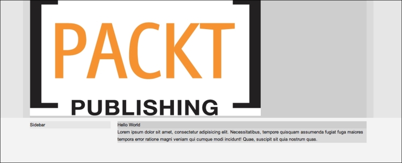
Fret not! Quickly open your gotchas.css file and append the following:
.logo {
    width: 30%;
}
.logo img {
    max-width: 100%;
}
I told you we'd see max-width again!
So what's going on here? We're setting the image's wrapping element to a width of 30 percent of its 980 px wide container and the image itself to fill that wrapping element. In effect, it makes our image constantly conform to be 30 percent of #wrap, even as it shrinks below 980 px.
Can't we just do this?
.logo img {
    width: 30%;
}
Well, yes; it will work as expected, but do you want to have to specify every image you ever use to be a certain size or would you rather just have the image fill it's container by default no matter how big or small? Keep in mind, if you use a small image inside a big container, it will stretch the image and you'll lose resolution—hence, I asked you to find a big image for this exercise. In such instances, feel free to specify the width of the image as auto so that it doesn't stretch.
This strategy is so common it has become a standard in the world of RWD—standardized by the pioneer of RWD itself, Ethan Marcotte. In short, if you're having issues with images not sizing properly, just apply the size you want, to their wrapping element, and then give them a max-width of 100%. It's not uncommon to see the following code in a CSS reset:
img {
    max-width: 100%;
}
Note
Just make sure images are always wrapped in an element with a defined size, and it's large enough to shrink down to fit whatever container it's in.
This is the easiest way, but again, you have to be careful about dumping too many images into your site and burdening the casual mobile user with huge load times. I can typically get by with a couple of images, a logo and a background image, so it's not a huge issue. Just be extremely mindful when you notice you're using more than two to three rather large images on a single page.
This strategy is supposed to work on video as well, but as with most things in CSS, it's never that easy. This brings us to our next gotcha videos. There is huge article written by Thierry Koblentz, on A List Apart, titled Creating Intrinsic Ratios for Video, that covers this topic in depth, but who wants to read all that? Not to mention the finalized code for doing this correctly is immense.
Luckily Chris Coyier (CSS Tricks) and Dave Rupert (Paravel) made a JavaScript plugin that makes this incredibly easy called FitVids. Read about it at https://github.com/davatron5000/FitVids.js.
Go find a YouTube video you like, grab the embed code under the Share link, save a copy of FitVids.js to your project directory, and modify your gotchas.html file shown as follows:
<!DOCTYPE html>
<html>
    <head>
        <title>Gotchas</title>
        <link rel="stylesheet" href="gotchas.css">
    </head>
    <body>

        <div id="wrap">

            <header>
                <figure class="logo"><img src="packtpub.jpg"></figure>
            </header>

            <section>
                <aside>Sidebar</aside>
                <article>
                    <header>
                        <h2>Hello World</h2>
                    </header>
                    <p>
                        Lorem ipsum...
                    </p>

                    <div class="video_wrapper">
                        <iframe width="960" height="720" src="http://www.youtube.com/embed/FR7wOGyAzpw" frameborder="0" allowfullscreen></iframe>
                    </div>

                </article>
            </section>

        </div>

        <script src="http://ajax.googleapis.com/ajax/libs/jquery/1.10.2/jquery.min.js"></script>
        <script src="jquery.fitvids.js"></script>
        <script>
            $('.video_wrapper').fitVids();
        </script>

    </body>
</html>
Note
Notice we're explicitly specifying the HTTP protocol of the URLs to be http, rather than leaving them blank, this way we can test locally.
FitVids.js relies on jQuery, so the steps are:
Place embedded code in a wrapping element; in this case,
.video_wrapperImport jQuery (in this case we're importing from Google's CDN)
Import FitVids
Apply the
fitVids()function to whatever selectors match your video wrapping elements
The last thing we're going to cover in the gotchas section is the viewport meta tag. To put this in the least confusing way possible, a pixel can be various sizes on various devices. By default, and if you've been viewing your responsive sites on your phone this entire time and wondering why they aren't stacking, it's because the browser is interpreting the viewport incorrectly which in practice, turns your responsive site into a desktop site.
It's basically trying to guess as to what you were trying to do, which is fine for unresponsive sites, but for those of us who are working their butts off to make nice, responsive sites, it's a pain in the neck. Luckily, it's an incredibly easy fix. Add the following to the <head> of gotchas.html:
<meta name="viewport" content="width=device-width, initial-scale=1">
Note
Now your device's viewport will interpret pixels literally, which will in-turn activate your media queries.
For more information on the specifics of the viewport meta tag, search for The Idiot's Guide to Viewport and Pixel.
Putting it all together
We're drawing to the end. You've been a good student. Let's have fun actually creating a real, responsive website.
Get your typing fingers ready...
Create a new file called instant.html, fill with the following code:
<!DOCTYPE html>
<html>
    <head>
        <title>INSTANT Responsive Web-Design</title>
        <meta name="viewport" content="width=device-width, initial-scale=1">
        <link rel="stylesheet" href="instant.css">
    </head>
    <body>

        <header class="top">
            <div class="center">

                <figure class="logo"><img src="packtpub.png"></figure>

                <nav>
                    <a href="#">Link</a>
                    <a href="#">Link</a>
                    <a href="#">Link</a>
                    <a href="#">Link</a>
                </nav>

            </div>
        </header>

        <section class="main">
            <div class="center">

                <aside>
                    <nav>
                        <a href="#">Sublink</a>
                        <a href="#">Sublink</a>
                        <a href="#">Sublink</a>
                        <a href="#">Sublink</a>
                        <a href="#">Sublink</a>
                        <a href="#">Sublink</a>
                    </nav>
                </aside>
                <article>
                    <header>
                        <h2>INSTANT Responsive Web-Design</h2>
                    </header>
                    <p>
                        Lorem ipsum...
                    </p>
                    <div class="video_wrapper">
                        <iframe width="960" height="720" src="http://www.youtube.com/embed/FR7wOGyAzpw" frameborder="0" allowfullscreen></iframe>
                    </div>
                </article>

            </div>
        </section>

        <script src="http://ajax.googleapis.com/ajax/libs/jquery/1.10.2/jquery.min.js"></script>
        <script src="jquery.fitvids.js"></script>
        <script>
            $('.video_wrapper').fitVids();
        </script>

    </body>
</html>
Where'd #wrap go?
We've added some classes to our first header element and our section element. We've also replaced the #wrap element with <div class="center">. This way we can set full width backgrounds and still have our background-less content centered all the same.
Create a file called instant.css and insert the following code:
* {
    margin: 0;
    padding: 0;
    font: 13px/21px Arial, sans-serif;
}
html {
    background: #2ecc71;
}
img {
    max-width: 100%;
}
.top {
    background: #34495e;
    overflow: hidden;
}
.logo {
    width: 50%;
    margin: 20px auto;
}
.top nav {
    margin-bottom: 10px;
    overflow: hidden;
}
.top nav a {
    background: #ecf0f1;
    text-align: center;
    text-decoration: none;
    border-radius: 5px;
    padding: 10px 0;
    color: #34495e;
    font-weight: bold;
    margin: 10px auto;
    width: 90%;
    display: block;
}
aside nav a {
    display: block;
    text-decoration: none;
    text-align: center;
    padding: 10px 0;
    background: #ecf0f1;
    color: #075227;
    font-weight: bold;
    border-bottom: 1px solid #ddd;
}
h2 {
    font-size: 30px;
    font-weight: bold;
    margin-bottom: 10px;
    line-height: 1.2;
    text-align: center;
}
p {
    margin-bottom: 20px;
}
article {
    background: #ecf0f1;
    margin: 15px;
    border-radius: 5px;
    padding: 15px;
}

@media (min-width: 600px) {
    aside {
        float: left;
        width: 25%;
    }
    article {
        float: left;
        width: 69%;
        padding: 3%;
    }
    .center {
        max-width: 980px;
        margin: auto;
        padding: 0 20px;
    }
    .logo {
        float: left;
        width: 20%;
        padding: 20px 0;
        margin-right: 10%;
    }
    .top nav {
        float: left;
        width: 70%;
        margin-top: 60px;
    }
    .top nav a {
        float: left;
        width: 23%;
        margin-left: 1%;
        margin-right: 1%;
    }
    .top nav a:first-child {
        width: 24%;
        margin-left: 0;
    }
    .top nav a:last-child {
        width: 24%;
        margin-right: 0;
    }
    aside nav a {
        margin-bottom: 10px;
        border-radius: 5px;
        border-top-right-radius: 0;
        border-bottom-right-radius: 0;
    }
    .main {
        overflow: hidden;
        padding-top: 30px;
    }
    article {
        margin: 0;
        padding: 3%;
        border-radius: 0;
        border-top-right-radius: 5px;
        border-bottom-right-radius: 5px;
        border-bottom-left-radius: 5px;
    }
    h2 {
        text-align: left;
    }
}
Note
Yikes, that's a lot of code.
Remember, things that will stay the same (background colors, fonts, and so on) should go outside of the media query in this Mobile-first approach. The only things that go inside of the media query have to do with the layout, and desktop-specific styling (rounded corners, and so on).
The process of doing this goes something like:
Create mobile version that looks nice
Add a
min-widthmedia queryAdd desktop-specific styling in that media query
Tweak, tweak, tweak

Desktop view of our mobile-first site

Mobile view of the site
Nice! Kudos! You're a responsive guru now! Well, not entirely, but after you build a couple of sites with these practices in mind, you'll be well on your way.
If you start feeling like you're repeating styles, especially in regards to your layouts, buttons, forms, and so on, you should definitely check out the insanely vast plethora of responsive CSS frameworks out there including Bootstrap, Foundation, and Inuit.
Still not enough for your hungry mind? Learn about the CSS preprocessors: LESS, SASS/SCSS, and Stylus. There are some really clever tools out there that will do things like generate responsive grids and buttons for you on the fly. Some notable ones are Bourbon Neat (great spacing between nested columns), Singularity.gs (insane), and even one written by yours truly called Jeet (http://jeetframework.com), which will let you specify column widths with any fraction. It's also packed with all the bells and whistles needed to make converting an idea into a responsive website a cakewalk.
Frameworks and preprocessors can be a bit tricky to get comfortable with, but don't give up hope, the payoffs are huge. I can literally recreate the same instant.html file in about five minutes from scratch using a framework and preprocessor.


