Building your first analysis under 60 seconds
With QuickSight, it is really easy to build your analysis with minimal effort. Let's do a test drive of QuickSight and build our first analysis using data from the US Department of Education that provides information about college tuition across all the states in the USA.
Downloading data
The dataset is available from the following public URL: https://catalog.data.gov/dataset/college-scorecard. Click on the Download icon as shown in the following screenshot to download raw data:

Figure 1.5: College scores raw data
Preparing data
The dataset has several files, one per each calendar year; for this demo, we will use the file MERGED2013_PP.csv. To simplify the analysis, I have selected a subset of the columns, changed all NULL to blank, changed PrivacySuppressed to blank, and uploaded this file to the following GitHub location: https://github.com/rnadipalli/quicksight/blob/master/sampledata/MERGED2013_PP.csv.
QuickSight navigation
Once you have registered and started QuickSight you will see the home page. Let's review the key navigation icons that you need to get used to, as shown in the next screenshot:
- The QuickSight icon in the top-left is a quick way to get back to the home page
- To upload new data, click on Manage data in the top-right
- To create a new analysis, click on New analysis on the left-hand side below the QuickSight logo
- To manage your account settings, click on the person icon in the top-right corner

Figure 1.6: QuickSight navigation
Loading data to QuickSight
Let's explore the steps to load our data to QuickSight:
- From the QuickSight home page, click on Manage data icon.
- Next, click on the New data set icon and you will see Create a Data Set page with several options, as shown in the following screenshot. Select the Upload a file option and upload the
MERGED2013_PP.csvfile from your local desktop to AWS QuickSight:
Figure 1.7: Uploading a CSV file
- After you have successfully uploaded the
MERGED2013_PP.csvfile, you will see a confirmation screen from QuickSight, as shown in the following screenshot. Click on the Next button to accept the defaults:
Figure 1.8: Confirm upload file settings
- After the confirmation page, QuickSight imports the data to SPICE and provides quick access to visualization of the data, as shown in the following screenshot. Click on the Visualize button and then proceed to the next section:

Figure 1.9: Data source details
Starting your visualizations
Now you are ready to start visualizing data using the built-in charts in QuickSight. Let's see how to create our first useful chart, which is also demonstrated in the next screenshot. Follow the steps to create a chart showing the average tuition fees by state:
- First select the horizontal bar chart from the Visual types.
- Next select the STABBR as the Y axis and TUITFTE as the Value field.
- Next in the Field wells option, change the Aggregate type of the value from the default Sum to Average.
The visualization is complete, as shown in the following screenshot, and now you can explore the chart and get more insights from the data:

Figure 1.10: Bar chart
Building multiple visualizations
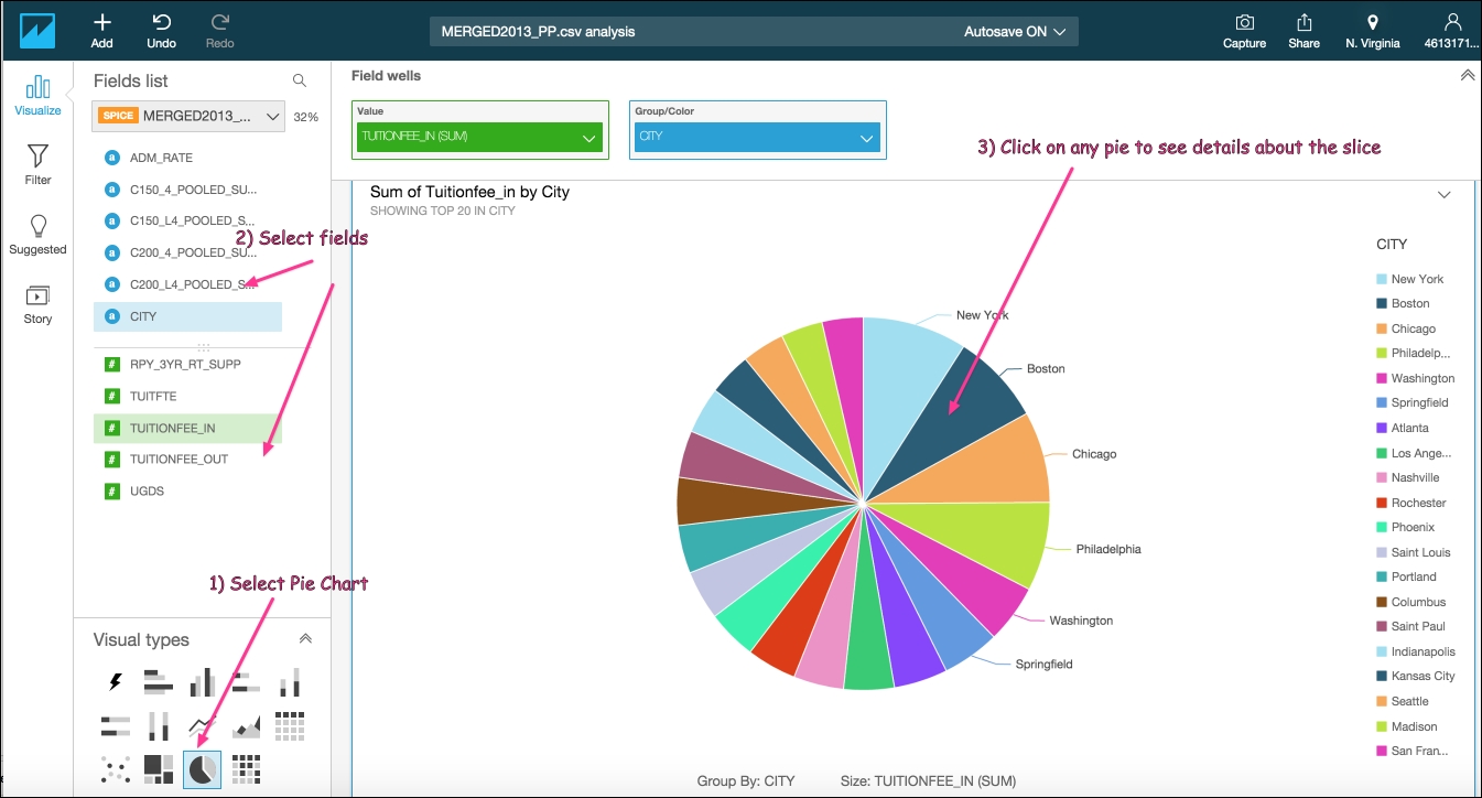
QuickSight additionally supports line graphs, area line charts, scatter plots, heat maps, pie graphs, tree maps, and pivot tables. You can next add another visual for the same dataset pretty easily and get further understanding of the data. In the following steps, we will see how to build a pie chart that shows the sum of in-state tuition by city:
- Click on the + to add a new visual.
- Select the pie chart from the Visual types.
- Next select the CITY as the Group/Color and TUTIONFEE_IN as the Value field.
- Notice the default aggregation for value is automatically set to Sum.
The visualization is complete, as shown in the following screenshot, and now you can explore the chart and get more insights from the data:

Figure 1.11: Pie chart


