Make It Easy for Users to Pay You
The routes by which products are paid for are many and varied, but—even if you’re not selling tangible items—there is often the need for a product to ask a user to upgrade and enter some payment details.
Time and again, these interactions fall short of top-quality user experience. Be they complex credit card forms, asking for too much information on lengthy order forms, or unclear pricing plan details, they represent a massive missed opportunity.
To some extent, this is a solved problem in mobile apps—both iOS and Android include extensive support for in-app purchases and subscriptions, allowing designers to use native input systems rather than clunky custom ones. The user likely has their payment details saved and it’s often a one-tap action to make a purchase.
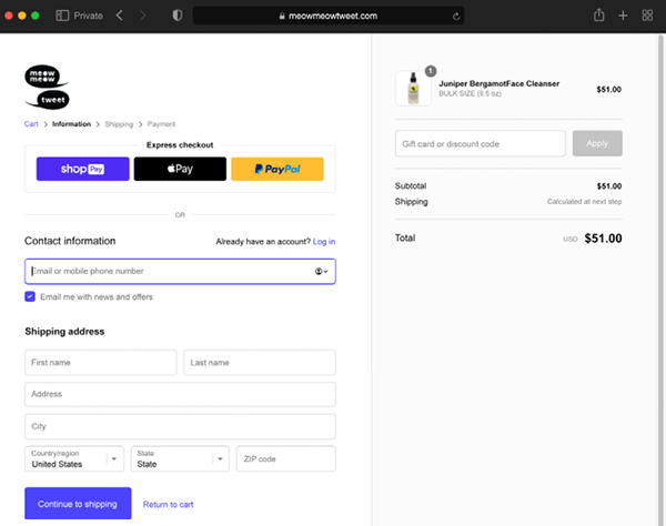
Figure 85.1: The Shopify checkout experience is well-tested and almost perfect
Out on the web, however, it’s a different story...


