Search icon CANCEL
Subscription
0
Cart icon
Your Cart (0 item)
Close icon
You have no products in your basket yet
Save more on your purchases! discount-offer-chevron-icon
Savings automatically calculated. No voucher code required.
Arrow left icon
Explore Products
Best Sellers
New Releases
Books
Videos
Audiobooks
Learning Hub
Newsletter Hub
Free Learning
Arrow right icon
Arrow up icon
GO TO TOP
WordPress Mobile Web Development: Beginner's Guide

You're reading from   WordPress Mobile Web Development: Beginner's Guide Make your WordPress website mobile-friendly and get to grips with the two hottest trends in web design—Mobile and WordPress with this book and ebook.

Arrow left icon
Product type Paperback
Published in Aug 2012
Publisher Packt
ISBN-13 9781849515726
Length 332 pages
Edition 1st Edition
Languages
Concepts
Arrow right icon
Author (1):
Arrow left icon
RACHEL MCCOLLIN RACHEL MCCOLLIN
Author Profile Icon RACHEL MCCOLLIN
RACHEL MCCOLLIN
Arrow right icon
View More author details
Toc

Table of Contents (18) Chapters Close

WordPress Mobile Web Development Beginner's Guide
Credits
About the Author
About the Reviewers
Acknowledgement
1. www.PacktPub.com
2. Preface
1. Using Plugins to Make Your Site Mobile-friendly FREE CHAPTER 2. Using Responsive Themes 3. Setting up Media Queries 4. Adjusting the Layout 5. Working with Text and Navigation 6. Optimizing Images and Video 7. Sending Different Content to Different Devices 8. Creating a Web App Interface 9. Adding Web App Functionality 10. Testing and Updating your Mobile Site Pop quiz—Answers

Time for action—making our images responsive


This is a fix that applies to all screen widths, so it doesn't go inside the media queries.

Instead, in the main body of the stylesheet (in the Carborelli's stylesheet, I'm working on the section for universal elements), we will add the following code snippet:

/*image resizing for responsive layout*/
img{
max-width: 100%;
height: auto;
}

That's it!

What just happened?

We did the following:

  • We added some CSS to ensure that each image on the page would not be displayed as more than the width of its containing element. In other words, its maximum displayed width, or max-width, is 100%.

  • We also added height: auto, which ensures that the correct aspect ratio is displayed for our images on Internet Explorer 8.

Now let's check the page again, as shown in the following screenshot:
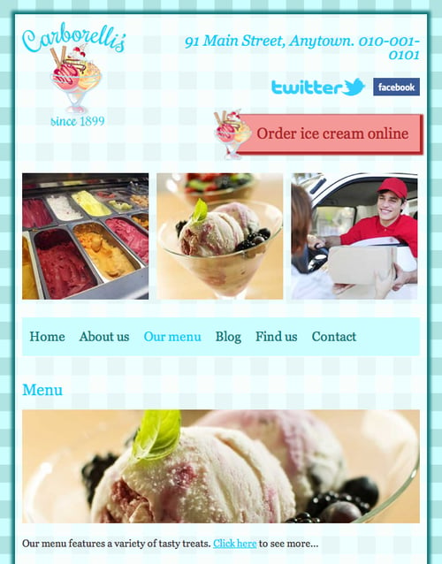
There you go. That's sorted and it was only a few short lines of code. Now, let's turn our attention to the images that don't span the full width of their containing element.

Resizing...

lock icon The rest of the chapter is locked
Register for a free Packt account to unlock a world of extra content!
A free Packt account unlocks extra newsletters, articles, discounted offers, and much more. Start advancing your knowledge today.
Unlock this book and the full library FREE for 7 days
Get unlimited access to 7000+ expert-authored eBooks and videos courses covering every tech area you can think of
Renews at $19.99/month. Cancel anytime
Banner background image