Chapter 1: An Introduction to Machine Learning
Activity 1: Finding the Distribution of Diabetic Patients in the PimaIndiansDiabetes Dataset
Solution:
- Load the dataset.
PimaIndiansDiabetes<-read.csv("PimaIndiansDiabetes.csv")
- Create a variable PimaIndiansDiabetesData for further use.
#Assign it to a local variable for further use
PimaIndiansDiabetesData<- PimaIndiansDiabetes
- Use the head() function to view the first five rows of the dataset.
#Display the first five rows
head(PimaIndiansDiabetesData)
The output is as follows:
pregnant glucose pressure triceps insulin mass pedigree age diabetes
1 6 148 72 35 0 33.6 0.627 50 pos
2 1 85 66 29 0 26.6 0.351 31 neg
3 8 183 64 0 0 23.3 0.672 32 pos
4 1 89 66 23 94 28.1 0.167 21 neg
5 0 137 40 35 168 43.1 2.288 33 pos
6 5 116 74 0 0 25.6 0.201 30 neg
From the preceding data, identify the input features and find the column that is the predictor variable. The output variable is diabetes.
- Display the different categories of the output variable:
levels(PimaIndiansDiabetesData$diabetes)
The output is as follows:
[1] "neg" "pos"
- Load the required library for plotting graphs.
library(ggplot2)
- Create a bar plot to view the output variables.
barplot <- ggplot(data= PimaIndiansDiabetesData, aes(x=age))
barplot + geom_histogram(binwidth=0.2, color="black", aes(fill=diabetes)) + ggtitle("Bar plot of Age")
The output is as follows:
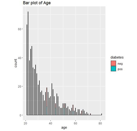
Figure 1.36: Bar plot output for diabetes
We can conclude that we have the most data for the age group of 20-30. Graphical representation thus allows us to understand the data.
Activity 2: Grouping the PimaIndiansDiabetes Data
Solution :
- View the structure of the PimaIndiansDiabetes dataset.
#View the structure of the data
str(PimaIndiansDiabetesData)
The output is as follows:
'data.frame':768 obs. of 9 variables:
$ pregnant: num 6 1 8 1 0 5 3 10 2 8 ...
$ glucose : num 148 85 183 89 137 116 78 115 197 125 ...
$ pressure: num 72 66 64 66 40 74 50 0 70 96 ...
$ triceps : num 35 29 0 23 35 0 32 0 45 0 ...
$ insulin : num 0 0 0 94 168 0 88 0 543 0 ...
$ mass : num 33.6 26.6 23.3 28.1 43.1 25.6 31 35.3 30.5 0 ...
$ pedigree: num 0.627 0.351 0.672 0.167 2.288 ...
$ age : num 50 31 32 21 33 30 26 29 53 54 ...
$ diabetes: Factor w/ 2 levels "neg","pos": 2 1 2 1 2 1 2 1 2 2 ...
- View the summary of the PimaIndiansDiabetes dataset.
#View the Summary of the data
summary(PimaIndiansDiabetesData)
The output is as follows:

Figure 1.37: Summary of PimaIndiansDiabetes data
- View the statistics of the columns of PimaIndiansDiabetes dataset grouped by the diabetes column.
#Perform Group by and view statistics for the columns
#Install the package
install.packages("psych")
library(psych) #Load package psych to use function describeBy
Use describeby with pregnancy and diabetes columns.
describeBy(PimaIndiansDiabetesData$pregnant, PimaIndiansDiabetesData$diabetes)
The output is as follows:
Descriptive statistics by group
group: neg
vars n mean sd median trimmed mad min max range skew kurtosis se
X1 1 500 3.3 3.02 2 2.88 2.97 0 13 13 1.11 0.65 0.13
----------------------------------------------------------------------------------------------
group: pos
vars n mean sd median trimmed mad min max range skew kurtosis se
X1 1 268 4.87 3.74 4 4.6 4.45 0 17 17 0.5 -0.47 0.23
We can view the mean, median, min, and max of the number of times pregnant attribute in the group of people who have diabetes (pos) and who do not have diabetes (neg).
- Use describeby with pressure and diabetes.
describeBy(PimaIndiansDiabetesData$pressure, PimaIndiansDiabetesData$diabetes)
The output is as follows:
Descriptive statistics by group
group: neg
vars n mean sd median trimmed mad min max range skew kurtosis se
X1 1 500 68.18 18.06 70 69.97 11.86 0 122 122 -1.8 5.58 0.81
----------------------------------------------------------------------------------------------
group: pos
vars n mean sd median trimmed mad min max range skew kurtosis se
X1 1 268 70.82 21.49 74 73.99 11.86 0 114 114 -1.92 4.53 1.31
We can view the mean, median, min, and max of the pressure in the group of people who have diabetes (pos) and who do not have diabetes (neg).
We have learned how to view the structure of any dataset and print the statistics about the range of every column using summary().
Activity 3: Performing EDA on the PimaIndiansDiabetes Dataset
Solution:
- Load the PimaIndiansDaibetes dataset.
PimaIndiansDiabetes<-read.csv("PimaIndiansDiabetes.csv")
- View the correlation among the features of the PimaIndiansDiabetes dataset.
#Calculate correlations
correlation <- cor(PimaIndiansDiabetesData[,1:4])
- Round it to the second nearest digit.
#Round the values to the nearest 2 digit
round(correlation,2)
The output is as follows:
pregnant glucose pressure triceps
pregnant 1.00 0.13 0.14 -0.08
glucose 0.13 1.00 0.15 0.06
pressure 0.14 0.15 1.00 0.21
triceps -0.08 0.06 0.21 1.00
- Pair them on a plot.
#Plot the pairs on a plot
pairs(PimaIndiansDiabetesData[,1:4])
The output is as follows:

Figure 1.38: A pair plot for the diabetes data
- Create a box plot to view the data distribution for the pregnant column and color by diabetes.
# Load library
library(ggplot2)
boxplot <- ggplot(data=PimaIndiansDiabetesData, aes(x=diabetes, y=pregnant))
boxplot + geom_boxplot(aes(fill=diabetes)) +
ylab("Pregnant") + ggtitle("Diabetes Data Boxplot") +
stat_summary(fun.y=mean, geom="point", shape=5, size=4)
The output is as follows:
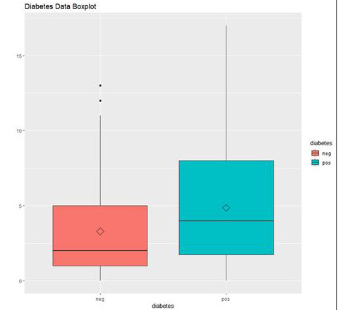
Figure 1.39: The box plot output using ggplot
In the preceding graph, we can see the distribution of "number of times pregnant" in people who do not have diabetes (neg) and in people who have diabetes (pos).
Activity 4: Building Linear Models for the GermanCredit Dataset
Solution:
These are the steps that will help you solve the activity:
- Load the data.
GermanCredit <-read.csv("GermanCredit.csv")
- Subset the data.
GermanCredit_Subset=GermanCredit[,1:10]
- Fit a linear model using lm().
# fit model
fit <- lm(Duration~., GermanCredit_Subset)
- Summarize the results using the summary() function.
# summarize the fit
summary(fit)
The output is as follows:
Call:
lm(formula = Duration ~ ., data = GermanCredit_Subset)
Residuals:
Min 1Q Median 3Q Max
-44.722 -5.524 -1.187 4.431 44.287
Coefficients:
Estimate Std. Error t value Pr(>|t|)
(Intercept) 2.0325685 2.3612128 0.861 0.38955
Amount 0.0029344 0.0001093 26.845 < 2e-16 ***
InstallmentRatePercentage 2.7171134 0.2640590 10.290 < 2e-16 ***
ResidenceDuration 0.2068781 0.2625670 0.788 0.43094
Age -0.0689299 0.0260365 -2.647 0.00824 **
NumberExistingCredits -0.3810765 0.4903225 -0.777 0.43723
NumberPeopleMaintenance -0.0999072 0.7815578 -0.128 0.89831
Telephone 0.6354927 0.6035906 1.053 0.29266
ForeignWorker 4.9141998 1.4969592 3.283 0.00106 **
ClassGood -2.0068114 0.6260298 -3.206 0.00139 **
---
Signif. codes: 0 '***' 0.001 '**' 0.01 '*' 0.05 '.' 0.1 ' ' 1
Residual standard error: 8.784 on 990 degrees of freedom
Multiple R-squared: 0.4742, Adjusted R-squared: 0.4694
F-statistic: 99.2 on 9 and 990 DF, p-value: < 2.2e-16
- Use predict() to make the predictions.
# make predictions
predictions <- predict(fit, GermanCredit_Subset)
- Calculate the RMSE for the predictions.
# summarize accuracy
rmse <- sqrt(mean((GermanCredit_Subset$Duration - predictions)^2))
print(rmse)
The output is as follows:
[1] 76.3849
In this activity, we have learned to build a linear model, make predictions on new data, and evaluate performance using RMSE.
Activity 5: Using Multiple Variables for a Regression Model for the Boston Housing Dataset
Solution:
These are the steps that will help you solve the activity:
- Load the dataset.
BostonHousing <-read.csv("BostonHousing.csv")
- Build a regression model using multiple variables.
#Build multi variable regression
regression <- lm(medv~crim + indus+rad , data = BostonHousing)
- View the summary of the built regression model.
#View the summary
summary(regression)
The output is as follows:
Call:
lm(formula = medv ~ crim + indus + rad, data = BostonHousing)
Residuals:
Min 1Q Median 3Q Max
-12.047 -4.860 -1.736 3.081 32.596
Coefficients:
Estimate Std. Error t value Pr(>|t|)
(Intercept) 29.27515 0.68220 42.913 < 2e-16 ***
crim -0.23952 0.05205 -4.602 5.31e-06 ***
indus -0.51671 0.06336 -8.155 2.81e-15 ***
rad -0.01281 0.05845 -0.219 0.827
---
Signif. codes: 0 '***' 0.001 '**' 0.01 '*' 0.05 '.' 0.1 ' ' 1
Residual standard error: 7.838 on 502 degrees of freedom
Multiple R-squared: 0.2781, Adjusted R-squared: 0.2737
F-statistic: 64.45 on 3 and 502 DF, p-value: < 2.2e-16
- Plot the regression model using the plot() function.
#Plot the fit
plot(regression)
The output is as follows:
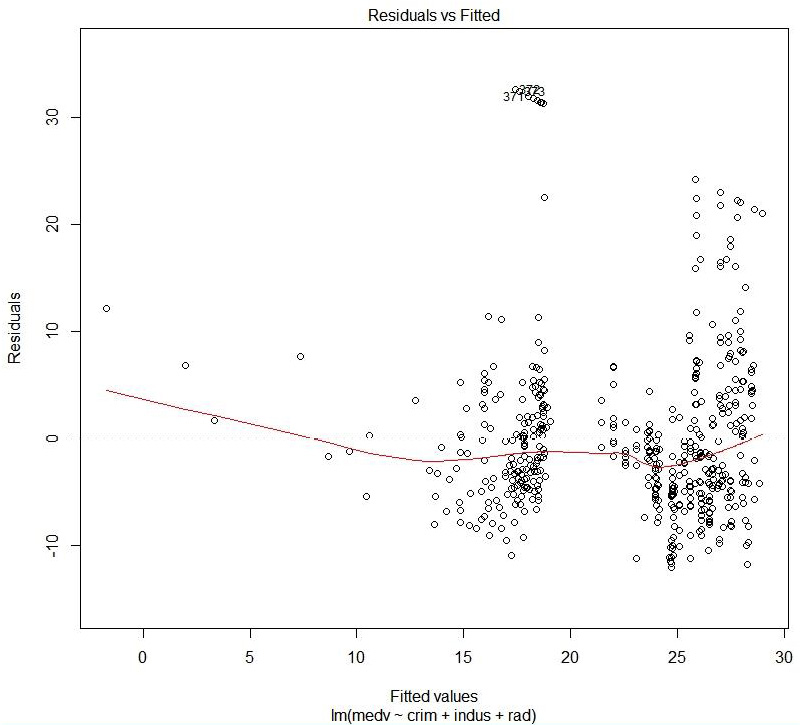
Figure 1.40: Residual versus fitted values
The preceding plot compares the predicted values and the residual values.
Hit <Return> to see the next plot:
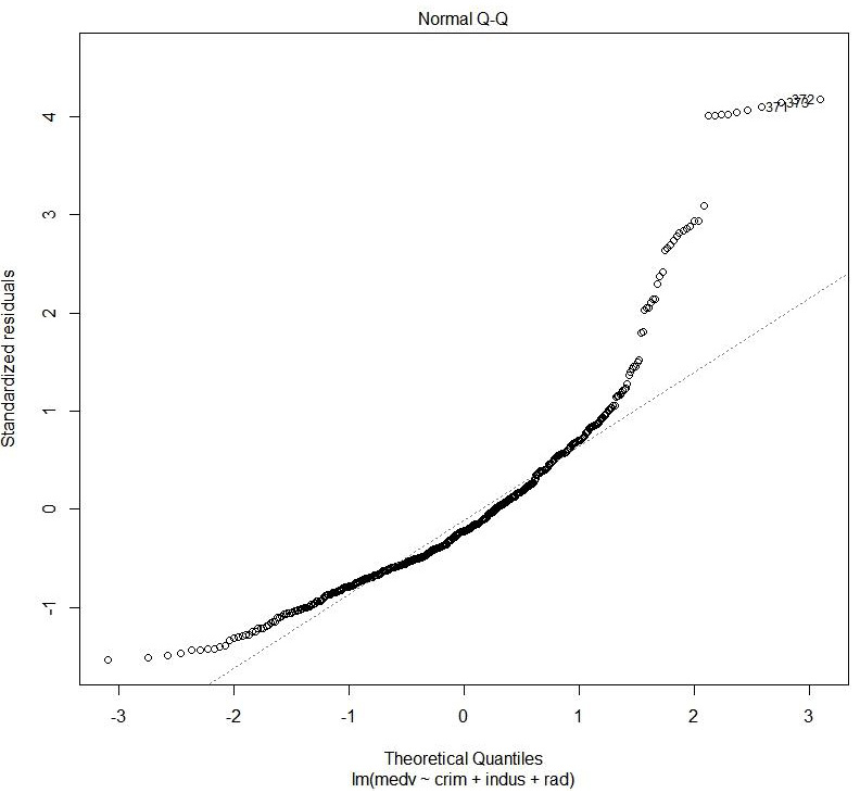
Figure 1.41: Normal QQ
The preceding plot shows the distribution of error. It is a normal probability plot. A normal distribution of error will display a straight line.
Hit <Return> to see the next plot:
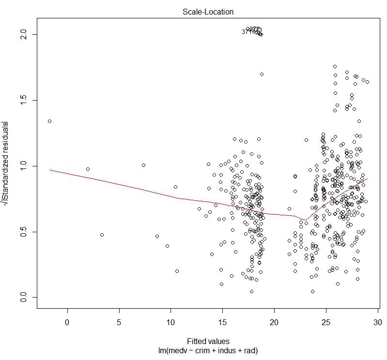
Figure 1.42: Scale location plot
The preceding plot compares the spread and the predicted values. We can see how the spread is with respect to the predicted values.
Hit <Return> to see the next plot:
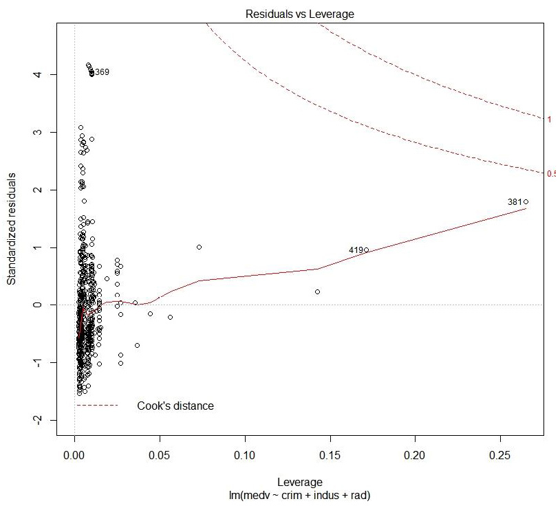
Figure 1.43: Cook's distance plot
This plot helps to identify which data points are influential to the regression model, that is, which of our model results would be affected if we included or excluded them.
We have now explored the datasets with one or more variables.