Adjusting character formatting
Once you have some text on the page, it is important to know how to format it. In this recipe, you will learn how to change the font face, adjust the font size, and alter the spacing between lines (known as leading), as well as change the spacing between characters (known as kerning and tracking).
We will also learn a few hidden tricks in InDesign when it comes to changing numbers, some of which work in other Creative Cloud tools.
Getting ready
In order to complete this recipe, simply open InDesign on your system and create a new document with 12 pages, as shown in the Creating a new document recipe in Chapter 1. You will also need to add a text frame containing some placeholder text, as shown in the Creating text frames and adding placeholder text recipe.
How to do it…
In order to format your text using a variety of character formatting options, follow these steps:
- Using the Type tool, click and drag to select some text within your text frame. With this text selected, look at the Control panel, shown as item A in Figure 2.8. If you don’t see the Control panel at all, you can open it by clicking Control in the Window menu:
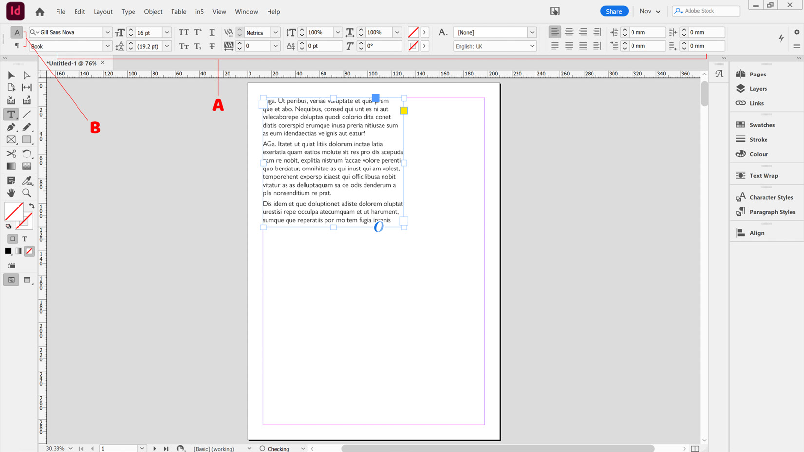
Figure 2.8: The InDesign interface showing the Control panel
The InDesign Control panel has two views, Character and Paragraph, and you can toggle between these using either of the two small icons marked as B in Figure 2.8. Switch to Character view now so that the top icon is highlighted, as seen in Figure 2.8.
- Next, we will click the arrow next to the current font family marked as A in Figure 2.9. This will bring up the font options, where you can choose an alternative font family from a scrollable list. Depending on the font files installed, you may be able to expand the font family using the small arrow next to the font family name (marked as B in Figure 2.9). This will allow you to access variations of some fonts, such as Regular, Bold, or Italic. Select the font you wish to use now:
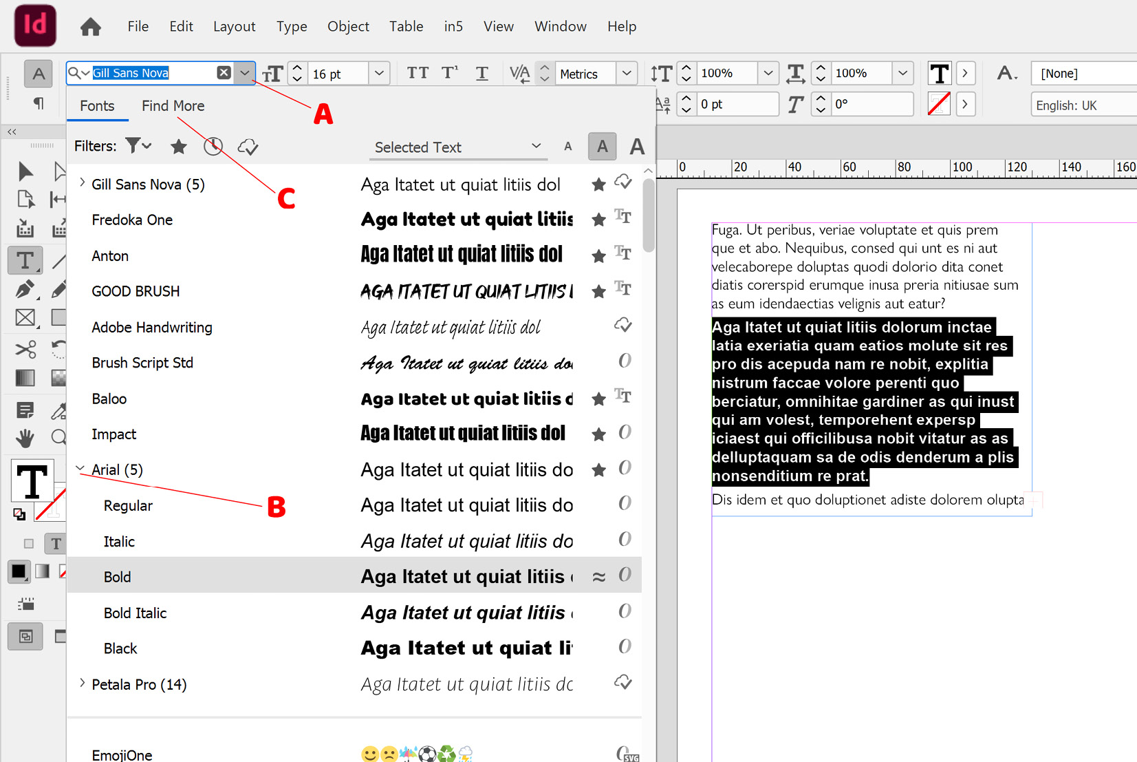
Figure 2.9: The font selection dropdown in InDesign
- If you can’t see the name of the font you want, you can always search for it in the Adobe Fonts library. This is a library of over 2,500 font families, which you can access as part of your InDesign subscription. To do this, click the Find More tab (marked as C in Figure 2.9) and you will see a list of Adobe fonts. To use one of these, click the cloud icon to the right of the font name, marked as A in Figure 2.10. When you click back on the Fonts tab, the font you activated should show up (occasionally, it can take a few seconds to synchronize):
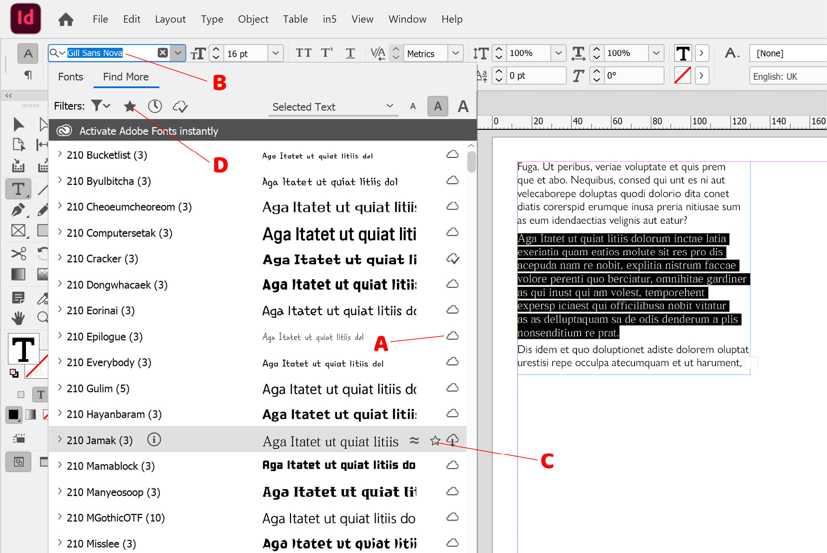
Figure 2.10: Find More fonts dialog
- You can also search for a font by name; simply start typing the name in the search bar (marked as B in Figure 2.10), and all fonts with that text in the name will be listed.
Note
If you want to add your own font files to InDesign, you can copy the files into the Fonts folder in the InDesign installation directory, and they will show up when you restart InDesign.
- If you work with a limited number of fonts (for example, to comply with brand guidelines), you might prefer to only see those fonts when opening the font selection dropdown. To do this, you can mark fonts as favorites by clicking the star icon, which shows up to the right of the font name when you hover over a font (marked as C in Figure 2.10), and then filtering to only show these favorites by clicking the Filter by favorites icon (marked as D in Figure 2.10).
- Having now chosen the font you want to work with, we can change the font size. This can be done by clicking the dropdown for font size (marked as A in Figure 2.11), which is positioned to the right of the font family dropdown. You can choose from the preset sizes or just type a number straight into the font size box itself. My personal favorite method is clicking the font size box and then using the up and down keys on the keyboard to adjust the size 1 pt at a time. If you hold down the Shift key while using the arrows, it changes the size in 10-pt increments instead:
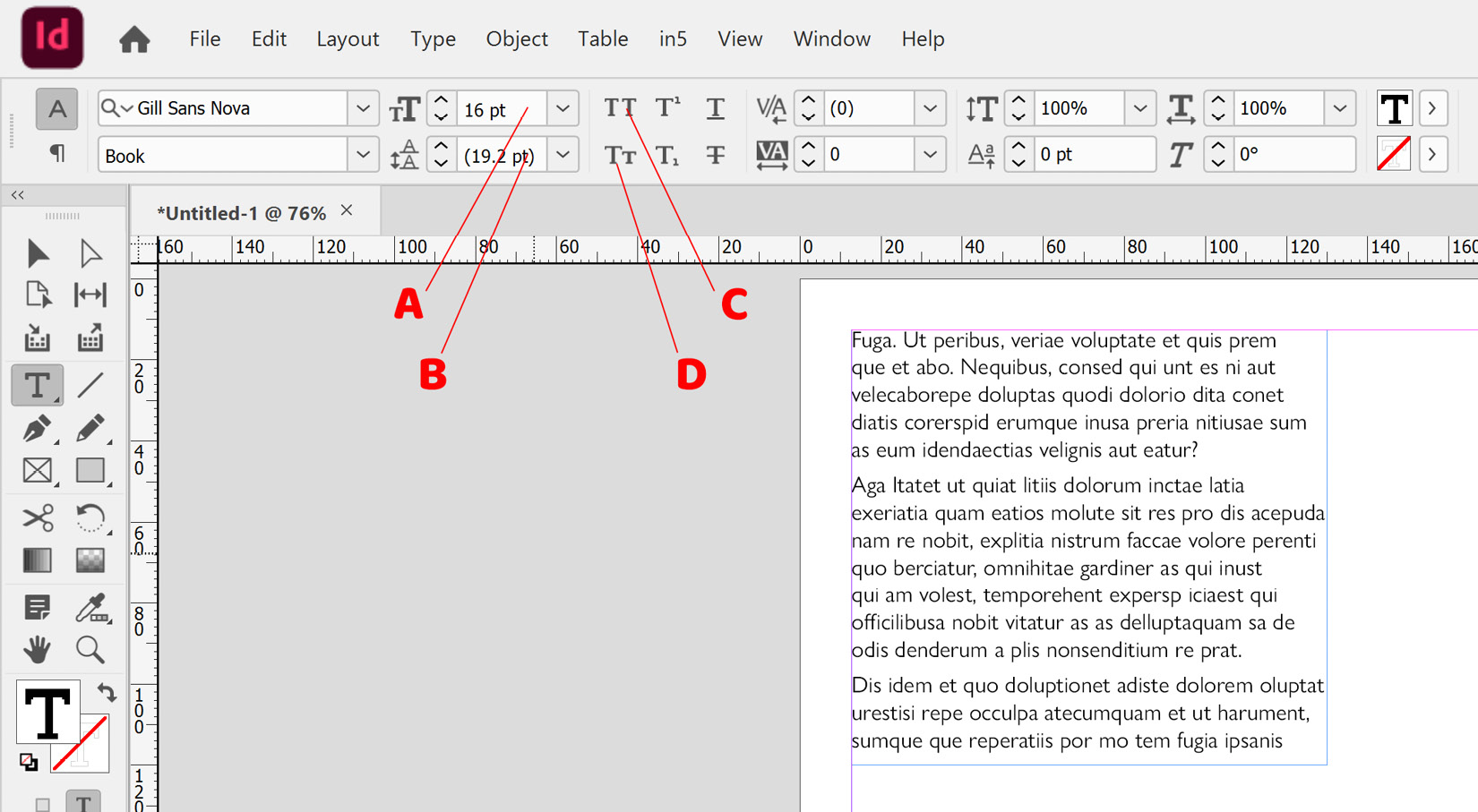
Figure 2.11: Character settings on the InDesign Control panel
Tip
When you are working in number boxes in Adobe tools, such as the font size box, many of them let you do sums. For example, typing 2 + 3 and hitting Return will set the size to 5 pt. You can use the +, -, *, and / characters for doing plus, minus, multiply, and divide calculations.
- The next setting we want to adjust is the Leading setting, marked as B in Figure 2.11. Leading is the space between the lines in paragraphs; by default, it is set to Auto, which means as the font size changes, so does the leading. When set to Auto, the leading is always set to 120% of the font size, and this will be a good setting for most of your text. However, in this instance, we want to space the lines out further though, without changing the font size. To do this, just increase the leading value either by selecting a new value from the dropdown or by using any of the other methods for changing numbers that are shown in step 6.
- Having chosen a font face and adjusted the size and leading, we now want to turn the text into capitals. You have two Caps options available in the Control panel:
- The first is the All Caps button marked as C in Figure 2.11; this will turn all the selected letters into uppercase letters.
- The second option is the Small Caps button marked as D in Figure 2.11.
In this instance, we are going to apply the All Caps method to the first three words (marked as A in Figure 2.12) by selecting them and clicking the Small Caps button, then on a new line apply small caps to some text (marked as B in Figure 2.12), again by selecting it and hitting the Small Caps button. Your content should now look something like that shown in Figure 2.12:
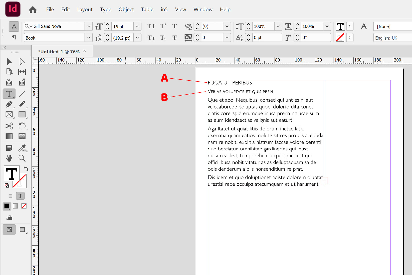
Figure 2.12: Text frame with the first line in all caps, then the second line in small caps
If small caps are available within the font face, InDesign will use these, but if not, InDesign will simulate small caps. You can control what scale InDesign uses for simulating small caps in the Preferences panel (Ctrl + K (PC)/Cmd + K (Mac)), under Advanced Type, marked as A in Figure 2.13:
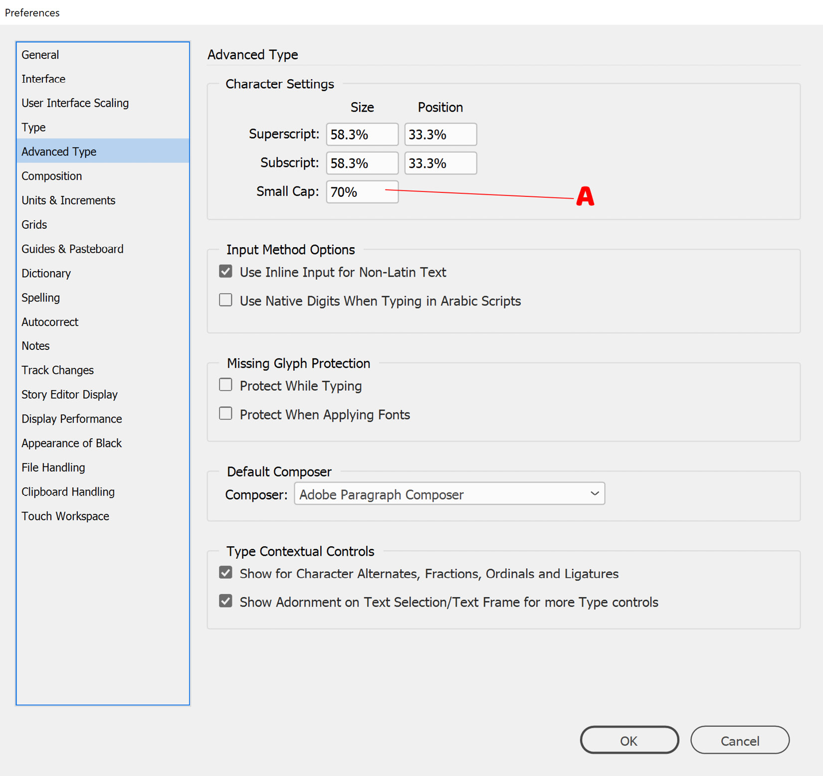
Figure 2.13: Advanced Type preferences in InDesign
- Having set the first three lines to All Caps, we now want to adjust the spacing between the second and third letters on that line. To do this, we will use the Kerning property, which is used to adjust the spacing between two individual characters. Click to place the cursor in between the second and third letters of the first line, then click into the Kerning box, marked as A in Figure 2.14. Use the up and down arrows on the keyboard to increase or decrease the kerning. In our case, we will set the value to 20.
As with the other number boxes, you can use the Shift key to move in larger increments, type numbers directly into the box, or select a value from the dropdown.
Note
In the Kerning and Tracking dropdown, you will see options for Metric and Optical, which are automatic kerning options, based on either the font design (metric) or the character shapes (optical). We are using manual kerning (and tracking) here, which is based on a percentage of the current font size being used.
- Moving on to the second line, we are now going to set the spacing between the characters for the whole of the second line using Tracking. Select the whole line and click into the Tracking box, marked as B in Figure 2.14. Again, use the arrows to adjust the spacing until the second line is extended to the width of the frame, as shown by C in Figure 2.14:
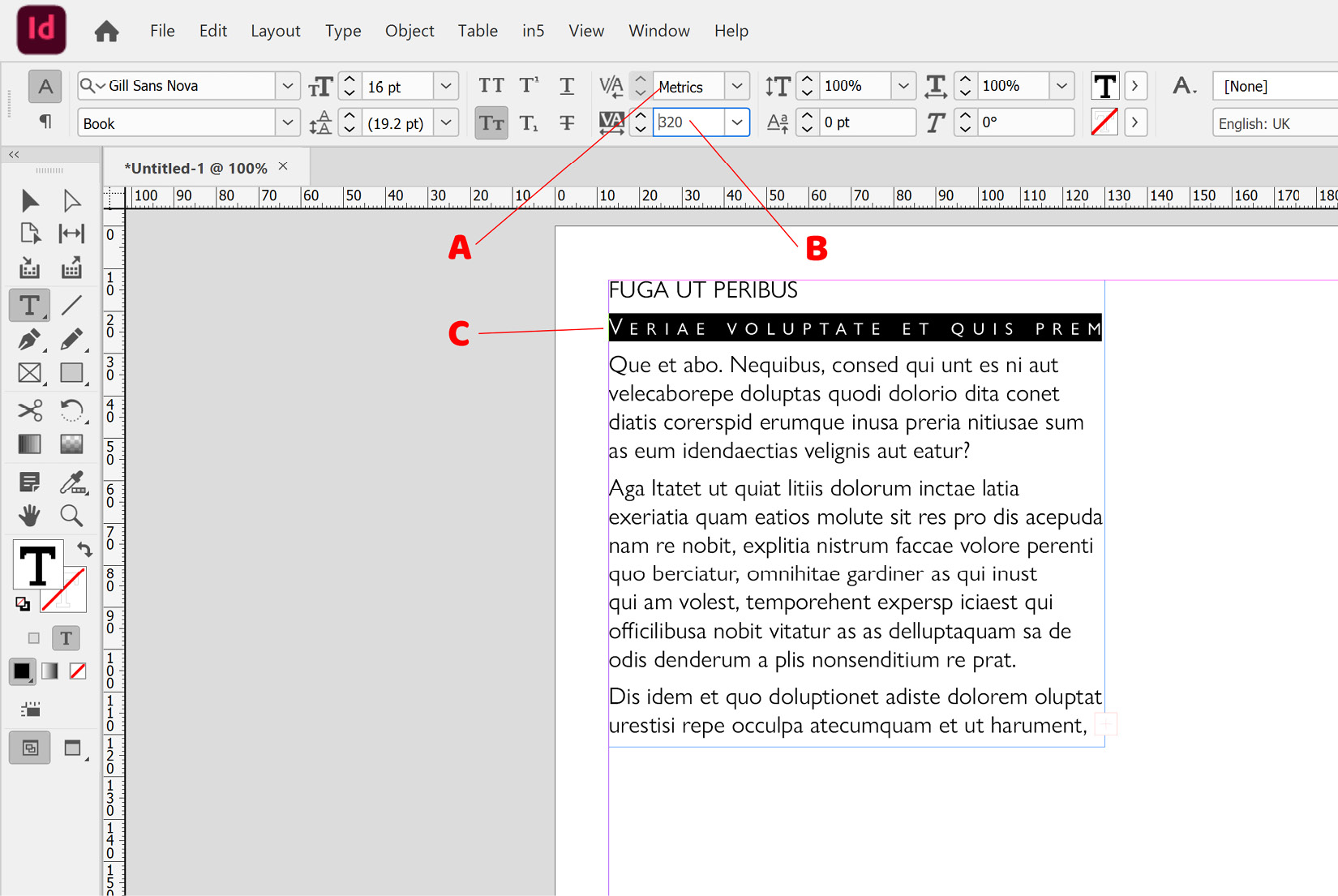
Figure 2.14: Controlling kerning and tracking in InDesign


