Search icon CANCEL
Subscription
0
Cart icon
Your Cart (0 item)
Close icon
You have no products in your basket yet
Save more on your purchases now! discount-offer-chevron-icon
Savings automatically calculated. No voucher code required.
Arrow left icon
Explore Products
Best Sellers
New Releases
Books
Videos
Audiobooks
Learning Hub
Conferences
Free Learning
Arrow right icon
Arrow up icon
GO TO TOP
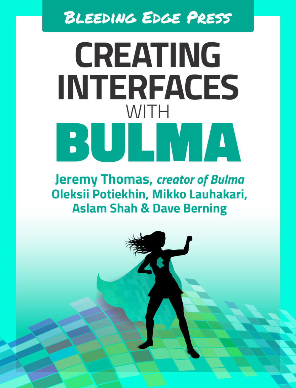
Creating Interfaces with Bulma

You're reading from   Creating Interfaces with Bulma Create impressive web interfaces with this open-source Flexbox-based CSS framework

Arrow left icon
Product type Paperback
Published in Nov 2019
Publisher
ISBN-13 9781800209374
Length 194 pages
Edition 1st Edition
Languages
Tools
Concepts
Arrow right icon
Authors (6):
Arrow left icon
Oleksii Potiekhin Oleksii Potiekhin
Author Profile Icon Oleksii Potiekhin
Oleksii Potiekhin
Dave Berning Dave Berning
Author Profile Icon Dave Berning
Dave Berning
Backstop Media LLC Backstop Media LLC
Author Profile Icon Backstop Media LLC
Backstop Media LLC
Mikko Lauhakari Mikko Lauhakari
Author Profile Icon Mikko Lauhakari
Mikko Lauhakari
Jeremy Thomas Jeremy Thomas
Author Profile Icon Jeremy Thomas
Jeremy Thomas
Aslam Shah Aslam Shah
Author Profile Icon Aslam Shah
Aslam Shah
+2 more Show less
Arrow right icon
View More author details
Toc

Table of Contents (15) Chapters Close

Preface
1. Introduction 2. Understanding Bulma, terminology, and concepts FREE CHAPTER 3. Creating and controlling forms with Bulma 4. Creating navigations and vertical menus 5. Creating responsive grids with common components 6. Creating breadcrumbs and file upload fields 7. Creating tables and selecting dropdowns 8. Creating more tables and selecting dropdowns 9. Creating notifications and cards 10. Using Bulma with Vanilla JavaScript 11. Using Bulma with Angular 12. Using Bulma with VueJS 13. Using Bulma with React 14. Customizing Bulma

Centered layout

Before implementing the login box, be sure to first set up the layout. You want the box to be both horizontally and vertically centered:

  • container: Makes sure that the box will have a maximum width, and won’t reach the edges of the page on wider viewports.
  • columns: Is a wrapper for the single column.
  • column: Will be horizontally centered.
  • box: With its white background and shadow allows its content to be readable on this turquoise webpage.
<section class="hero is-primary is-fullheight">
  <div class="hero-body">
    <div class="container">
      <div class="columns is-centered">
        <div class="column">
          <form class="box">
            Login
          </form>
        </div>
      </div>
    </div>
  </div>
</section>

Even though you are using is-centered, the content doesn’t look centered. It’s because...

lock icon The rest of the chapter is locked
Register for a free Packt account to unlock a world of extra content!
A free Packt account unlocks extra newsletters, articles, discounted offers, and much more. Start advancing your knowledge today.
Unlock this book and the full library FREE for 7 days
Get unlimited access to 7000+ expert-authored eBooks and videos courses covering every tech area you can think of
Renews at $19.99/month. Cancel anytime