Pie chart
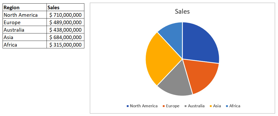
A pie chart is a chart used to show the relative (often percentage-wise) breakdown of a measure by related categories. An example is a pie chart of sales broken down by contributing regions, as shown in the following screenshot:

Figure 8.22 – Pie chart of sales by region
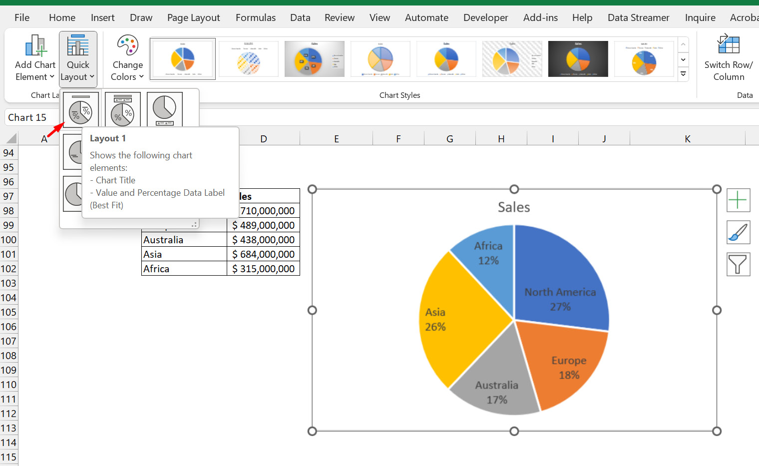
An obvious problem with the pie chart is that the default design you get from Excel is not user-friendly. It has two major problems: it gives no clear indication of the values of each category and you have to match the colors to the categories. However, there is a quick fix. Select the chart, go to Chart Design, click on Quick Layout, and select Layout 1. The outcome is shown in Figure 8.23. Notice that the two issues mentioned earlier with the default chart have been addressed in this layout choice. The values are visible and the categories have their names displayed on their pie piece:

Figure 8.23 – Pie chart showing quick layout improvement...


