Search icon CANCEL
Subscription
0
Cart icon
Your Cart (0 item)
Close icon
You have no products in your basket yet
Save more on your purchases! discount-offer-chevron-icon
Savings automatically calculated. No voucher code required.
Arrow left icon
Explore Products
Best Sellers
New Releases
Books
Videos
Audiobooks
Learning Hub
Newsletter Hub
Free Learning
Arrow right icon
timer SALE ENDS IN
0 Days
:
00 Hours
:
00 Minutes
:
00 Seconds
Arrow up icon
GO TO TOP
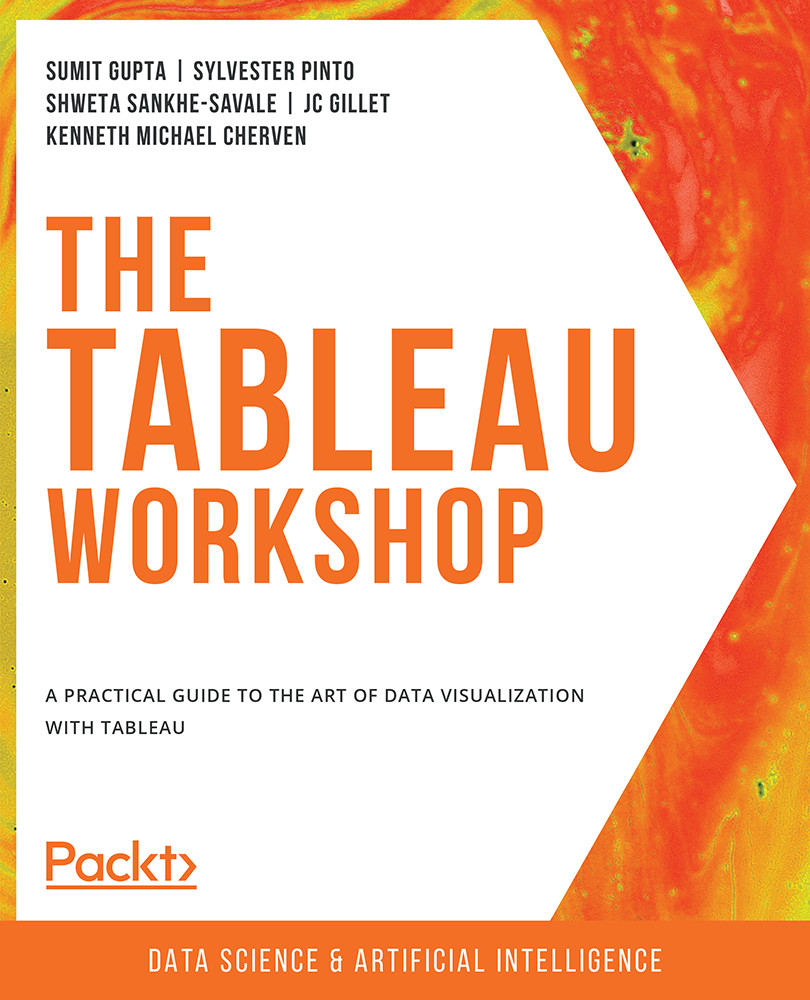
The Tableau Workshop

You're reading from   The Tableau Workshop A practical guide to the art of data visualization with Tableau

Arrow left icon
Product type Paperback
Published in Apr 2022
Publisher Packt
ISBN-13 9781800207653
Length 822 pages
Edition 1st Edition
Languages
Tools
Arrow right icon
Authors (5):
Arrow left icon
Shweta Savale Shweta Savale
Author Profile Icon Shweta Savale
Shweta Savale
Kenneth Michael Cherven Kenneth Michael Cherven
Author Profile Icon Kenneth Michael Cherven
Kenneth Michael Cherven
Sumit Gupta Sumit Gupta
Author Profile Icon Sumit Gupta
Sumit Gupta
Sylvester Pinto Sylvester Pinto
Author Profile Icon Sylvester Pinto
Sylvester Pinto
JC Gillet JC Gillet
Author Profile Icon JC Gillet
JC Gillet
+1 more Show less
Arrow right icon
View More author details
Toc

Table of Contents (12) Chapters Close

Preface
1. Introduction: Visual Analytics with Tableau 2. Data Preparation: Using Tableau Desktop FREE CHAPTER 3. Data Preparation: Using Tableau Prep 4. Data Exploration: Comparison and Composition 5. Data Exploration: Distributions and Relationships 6. Data Exploration: Exploring Geographical Data 7. Data Analysis: Creating and Using Calculations 8. Data Analysis: Creating and Using Table Calculations 9. Data Analysis: Creating and Using Level of Details (LOD) Calculations 10. Dashboards and Storyboards 11. Tableau Interactivity: Part 1

Exploring Comparison across Measures

Bullet charts are a type of bar chart that allow you to add target/goal comparisons to your charts/views. As much as bar charts are useful, more often than not when you are presenting data using bar charts, you will hear questions such as "How does this compare to this KPI/metric?" and "So, what should we do with this data?" because bar charts fail to add the additional context that stakeholders are looking for. This is where bullet charts shine as they add the required comparisons to goals/targets/thresholds. Think of bullet charts as bar charts with historical context or a baseline for comparison.

Say you are working on a project for which you are presenting sales figures for your SaaS products as bar charts. The first question you receive from your stakeholders might be "How does this compare to our previous quarter's/year's results? Did we do well or underperform?" If you had shown the same data...

lock icon The rest of the chapter is locked
Register for a free Packt account to unlock a world of extra content!
A free Packt account unlocks extra newsletters, articles, discounted offers, and much more. Start advancing your knowledge today.
Unlock this book and the full library FREE for 7 days
Get unlimited access to 7000+ expert-authored eBooks and videos courses covering every tech area you can think of
Renews at $19.99/month. Cancel anytime
Banner background image