Using LazyHGrid and LazyVGrid (iOS 14+)
Just like lazy stacks, lazy grids use lazy loading to display content on the screen. They initialize only the subset of the items that would soon be displayed on the screen as the user scrolls. SwiftUI 2 introduced the LazyVGrid and LazyHGrid views. Let's implement a lazy grid that displays some text in this recipe.
Getting ready
Create a new SwiftUI iOS project and name it UsingLazyGrids.
How to do it…
We'll implement a LazyVGrid and LazyHGrid view inside a Stack view so as to observe both views in action on a single page. The steps are as follows:
- Above the
ContentViewstruct's body variable, let's create an array ofGridItemcolumns. TheGridItemstruct is used to configure the layout ofLazyVGrid:let columns = [ GridItem(.adaptive(minimum: 100)) ]
- Create an array of
GridItemrows that define the layout that would be used inLazyHGrid:let rows = [ GridItem(.flexible()), GridItem(.flexible()), GridItem(.flexible()) ]
- Create an array of colors. This will be used for styling some items in our view:
let colors: [Color] = [.green,.red, .yellow,.blue]
- Replace the initial
Textview in the body view with aVStackcomponent and a scroll view. - Within the scroll view, add a
LazyVGridview and aForEachstruct that iterates over the numbers1–999and displays the number in aTextview:VStack { ScrollView { LazyVGrid(columns: columns, spacing:20) { ForEach(1...999, id:\.self){ index in Text("Item \(index)") } } } } - The resulting view displays the numbers in a grid, but the content looks very bland. Let's add some zest by styling the text.
- Add a
padding()modifier, a background modifier that uses the value of the current index to pick a color from our color array, and theclipshape()modifier to give eachTextview a capsule shape:… ForEach(1...999, id:\.self){ index in Text("Item \(index)") .padding(EdgeInsets(top: 30, leading: 15, bottom: 30, trailing: 15)) .background(colors[index % colors.count]) .clipShape(Capsule()) } … - Now, let's add a scroll view and
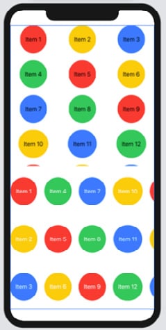
LazyHStack. You will notice that everything else is the same as theLazyVGridview except for thecolumnparameter that's changed to arowparameter:VStack { … ScrollView(.horizontal) { LazyHGrid(rows: rows, spacing:20) { ForEach(1...999, id:\.self){ index in Text("Item \(index)") .foregroundColor(.white) .padding(EdgeInsets(top: 30, leading: 15, bottom: 30, trailing: 15)) .background(colors[index % colors. count]) .clipShape(Capsule()) } } } }The resulting preview should look as follows:

Figure 2.13 – The UsingLazyStacks app
Run the app in the preview and vertically scroll through LazyVGrid and horizontally scroll through LazyHGrid. Observe how smoothly the scrolling occurs despite the fact that our data source contains close to 2,000 elements. Scrolling stays responsive because all our content is lazily loaded.
How it works…
One of the fundamental concepts of using lazy grids involves understanding how to define the LazyVGrid columns or the LazyHGrid rows. The LazyVGrid column variable was defined as an array containing a single GridItem component but causes three rows to be displayed. GridItem(.adaptive(minimum: 80)) tells SwiftUI to use at least 80 units of width for each item and place as many items as it can along the same row. Thus, the number of items displayed on a row may increase when the device is changed from portrait to landscape orientation, and vice versa.
GridItem(.flexible()), on the other hand, fills up each row as much as possible:
  let rows = [
       GridItem(.flexible()),
       GridItem(.flexible()),
       GridItem(.flexible())
  ]
Adding three GridItem(.flexible()) components divides the available space into three equal rows for data display. Remove or add more GridItem(.flexible()) components to the row array and observe how the number of rows decreases or increases.
We provide two parameters to our lazy grids: a columns/rows parameter that specifies the layout of the grid and a spacing parameter that defines the spacing between the grid and the next item in the parent view.


