Search icon CANCEL
Subscription
0
Cart icon
Your Cart (0 item)
Close icon
You have no products in your basket yet
Save more on your purchases! discount-offer-chevron-icon
Savings automatically calculated. No voucher code required.
Arrow left icon
Explore Products
Best Sellers
New Releases
Books
Videos
Audiobooks
Learning Hub
Free Learning
Arrow right icon
Arrow up icon
GO TO TOP
SAP BusinessObjects Dashboards 4.1 Cookbook

You're reading from   SAP BusinessObjects Dashboards 4.1 Cookbook Over 100 simple and incredibly effective recipes to help transform your static business data into exciting dashboards filled with dynamic charts and graphics

Arrow left icon
Product type Paperback
Published in Mar 2015
Publisher
ISBN-13 9781784391959
Length 452 pages
Edition 1st Edition
Concepts
Arrow right icon
Toc

Table of Contents (17) Chapters Close

Preface 1. Staying in Control 2. Data Visualization FREE CHAPTER 3. From a Static to an Interactive Dashboard 4. Dynamic Visibility 5. Using Alerts 6. Advanced Components 7. Dashboard Look and Feel 8. Dashboard Data Connectivity 9. Exporting and Publishing 10. Top Third-party Add-ons 11. Performance Tuning 12. Increasing Productivity A. Real-world Dashboard Case Studies B. Additional Resources – Supported Excel Functions and System/Software Requirements C. The Future of Dashboarding with SAP Design Studio Index

Using a radar chart


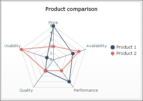
The radar chart is able to represent more than two variables in a single chart. In this chart, the multiple axes all start at the same point. The radar chart can be used to make comparisons between series based on their score on a set of variables. In this way outliers can be quickly discovered and analyzed. The following screenshot represents a radar chart:
Getting ready

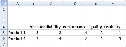
Open a new file in SAP BusinessObjects Dashboards and enter the data, as shown in the following screenshot, into the spreadsheet:
How to do it...

  1. Drag a Radar Chart component to the canvas.

  2. Enter a name and subtitle for the chart.

  3. Bind the cell range A4 to F6 to the By Range field.

How it works...

Our dataset has two series and five categories. The chart has an axis for each category, and on these axes, the accompanying values are plotted for each series. The values of a series are connected with a line.

There's more...

The filled radar chart component does the same job as the radar chart component and has the...

You have been reading a chapter from
SAP BusinessObjects Dashboards 4.1 Cookbook
Published in: Mar 2015
Publisher:
ISBN-13: 9781784391959
Register for a free Packt account to unlock a world of extra content!
A free Packt account unlocks extra newsletters, articles, discounted offers, and much more. Start advancing your knowledge today.
Unlock this book and the full library FREE for 7 days
Get unlimited access to 7000+ expert-authored eBooks and videos courses covering every tech area you can think of
Renews at $19.99/month. Cancel anytime
Banner background image