Search icon CANCEL
Subscription
0
Cart icon
Your Cart (0 item)
Close icon
You have no products in your basket yet
Arrow left icon
Explore Products
Best Sellers
New Releases
Books
Videos
Audiobooks
Learning Hub
Newsletter Hub
Free Learning
Arrow right icon
timer SALE ENDS IN
0 Days
:
00 Hours
:
00 Minutes
:
00 Seconds
Arrow up icon
GO TO TOP
SAP BusinessObjects Dashboards 4.1 Cookbook

You're reading from   SAP BusinessObjects Dashboards 4.1 Cookbook Over 100 simple and incredibly effective recipes to help transform your static business data into exciting dashboards filled with dynamic charts and graphics

Arrow left icon
Product type Paperback
Published in Mar 2015
Publisher
ISBN-13 9781784391959
Length 452 pages
Edition 1st Edition
Concepts
Arrow right icon
Toc

Table of Contents (17) Chapters Close

Preface 1. Staying in Control FREE CHAPTER 2. Data Visualization 3. From a Static to an Interactive Dashboard 4. Dynamic Visibility 5. Using Alerts 6. Advanced Components 7. Dashboard Look and Feel 8. Dashboard Data Connectivity 9. Exporting and Publishing 10. Top Third-party Add-ons 11. Performance Tuning 12. Increasing Productivity A. Real-world Dashboard Case Studies B. Additional Resources – Supported Excel Functions and System/Software Requirements C. The Future of Dashboarding with SAP Design Studio Index

Using a combination chart

With the combination chart you can use both columns and lines to visualize data in one single chart.

Getting ready

Open a new file in SAP BusinessObjects Dashboards and enter the data, as shown in the following screenshot, into the spreadsheet:

Getting ready

In the Number section of the Home tab of the toolbar, use the % option to convert the market share values into percentages:

Getting ready

How to do it...

  1. Drag a Combination Chart component to the canvas.
  2. Bind the Chart field to cell A1 and the Subtitle field to cell B2.
  3. Bind the By Range field to the spreadsheet range from A4 to E6.
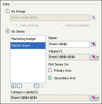
  4. Select By Series and select the Market share series. Select the option to Plot Series On: Secondary Axis:
    How to do it...
  5. As you can see now, both axes are populated with values:
    How to do it...

How it works...

After binding the data to the component, we adjusted the Market share series to plot its data on the secondary axis. After doing this, a second y-axis appeared on the right-hand side of the chart, labeled with percentages.

There's more....

lock icon The rest of the chapter is locked
Register for a free Packt account to unlock a world of extra content!
A free Packt account unlocks extra newsletters, articles, discounted offers, and much more. Start advancing your knowledge today.
Unlock this book and the full library FREE for 7 days
Get unlimited access to 7000+ expert-authored eBooks and videos courses covering every tech area you can think of
Renews at $19.99/month. Cancel anytime