Implementing a scrollable list in Jetpack Compose
When building Android applications, one thing that we can all agree on is you must know how to build a RecyclerView to display your data. With our new, modern way of building Android applications, if we need to use RecyclerView, we can use LazyColumn, which is similar. In this recipe, we will look at rows, columns, and LazyColumn, and build a scrollable list using our dummy data.
In addition, we will be learning some Kotlin in the process.
Getting ready
We will continue using the Compose Basics project to build a scrollable list; hence, to get started, you need to have done the previous recipe.
How to do it…
Follow these steps to build your first scrollable list:
- Let us go ahead and build our first scrollable list, but first, we need to create our dummy data, and this is the item we want to be displayed on our list. Hence, create a package called
favoritecitywhere our scrollable example will live. - Inside the
favoritecitypackage, create a new data class and call itCity; this will be our dummy data source –data classCity (). - Let us model our
Citydata class. Make sure you add the necessary imports once you have added the annotated values:data class City( val id: Int, @StringRes val nameResourceId: Int, @DrawableRes val imageResourceId: Int )
- Now, in our dummy data, we need to create a Kotlin class and call this class
CityDataSource. In this class, we will create a function calledloadCities(), which will return our list ofList<City>, which we will display in our scrollable list. Check the Technical requirements section for all the required imports to get all the code and images:class CityDataSource { fun loadCities(): List<City> { return listOf<City>( City(1, R.string.spain, R.drawable.spain), City(2, R.string.new_york, R.drawable.newyork), City(3, R.string.tokyo, R.drawable.tokyo), City(4, R.string.switzerland, R.drawable.switzerland), City(5, R.string.singapore, R.drawable.singapore), City(6, R.string.paris, R.drawable.paris), ) } } - Now, we have our dummy data, and it is time to display this on our scrollable list. Let’s create a new Kotlin file in our
componentspackage and call itCityComponents. InCityComponents, we will create our@Previewfunction:@Preview(showBackground = true) @Composable private fun CityCardPreview() { CityApp() } - Inside our
@Previewfunction, we have another composable function,CityApp(); inside this function, we will call ourCityListcomposable function, which has the list as a parameter. In addition, in this composable function, we will callLazyColumn, anditemswill beCityCard(cities). See the How it works section for further explanation aboutLazyColumnanditems:@Composable fun CityList(cityList: List<City>) { LazyColumn { items(cityList) { cities -> CityCard(cities) } } } - Finally, let us construct our
CityCard(city)composable function:@Composable fun CityCard(city: City) { Card(modifier = Modifier.padding(10.dp), elevation = 4.dp) { Column { Image( painter = painterResource( city.imageResourceId), contentDescription = stringResource( city.nameResourceId), modifier = Modifier .fillMaxWidth() .height(154.dp), contentScale = ContentScale.Crop ) Text( text = LocalContext.current.getString( city.nameResourceId), modifier = Modifier.padding(16.dp), style = MaterialTheme.typography.h5 ) } } } - When you run the
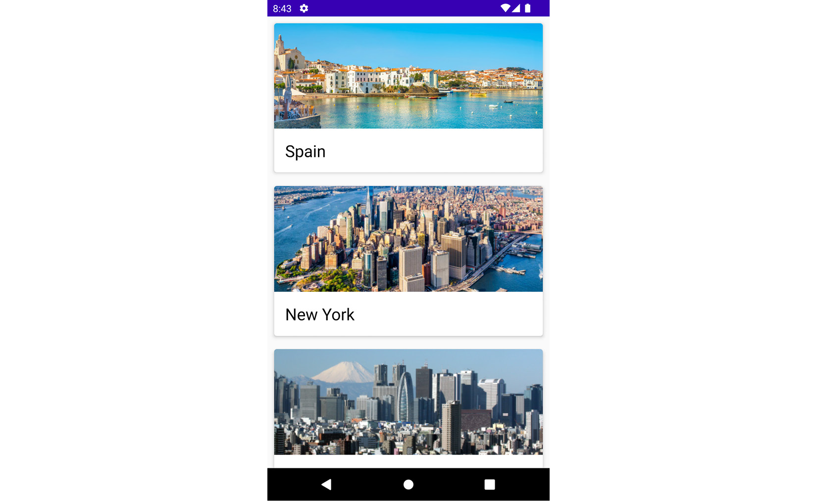
CityCardPreviewcomposable function, you should have a scrollable list, as seen in Figure 2.6.

Figure 2.7 – A scrollable list of cities
How it works…
In Kotlin, a list has two types, immutable and mutable. Immutable lists are items that cannot be modified, whereas mutable lists are items in the list that can be modified. To define a list, we can say a list is a generic ordered collection of elements, and these elements can be in the form of integers, strings, images, and so on, which is mostly informed by the type of data we want our lists to contain. For instance, in our example, we have a string and image helping identify our favorite cities by name and image.
In our City data class, we use @StringRes, and @DrawableRes in order to just pull this directly from the res folders for Drawable and String easily, and they also represent the ID for the images and string.
We created CityList and annotated it with the composable function and declared the list of city objects as our parameter in the function. A scrollable list in Jetpack Compose is made using LazyColumn. The main difference between LazyColumn and Column is that when using Column, you can only display small items, as Compose loads all items at once.
In addition, a column can only hold fixed composable functions, whereas LazyColumn, as the name suggests, loads the content as required on demand, making it good for loading more items when needed. In addition, LazyColumn comes with a scrolling ability inbuilt, which makes work easier for developers.
We also created a composable function, CityCard, where we import the Card() element from Compose. A card contains content and actions about a single object; in our example, for instance, our card has an image and the name of the city. A Card() element in Compose has the following inputs in its parameter:
@Composable
fun Card(
    modifier: Modifier = Modifier,
    shape: Shape = MaterialTheme.shapes.medium,
    backgroundColor: Color = MaterialTheme.colors.surface,
    contentColor: Color = contentColorFor(backgroundColor),
    border: BorderStroke? = null,
    elevation: Dp = 1.dp,
    content: @Composable () -> Unit
),
This means you can easily model your card to the best fitting; our card has padding and elevation, and the scope has a column. In this column, we have an image and text, which helps describe the image for more context.
See also
There is more to learn about lists and grids in Compose; you can use this link to learn more: https://developer.android.com/jetpack/compose/lists.


