Setting up the interactive backend
As mentioned above, our notebooks will all start with the following, as does this preview notebook:
In [1]: import matplotlib
        matplotlib.use('nbagg')
        %matplotlib inline
In [2]: import matplotlib.pyplot as plt
        import seaborn as sns
        import numpy as np
        from scipy import stats
        import pandas as pd
These commands do the following:
- Set up the interactive backend for plotting
- Allow us to evaluate images in-line, as opposed doing the same in a pop-up window
- Provide the standard alias to the
matplotlib.pyplotsub package and import other packages that we will need
Joint plots with Seaborn
Our first preview example will take a look at the Seaborn package, an open source third-party library for data visualization and attractive statistical graphs. Seaborn depends upon not only matplotlib, but also NumPy and SciPy (among others). These were already installed for you when you ran make (pulled from the requirements.txt file).
We'll cover Seaborn palettes in more detail later in the book, so the following command is just a sample. Let's use a predefined palette with a moderate color saturation level:
In [3]: sns.set_palette("BuPu_d", desat=0.6)
        sns.set_context("notebook", font_scale=2.0)
Next, we'll generate two sets of random data (with a random seed of our choosing), one for the x axis and the other for the y axis. We're then going to plot the overlap of these distributions in a hex plot. Here are the commands for the same:
In [4]: np.random.seed(42424242)
In [5]: x = stats.gamma(5).rvs(420)
        y = stats.gamma(13).rvs(420)
In [6]: with sns.axes_style("white"):
            sns.jointplot(x, y, kind="hex", size=16);
The generated graph is as follows:

Scatter plot matrix graphs with Pandas
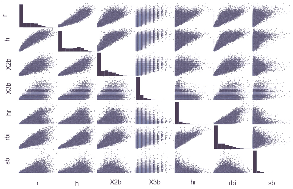
In the second preview, we will use Pandas to graph a matrix of scatter plots whose diagonal will be the statistical graphs representing the kernel density estimation. We're going to go easy on the details for now; this is just to whet your appetite for more!
Pandas is a statistical data analysis library for Python that provides high-performance data structures, allowing one to carry out an entire scientific computing workflow in Python (as opposed to having to switch to something like R or Fortran for parts of it).
Let's take the seven columns (inclusive) from the baseball.csv data file between Runs (r) and Stolen Bases (sb) for players between the years of 1871 and 2007 and look at them at the same time in one graph:
In [7]: baseball = pd.read_csv("../data/baseball.csv")
In [8]: plt.style.use('../styles/custom.mplstyle')
        data = pd.scatter_matrix(
             baseball.loc[:,'r':'sb'],
             figsize=(16,10))
The generated graph is as follows:

Command 8 will take a few seconds longer than our previous plot since it's crunching a lot of data.
For now, the plot may look like something only a sabermetrician could read, but by the end of this book, complex graph matrices will be only one of many advanced topics in matplotlib that will have you reaching for new heights.
One last teaser before we close out the chapter—you may have noticed that the plots for the baseball data took a while to generate. Imagine doing 1,000 of these. Or 1,000,000. Traditionally, that's a showstopper for matplotlib projects, but in the latter half of this book, we will cover material that will not only show you how to overcome that limit, but also offer you several options to make it happen.
It's going to be a wild ride.


