Other interface controls
So far we have only had to look at buttons and fields to be able to create the calculator. In later chapters we will use many more controls, so let's take a sneak peek at those.
Video player control
If your system has QuickTime installed, LiveCode can play QuickTime movies, using the Player control type. Those can be added to the card in several ways, as well as by using a script command as described in the following points:
A file can be added from your hard drive by selecting Import as Control/Video File from the File menu
An empty player can be created by selecting New Control/Player from the Object menu
A player control can be dragged from the Tools palette to the card
A player can be created with code, including setting its name:
new player "player name"
Having added the player to the card, you can then set which video file is to be played by entering the file path or URL of the file under the Basic Settings of the Inspector palette. You can also set the path to the video with the following script:
set the filename of player "player name" to "file path or URL"
Still image control
In the same way that you just saw for playing video, still images can also be added to a stack. All of the options shown for adding a video player can be used for images. Here, for example, is the script needed to add the RunRev company logo to the card:
new image "revlogo"
set the filename of image "revlogo" to "http://www.runrev.com/runrev-globals/corporate-nav/images/runrev.gif"
Rollover buttons
Images that you import can be used as icons in a button. To set up a button so that it has a nice idle state image, and an associated highlight image, you would do the following steps:
Select File | Import As Control | Image File…
Choose the images that represent the idle and highlight states, and click on Open.
Select the button that you wish to look like these images, and under Icons & Border in the Inspector palette, click on the magic wand button to the right-hand side of the top entry (Icon).
In the dialog that appears, select This Stack from the drop-down menu.
Select the image that is the idle state for the button.
Click on the magic wand button next to the Hover entry, and choose the highlight state image.
Under Basic Properties, choose Transparent Button from the Style drop-down menu.
Uncheck the boxes for Show name, Auto hilite, and Shared hilite.
Resize the button to be big enough to show the image.
Select each of the original images, and under Basic Properties, uncheck the Visible box.
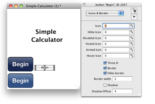
Here we can see two images that have been imported in order to give the Begin button a more iOS appearance. The button is selected, and the Inspector palette shows the icon selection choices.

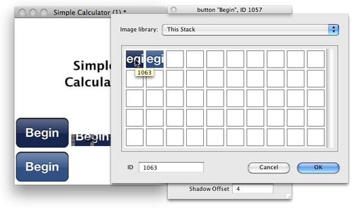
Then when you choose an image to use, the button itself will be updated. In this case the Hover Icon has been set to the darker version of the graphic, but as shown here, the button still needs to be resized.

Many More Controls…
LiveCode has a lot of different controls. Many are just slight variations, but there are plenty that are quite different from each other. Look at the Object menu, and then New Control. As you'll see the list is very long!


