Visualizing with R
There are severalvisualization mechanisms available in R.
- Produce a R Scatter plot
In this example, we produce a scatter plot using the standard R plot() function. Built into the plot function, we can chart the relationship between the x and y values as well.
How to do it...
We can use this script:
# load the iris dataset
data <- read.csv("http://archive.ics.uci.edu/ml/machine-learning-databases/iris/iris.data")

#Let us also clean up the data so as to be more readable
colnames(data) <- c("sepal_length", "sepal_width", "petal_length", "petal_width", "species")

# make sure the data is as expected
summary(data)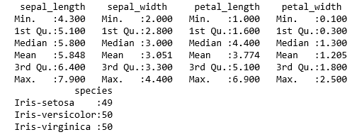
Produce the Scatter plot:
plot(data$sepal_length, data$petal_length)
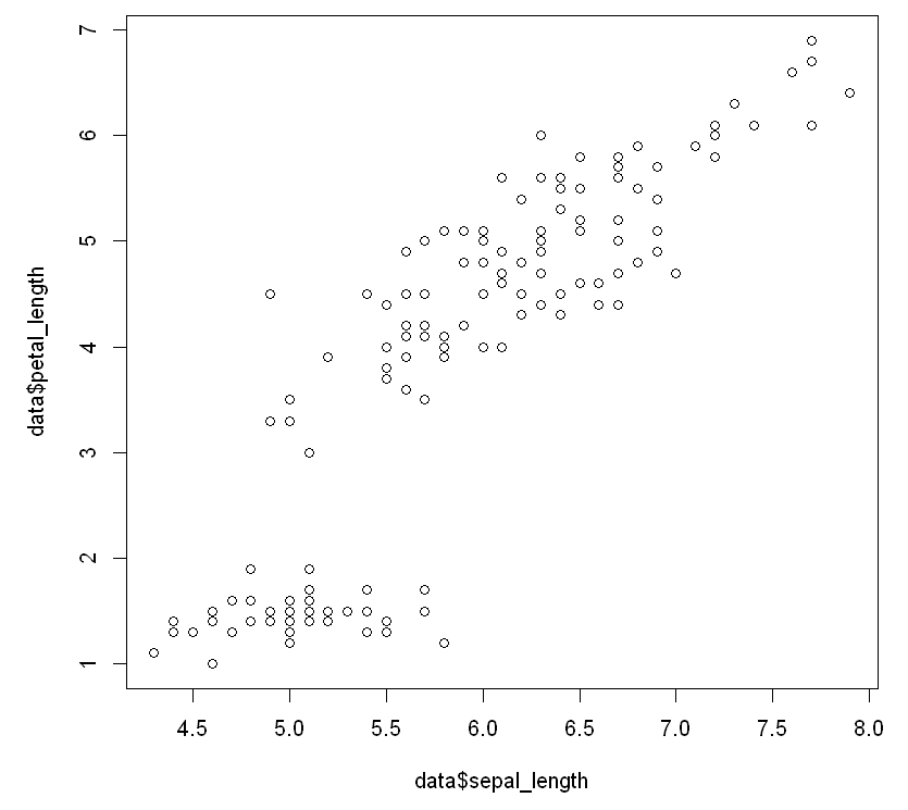
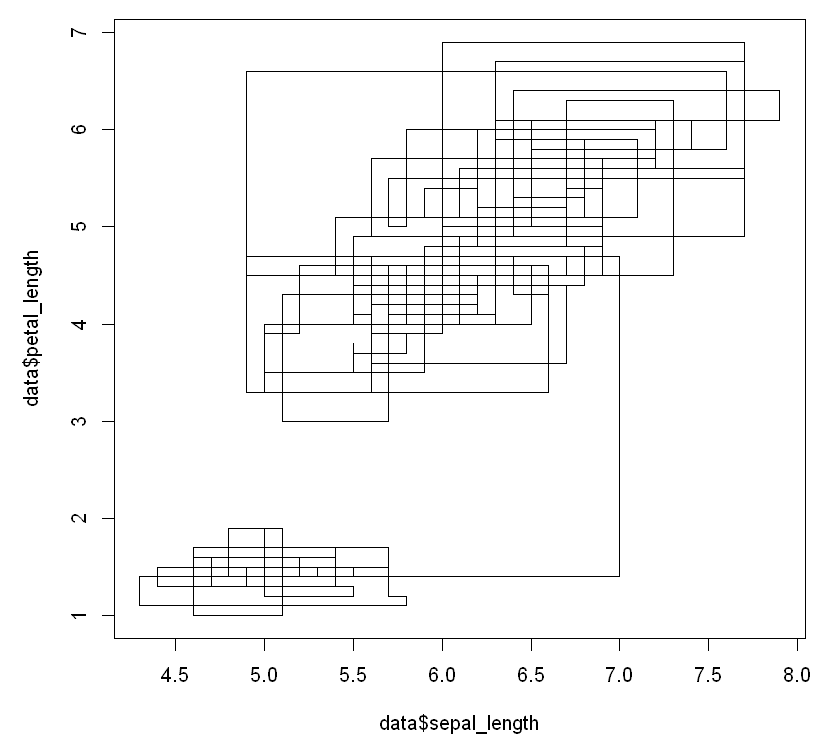
And produce the following visualizations of the relationships between the values. This plot is a stepwise look at how changing one value appears, to see the effect on the other:
plot(data$sepal_length, data$petal_length, type="s")
The output is as follows:
And we look at a histogram of the same data...