€18.99
per month
Video
Sep 2023
3hrs 40mins
1st Edition
-
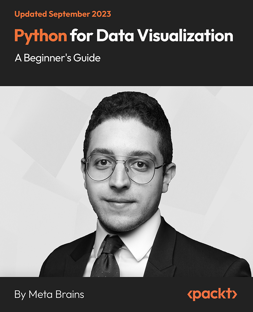
Learn to create various visualizations with Python libraries such as Matplotlib, Seaborn, and Plotly
-
Acquire skills to create visuals and communicate insights, explore storytelling and visualization
-
Work on real-world projects and case studies to apply data visualization techniques to real data
Python-based data visualization uses the Python programming language and its libraries to transform data into visual representations, such as charts, graphs, and interactive dashboards. Python’s libraries, including Matplotlib, Seaborn, Plotly, and Bokeh, offer customizable plot types and interactive features to craft compelling visual narratives. Through data storytelling and customization, Python shares insights and effectively communicates them, making it an indispensable skill for anyone working with data.
In this course, we will begin by grasping the importance of data visualization and exploring essential Python libraries such as Matplotlib, Seaborn, and Plotly. You will learn to customize and enhance visualizations, adjust colors, labels, and legends, and understand the principles of effective data storytelling. The course delves into advanced topics such as creating interactive dashboards and dynamic data plots. We will work on practical projects and real-world examples to equip us with the skills to turn raw data into informative visuals using Python.
Upon completion, we will master Python-based data visualization from core principles to practical skills, Matplotlib, Seaborn, and Plotly, and transform raw data into compelling visuals. We will acquire tools to create visuals, convey insights, and make data-driven decisions with confidence.
This course caters to a wide audience from beginners with no programming experience to experienced data professionals, programmers looking to expand their skillsets, business professionals seeking practical data visualization knowledge, and students/researchers aiming to strengthen their data visualization proficiency using Python. There are no specific prerequisites for this course. However, having a basic understanding of mathematics and readiness to learn are helpful attributes for successfully completing the course.
-
Understand the importance/principles of effective data visualization
-
Learn Matplotlib, Seaborn, and Plotly to create various visualizations
-
Learn to tailor colors, labels, and styles to enhance visuals
-
Craft data visualizations to create compelling narratives
-
Create engaging and user-friendly interactive data displays
-
Explore geospatial data mapping and location-based visualizations
 United States
 Great Britain
 India
India
 Germany
 France
 Canada
 Russia
 Spain
Spain
 Brazil
 Australia
 Singapore
 Hungary
 Philippines
 Mexico
 Thailand
 Ukraine
 Luxembourg
 Estonia
 Lithuania
 Norway
 Chile
Chile
 South Korea
 Ecuador
 Colombia
 Taiwan
 Switzerland
 Indonesia
 Cyprus
 Denmark
 Finland
 Poland
 Malta
Malta
 Czechia
 New Zealand
 Austria
 Turkey
 Sweden
 Italy
Italy
 Egypt
Egypt
 Belgium
 Portugal
 Slovenia
 Ireland
 Romania
 Greece
 Argentina
 Malaysia
 South Africa
 Netherlands
 Bulgaria
 Latvia
 Japan
Japan
 Slovakia


