Working with text inputs, checkboxes, and radio buttons
As we delve deeper into the practical aspects of Angular and PrimeNG, we’ll focus on the implementation of text inputs, checkboxes, and radio buttons. These form controls are fundamental to any application, enabling users to interact with the application and provide necessary data.
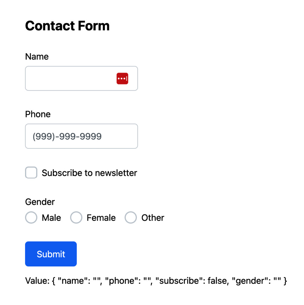
Let’s take a look at this contact form component:

Figure 5.3 – Sample contact form
The contact form utilizes various PrimeNG components such as InputText, InputMask, Checkbox, and RadioButton. Let’s take a look at each part.
InputText
The pInputText directive is used to enhance existing text input fields. To use the pInputText directive in your Angular project, you first need to import the InputTextModule module from PrimeNG. You can do this by adding the following import statement to your component file:
import { InputTextModule } from 'primeng/inputtext' Next, you can use the pInputText directive in your template file to create a text input field. Here’s the example that we used in the contact form from Figure 5.3:
<label for="name">Name</label>
<input pInputText id="name" type="text" formControlName="name" />
Let’s break down the code:
<label for="name">Name</label>: This is a standard HTML label element. Theforattribute associates the label with the input field that has an ID ofname.pInputText: This directive tells Angular to apply the PrimeNG text input functionality and styling to this input field.id="name": This attribute sets the ID of the input field, which is used to associate it with the label.type="text": This attribute sets the type of the input field. In this case, it’s a text field.formControlName="name": This attribute is part of Angular’s reactive forms module. It binds the input field to aFormControlnamednamein the component class.
InputMask
As we delve deeper into PrimeNG’s form controls, let’s turn our attention to a component that offers a more controlled input experience: p-inputMask. This component is designed to handle inputs that follow a specific format, such as phone numbers, dates, or social security numbers.
To use the p-inputMask component in your Angular project, you first need to import the InputMaskModule module from PrimeNG. You can do this by adding the following import statement to your component file:
import { InputMaskModule } from 'primeng/inputmask' Here’s the example that we used in the contact form in Figure 5.3:
<label for="phone">Phone</label>
<p-inputMask
   id="phone"
   mask="(999)-999-9999"
   formControlName="phone"
   placeholder="(999)-999-9999"
/>
In this example, we’re creating an input field for a phone number. The p-inputMask component is used as an input field, enforcing the phone number format. Let’s break down the code further:
<label for="phone">Phone</label>: This is a standard HTML label element. Theforattribute associates the label with the input field that has an ID ofphone.p-inputMask: This PrimeNG component is used to apply the PrimeNG styles to the input field and to define the input format for the phone number.mask="(999)-999-9999": This attribute sets the input pattern for a specific field. In this case, the mask consists of placeholders represented by the character 9, which indicates that only numeric characters can be entered in those positions. By applying this mask, users are restricted to inputting numbers in the designated places, ensuring data consistency and accuracy.formControlName="phone": This attribute is part of Angular’s reactive forms module. It binds the input field to aFormControlnamedphonein the component class.
Checkbox
As we continue to explore PrimeNG’s form controls, let’s focus on a component that allows users to make binary choices: p-checkbox. This component is used to create checkboxes, which let users select one or more options from a set.
To use the p-checkbox component in your Angular project, you first need to import the CheckboxModule module from PrimeNG. You can do this by adding the following import statement to your component file:
import { CheckboxModule } from 'primeng/checkbox' Here’s the example that we used in the previous contact form in Figure 5.3:
<p-checkbox
   formControlName="subscribe"
   [binary]="true"
   label="Subscribe to newsletter"
/>
Let’s break down the code:
p-checkbox: This PrimeNG component is used to apply the PrimeNG styles to the checkbox field.formControlName="subscribe": This attribute is part of Angular’s reactive forms module. It binds the checkbox to aFormControlnamedsubscribein the component class.[binary]="true": This attribute sets the checkbox’s value to eithertrueorfalse. If the checkbox is checked, the value istrue; otherwise, it’sfalse.label="Subscribe to newsletter": This attribute sets the label displayed next to the checkbox.
RadioButton
PrimeNG’s p-radioButton is a UI component that can be used to create radio button inputs in Angular forms. It is a useful component that allows users to make a single choice from a set of mutually exclusive options, such as in surveys, preference selection, form validation, filtering, sorting, and step-by-step processes.
To use the p-radioButton component in your Angular project, you first need to import the RadioButtonModule module from PrimeNG. You can do this by adding the following import statement to your component file:
import { RadioButtonModule } from 'primeng/radiobutton' Here’s the example that we used in the previous contact form in Figure 5.3:
<p-radioButton
   ngFor="let gender of genders"
   name="gender"
   value="{{ gender.value }}"
   label="{{ gender.name }}"
   formControlName="gender"
/>
Let’s break down the code:
p-radioButton: This is where we define our PrimeNG radio buttons.*ngFor="let gender of genders”: This is Angular’s built-in directive for rendering a list. It creates a new radio button for each gender in thegendersarray.name="gender": This attribute sets the name of the radio button group. All radio buttons with the same name belong to the same group, and only one can be selected at a time.value="{{ gender.value }}": This attribute sets the value of the radio button. It’s bound to thevalueproperty of the currentgenderobject.label="{{ gender.name }}": This attribute sets the label displayed next to the radio button. It’s bound to thenameproperty of the currentgenderobject.formControlName="gender": This attribute is part of Angular’s reactive forms module. It binds the group of radio buttons to aFormControlnamedgenderin the component class.
We have learned about some fundamental form controls that allow users to interact with your application. In the next section, we will go over more complex components such as dropdowns, multi-selects, and date pickers.


