In his book, The Design of Everyday Things, Donald A. Norman tells us about his constant trouble with opening doors:
He says, explaining his frustration. This is one of the examples that he presents in his book to illustrate how a poor design can have a negative effect on user experience:
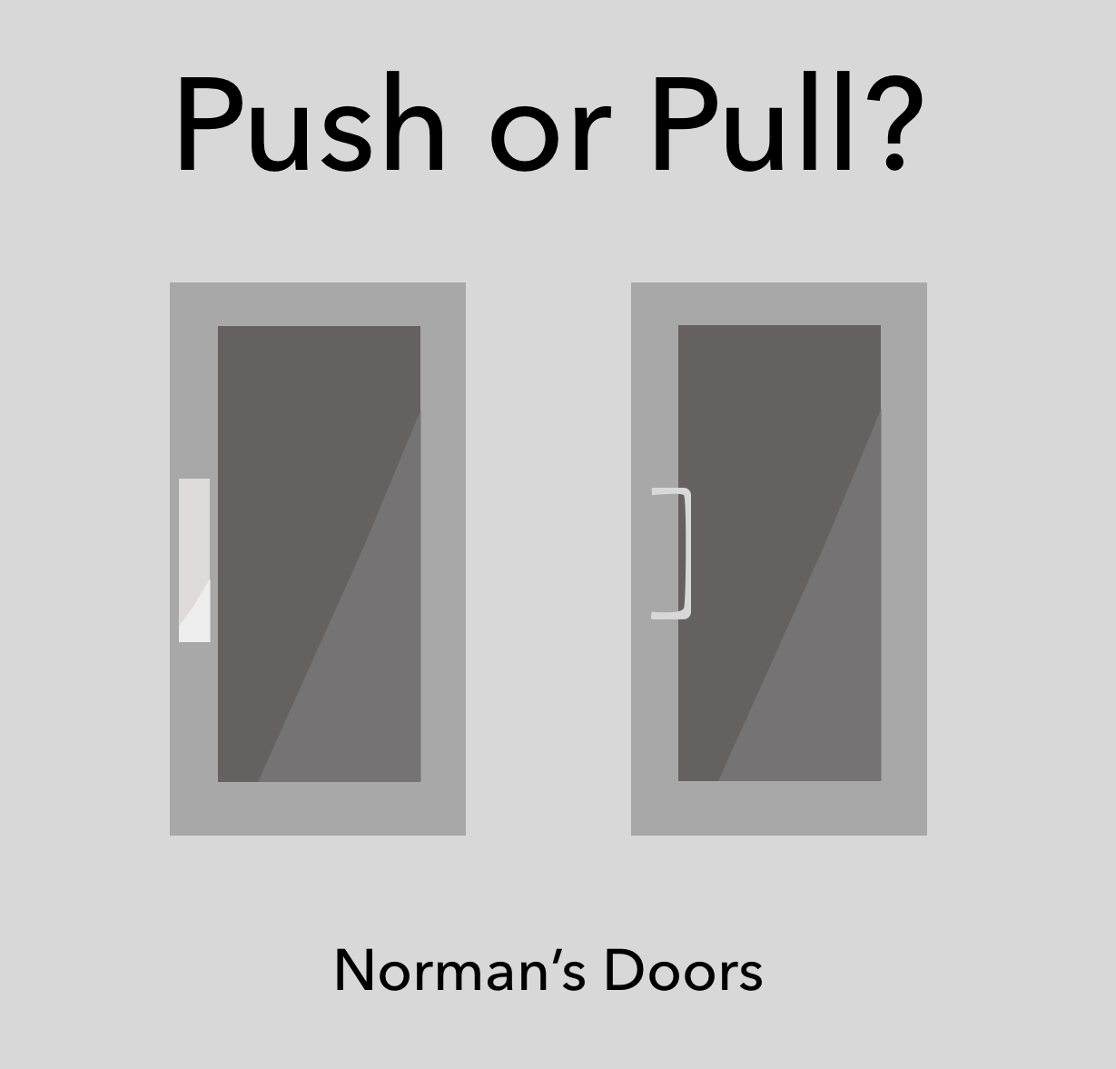
Known as Norman's Doors, we can see examples of these misleading designs everywhere: remote controls, sink taps, buttons, elevator panels, utensils, home appliances, and a number of other examples of how poor design has been causing day-to-day confusion.
We are constantly playing our role as users, having positive or negative experiences, not only when using products, but also offline or brick and mortar services such as navigating in a supermarket, using ATM machines, searching for our gate at the airport, even using toilets can be challenging. And every experience online or offline can be designed or redesigned to be positive. It doesn't matter if it is an app, a website, or a Norman Door.
Just to give an idea of how a poor design can impact different aspects and environments of our day-to-day life, a recent survey by the Japan Restroom Industry Association showed that foreign tourists often have a hard time of understanding the many and different controls of Japanese toilets, making the experience of using the toilet more complicated than they thought: 25% of them confirmed that they did not know how to use a Japanese-style toilet. Alarmingly, I pressed the emergency button was a similarly common, expressed by 8.8% of foreigners. Concerned about being more tourist-friendly for the 2020 Tokyo Olympic Games, Japan's Restroom Industry Association (a group of 10 companies that include Panasonic and Toshiba) has agreed to create a set of standardized pictograms:

As you can see, user experience does not only apply to digital applications, but it can also be seen in simple, everyday activities. It is the main job of a UX designer to turn all these negative experiences, as results of a poor design, into positive experiences.


