The grid and guides
One of the key methods for keeping your designs to a high professional standard is precision. By using the following layout methods in conjunction with a variety of alignment techniques (we will be going over them in future chapters), you will be able to construct with confidence.
Grid
You can quickly view (and hide) your grid layout by using the Ctrl/Command + ' keyboard shortcut. In addition, if you would like to customize the grid, you can summon the Preferences panel with the keyboard shortcut of Ctrl/Command + K. One benefit to turning on the grid's visibility is the ability to snap to it. You can activate Snap to Grid using the keyboard shortcut of Shift + Ctrl/Command + ' as shown here:

Figure 1.15 – Grid view
Be sure to use the Properties panel to customize the grid to your liking. From here, you can choose Snap to Grid or go into the preferences by using the Quick Actions button to change the dimensions, style, and color of the grid.
Rulers
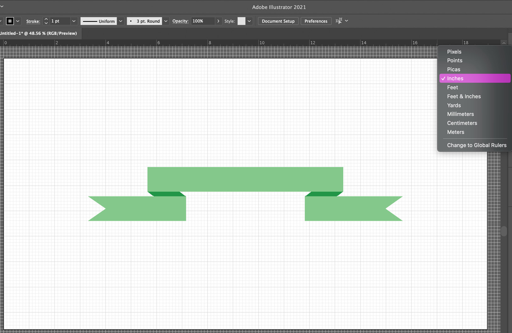
After turning on the Rulers view (Ctrl/Command + R), you can further utilize the tool by adjusting the unit of measurement. Just right-click on either ruler to see a contextual menu for all the available units of measurement, and then select your preferred units:

Figure 1.16 – Rulers view
I suggest changing your rulers to the unit of measurement your intended output will use. For example, if you are intending the graphic for the web or screen, then using pixels is likely the best choice. If the end result is to go to print, then the units should relate to that.
Guides
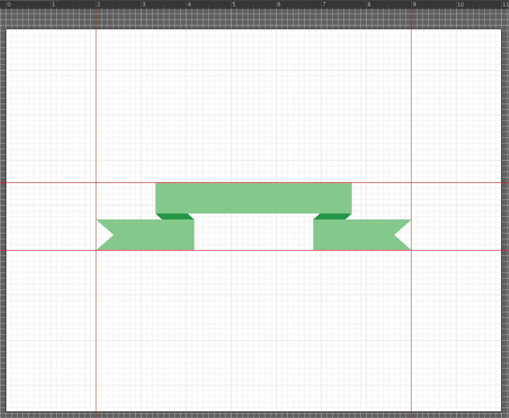
To add guides, just locate your cursor inside the vertical ruler to click and then drag a vertical guide and, similarly, locate your cursor inside a horizontal ruler to click and then drag a horizontal guide.
Guides are non-printable, so use them as needed to create order within your documents. Guides work well for developing templates that you can later share with colleagues or clients to help speed along the design process while ensuring accuracy. You can use the Ctrl/Command + ; keyboard shortcut to quickly view (and hide) your guides:

Figure 1.17 – Guides
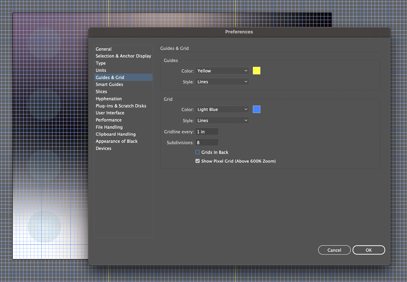
As mentioned earlier, the guides can be created by pulling them from the rulers. After they have been created, they can be moved by dragging them, or even deleted (just drag them back into the ruler). Go to the menu bar and choose View > Guides > Lock Guides to keep from accidentally moving guides around or protect them as a template before sharing with others. To make your guides more visible, open your system preferences (remember that this was discussed earlier in this chapter) and change the color of your guides to something that offers a greater contrast to your work:

Figure 1.18 – Guides & Grid adjustments within the Preferences panel
In Figure 1.18, you can see that the work is predominately made up of cool colors, so having guides with a color with a warm hue helps to separate it from the artwork and offers greater visibility.
Consistency will be the key to mastering your designs, and using these layout aides should allow you to check for accuracy and deliver work that you are confident in its exactness.
As much as we all try to stay on top of things when it comes to the technology we use, it is inevitable that upgrades and improvements (even setbacks, at times) will continually require us to learn more. Even if you are comfortable with Adobe Illustrator and the topics I have addressed so far, you may find this book helpful in discovering some of the newest tricks this tool can do.


