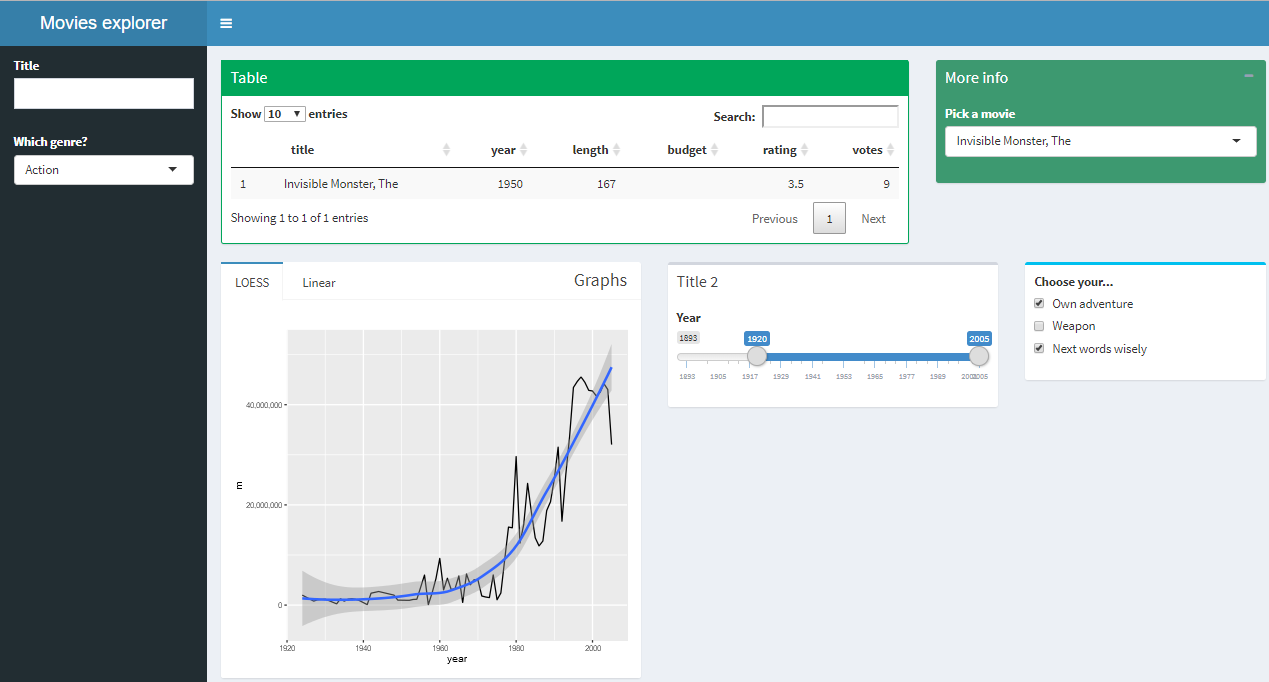
In this section, we will look at how to make your application attractive and well laid out using boxes and the fluidRow() function. We will take out the sidebar menu buttons that we used in the previous section to switch between different pages in the dashboard, and lay everything out on one page. Also, we will look at the use of tabbed boxes, for when you want one box to contain several pieces of content.
Let's look at the application here. We've upgraded the table to a data table using the DT package, because it can be made to scale better on the page. To pick the movie, it's displayed right next to the table, and the graph and year selector are below it, as shown in the following screenshot:

A dummy control is placed next to the real control to give a better example of how to lay out multiple elements, and how they look. The movies selector...


