Search icon CANCEL
Subscription
0
Cart icon
Your Cart (0 item)
Close icon
You have no products in your basket yet
Save more on your purchases! discount-offer-chevron-icon
Savings automatically calculated. No voucher code required.
Arrow left icon
Explore Products
Best Sellers
New Releases
Books
Videos
Audiobooks
Learning Hub
Newsletter Hub
Free Learning
Arrow right icon
Arrow up icon
GO TO TOP
WordPress Mobile Web Development: Beginner's Guide

You're reading from   WordPress Mobile Web Development: Beginner's Guide Make your WordPress website mobile-friendly and get to grips with the two hottest trends in web design—Mobile and WordPress with this book and ebook.

Arrow left icon
Product type Paperback
Published in Aug 2012
Publisher Packt
ISBN-13 9781849515726
Length 332 pages
Edition 1st Edition
Languages
Concepts
Arrow right icon
Author (1):
Arrow left icon
RACHEL MCCOLLIN RACHEL MCCOLLIN
Author Profile Icon RACHEL MCCOLLIN
RACHEL MCCOLLIN
Arrow right icon
View More author details
Toc

Table of Contents (18) Chapters Close

WordPress Mobile Web Development Beginner's Guide
Credits
About the Author
About the Reviewers
Acknowledgement
1. www.PacktPub.com
2. Preface
1. Using Plugins to Make Your Site Mobile-friendly FREE CHAPTER 2. Using Responsive Themes 3. Setting up Media Queries 4. Adjusting the Layout 5. Working with Text and Navigation 6. Optimizing Images and Video 7. Sending Different Content to Different Devices 8. Creating a Web App Interface 9. Adding Web App Functionality 10. Testing and Updating your Mobile Site Pop quiz—Answers

Making images fit into a responsive layout


The layout for the Carborelli's site is now responsive, with percentage widths for the main areas of each page. We've also used media queries to adjust the layout for different-sized screens. But, we haven't yet added any code to adjust the width of the images.

For large images, this can break the layout. Let's see how.

Ensuring images don't stray outside their container

Let's start by looking at a static page on the Carborelli's site—the ice cream menu page, as shown in the following screenshot:
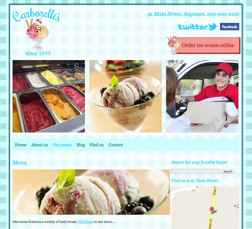
As we can see, there is an image of some ice cream in the content, which takes up the whole width of that content. That image has been added into the content of the page using the full size image, which defaults to 640px of width.

But what happens when we resize the browser?
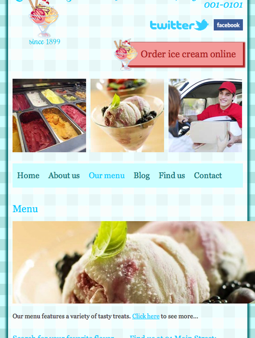
The image is still 640px wide, wider than the window itself—ruining the layout.

You'll be pleased to know that this can be easily fixed!

lock icon The rest of the chapter is locked
Register for a free Packt account to unlock a world of extra content!
A free Packt account unlocks extra newsletters, articles, discounted offers, and much more. Start advancing your knowledge today.
Unlock this book and the full library FREE for 7 days
Get unlimited access to 7000+ expert-authored eBooks and videos courses covering every tech area you can think of
Renews at $19.99/month. Cancel anytime
Banner background image