Explain Data
With Explain Data, you can begin to uncover some of the reasons and explanations behind the data you see in your visualizations. Why are sales up so much at a specific point on the timeline? Why was profit down so much last month? Explain Data takes some of the tedious manual effort out of hunting for answers to questions like these.
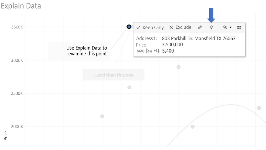
To use Explain Data, simply select a mark in a view that you’d like to understand and select the Explain Data option on the tooltip toolbar (it looks like a lightbulb). For example, we’ll take the data shown in the Price vs. Size scatterplot we examined in Figure 9.13. Specifically we’ll examine the two most significant outliers.
First select the mark for 803 Parkhill Dr. Mansfield TX 76063 in the Testing predictions sheet (shown in Figure 9.21 and then click the Explain Data toolbar option as shown here:

Figure 9.21: Selecting a mark for Explain Data
This opens the Explain Data pane, which looks...


