Search icon CANCEL
Subscription
0
Cart icon
Your Cart (0 item)
Close icon
You have no products in your basket yet
Save more on your purchases now! discount-offer-chevron-icon
Savings automatically calculated. No voucher code required.
Arrow left icon
Explore Products
Best Sellers
New Releases
Books
Videos
Audiobooks
Learning Hub
Conferences
Free Learning
Arrow right icon
Arrow up icon
GO TO TOP
Python GUI Programming Cookbook

You're reading from   Python GUI Programming Cookbook Develop functional and responsive user interfaces with tkinter and PyQt5

Arrow left icon
Product type Paperback
Published in Oct 2019
Publisher
ISBN-13 9781838827540
Length 486 pages
Edition 3rd Edition
Languages
Tools
Arrow right icon
Author (1):
Arrow left icon
Burkhard Meier Burkhard Meier
Author Profile Icon Burkhard Meier
Burkhard Meier
Arrow right icon
View More author details
Toc

Table of Contents (13) Chapters Close

Preface 1. Creating the GUI Form and Adding Widgets 2. Layout Management FREE CHAPTER 3. Look and Feel Customization 4. Data and Classes 5. Matplotlib Charts 6. Threads and Networking 7. Storing Data in Our MySQL Database via Our GUI 8. Internationalization and Testing 9. Extending Our GUI with the wxPython Library 10. Building GUIs with PyQt5 11. Best Practices 12. Other Books You May Enjoy

Creating a check button with different initial states

In this recipe, we will add three check button widgets, each with a different initial state:

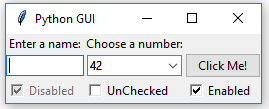
  • The first is disabled and has a checkmark in it. The user cannot remove this checkmark as the widget is disabled.
  • The second check button is enabled, and by default has no checkmark in it, but the user can click it to add a checkmark.
  • The third check button is both enabled and checked by default. The users can uncheck and recheck the widget as often as they like.

Getting ready

This recipe extends the previous recipe, Creating combobox widgets.

How to do it...

Here is the code for creating three check button widgets that differ in their states:

  1. Start with the GUI_combobox_widget_readonly_plus_display_number.py module and save it as GUI_checkbutton_widget.py.
  2. Create three tk.IntVar instances and save them in local variables:
chVarDis = tk.IntVar()
chVarUn = tk.IntVar()
chVarEn = tk.IntVar()
  1. Set the text attributes for each of the Combobox widgets we are creating:
text="Disabled"
text="UnChecked"
text="Enabled"
  1. Set their state to deselect/select:
check1.select()
check2.deselect()
check3.select()
  1. Use grid to lay them out:
check1.grid(column=0, row=4, sticky=tk.W)
check2.grid(column=1, row=4, sticky=tk.W)
check3.grid(column=2, row=4, sticky=tk.W)

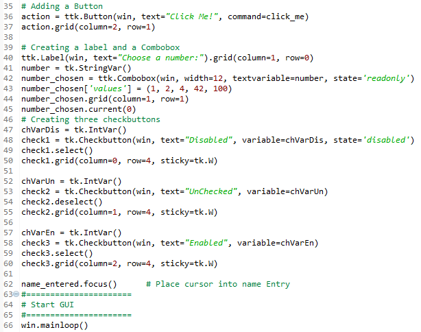
The preceding steps will finally produce the following code (GUI_checkbutton_widget.py):

  1. Run the module. Running the new code results in the following GUI:

Let's go behind the scenes to understand the code better.

How it works...

Steps 1 to 4 show the details and the screenshot in step 5 displays the important aspects of the code.

In lines 47, 52, and 57 ,we create three variables of the IntVar type. In the line following each of these variables, we create a Checkbutton widget, passing in these variables. They will hold the state of the Checkbutton widget (unchecked or checked). By default, that is either 0 (unchecked) or 1 (checked), so the type of the variable is a tkinter integer.

We place these Checkbutton widgets in our main window, so the first argument passed into the constructor is the parent of the widget, in our case, win. We give each Checkbutton widget a different label via its text attribute.

Setting the sticky property of the grid to tk.W means that the widget will be aligned to the west of the grid. This is very similar to Java syntax, and it means that it will be aligned to the left. When we resize our GUI, the widget will remain on the left side and not be moved toward the center of the GUI.

Lines 49 and 59 place a checkmark into the Checkbutton widget by calling the select() method on these two Checkbutton class instances.

We continue to arrange our widgets using the grid layout manager, which will be explained in more detail in Chapter 2, Layout Management.

We've successfully learned how to create a check button with different initial states. Now, let's move on to the next recipe.

lock icon The rest of the chapter is locked
Register for a free Packt account to unlock a world of extra content!
A free Packt account unlocks extra newsletters, articles, discounted offers, and much more. Start advancing your knowledge today.
Unlock this book and the full library FREE for 7 days
Get unlimited access to 7000+ expert-authored eBooks and videos courses covering every tech area you can think of
Renews at €18.99/month. Cancel anytime