Building the website pages
Sarah will begin with the home page. This section will provide a detailed, step-by-step guide on how Sarah uses the Power Pages design studio to build the home page, emphasizing how each element is added and customized. They had several sites listed as RobBuilderDev1, RobBuilderDev2, and RobBuilderDev3 from the various templates they had configured. Now, they had a good idea of which template they wanted to use and the content they would implement for these first few pages. Sarah and Brenda decided to use the template they had named RobBuilderDev1 to work on for their home page and to create a draft website on which to base their work.
Sarah followed these steps to access the Power Pages design studio:
- Sarah opened the Power Pages design studio and edited
RobBuilderDev1. - She selected the Home page from the Pages tab.
- Sarah clicked on the text areas within the Home page designer to edit. Sarah pasted in the text that Brenda had previously prepared, including the welcoming headline and introductory text.
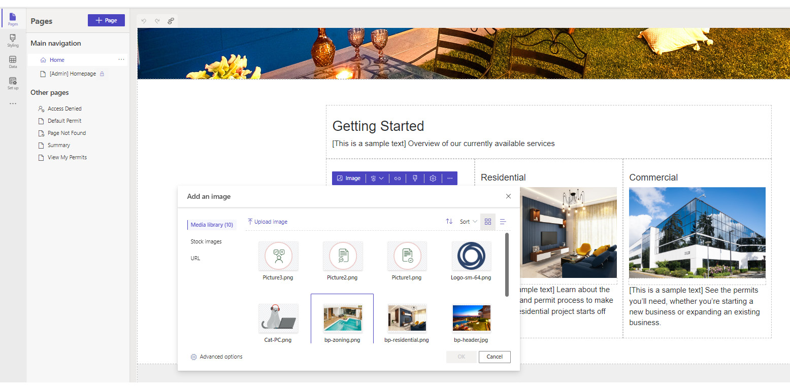
- Sarah uploaded the images that Brenda had prepared. In some cases, she used an image editor to crop or resize images to fit the image controls placed in the template. The preselected template already had images, so Sarah replaced these by clicking on them and uploading the new images, as shown in Figure 2.2:

Figure 2.2 – Replacing and uploading images
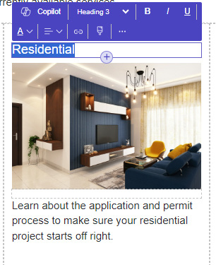
- As they developed the Home page together, they discussed some of the text box and image design and made a few changes to the original template design that they agreed would be better; for example, making some headlines a bit smaller:

Figure 2.3 – Clicking the text brings up the style tool
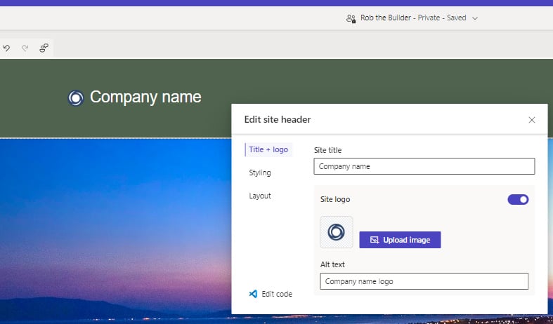
- Sarah used the design tools on the page to customize colors, fonts, and other style elements to match the company’s branding guidelines. Now, they added branding elements such as the company logo, tagline, or any other unique branding features. There was already a logo in the header from the template. Sarah clicked on it and replaced it with the company logo Brenda had prepared:

Figure 2.4 – Clicking the logo to replace it
- When they were satisfied with the page content, Sarah used the Preview feature in the Power Pages design studio to see how the Home page looked in a live environment.
- Having built the Home page, Sarah and Brenda spent the rest of the day applying this process to other pages. They focused on the About Us and Contact Us pages.
- For the client listing page, they started with a new page and selected sections to insert, selecting two-column sections, creating a listing of headings, followed by an image and then a block of text, highlighting keywords with bold and colorful text.
- They then worked on the footer. Sarah had some basic footer text that she had authored herself, and Brenda had some ideas; they also placed and inserted links for their social media pages.
Now that Brenda and Sarah had created a home page along with the pages to showcase their business, they were ready to replace their legacy website.
Brenda now wanted to discuss with Sarah what the next steps would be. She wanted a website that not only interacted with her customers and suppliers but also with the construction teams or, more specifically, the foremen to implement the incident management (IM) pages.


