Pick a Sensible Size for Multiline Input Fields
Forms need to be as frictionless as possible, because they are a huge barrier for users to painstakingly navigate. Conversion rates are generally low, so make forms as easy for the user to complete as possible.
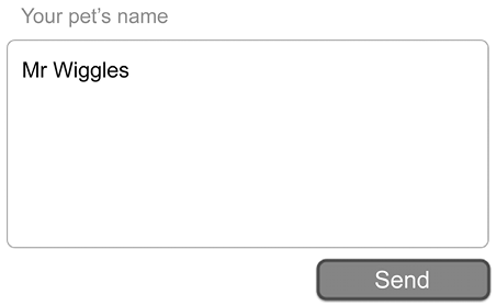
Sometimes, we need to ask users for more than a simple one- or two-word answer (like a name) and a multiline input field (or “text area”) is needed. A common mistake on the web (and in some desktop apps) is to provide a text area that is way too big or way too small.
If the text area is way too big, and the user has to manipulate the viewport to see what they’re typing, then you’re wasting valuable screen space.

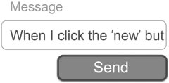
If the text area is way too small, then the user has to scroll around inside the field to see what they’ve written.

Figure 44.2: An impossibly small input field for lots of text
HTML...


