Analysis of Weather-Related Features
Let's now focus on an analysis of the group of features representing the weather conditions. Our expectation is to observe a strong dependency of those features on the current number of rides, as bad weather can significantly influence bike sharing services.
The weather features we identified earlier are the following:
weathersit: This is a categorical variable representing the current weather situation. We encoded this variable with the following four values:
Figure 1.17: Description of weather features
temp: This is the normalized temperature in Celsius. Values are divided by 41, which means that the highest registered temperature in the data is 41°C (corresponding to 1 in our dataset).atemp: The normalized feeling temperature in Celsius. Values are divided by 50, which means that the highest registered temperature in the data is 50°C (corresponding to 1 in our dataset).hum: The humidity level as a percentage.windspeed: The wind speed in m/s.
From the provided descriptions, we can see that most of the weather-related features assume continuous values (except for weathersit). Furthermore, as both our variables of interest (the casual and registered number of rides) are also continuously distributed, the first and most common way to measure the relationship between two different continuous variables is to measure their correlation.
Correlation (also known as Pearson's correlation) is a statistic that measures the degree to which two random variables move in relation to each other. In practice, it provides a numerical measure (scaled between -1 and 1), through which we can identify how much one of the variables would move in one direction, assuming that the other one moves. Let's denote, with X and Y, the two random variables. The correlation coefficient between X and Y is denoted with ρ(X,Y) and is computed by the formula:

Figure 1.18: The correlation coefficient between X and Y
Here,  and
and  denote the mean of the two variables, and
 Xi and Yi represent the individual data points in set X and set Y. A positive correlation between X and Y means that increasing one of the values will increase also the other one, while a negative correlation means that increasing one of the values will decrease the other one.
Let's provide a practical example on computing the correlation between two variables. As we want to compare several variables, it makes sense to define a function that performs the analysis between the variables, as we want to follow the Don't Repeat Yourself principle (commonly known as DRY):
def plot_correlations(data, col):
# get correlation between col and registered rides
    corr_r = np.corrcoef(data[col], data["registered"])[0,1]
    ax = sns.regplot(x=col, y="registered", data=data, \
                     scatter_kws={"alpha":0.05}, \
                     label=f"Registered rides \
                     (correlation: {corr_r:.3f})")
# get correlation between col and casual rides
    corr_c = np.corrcoef(data[col], data["casual"])[0,1]
    ax = sns.regplot(x=col, y='casual', data=data, \
                     scatter_kws={"alpha":0.05}, \
                     label=f"Casual rides (correlation: {corr_c:.3f})")
    #adjust legend alpha
    legend = ax.legend()
    for lh in legend.legendHandles:
        lh.set_alpha(0.5)
    ax.set_ylabel("rides")
    ax.set_title(f"Correlation between rides and {col}")
    return ax
Applying the previously defined function to the four columns (temp, atemp, hum, and windspeed) returns the following figure:
plt.figure(figsize=(10,8))
ax = plot_correlations(preprocessed_data, 'temp')
plt.savefig('figs/correlation_temp.png', format='png')
plt.figure(figsize=(10,8))
ax = plot_correlations(preprocessed_data, 'atemp')
plt.savefig('figs/correlation_atemp.png', format='png')
The output should be as follows:
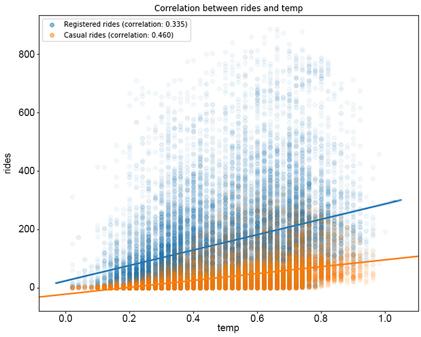
Figure 1.19: The correlation between rides and temp
The plot for correlation between rides and atemp would be as follows:
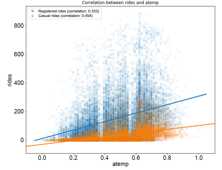
Figure 1.20: The correlation between the rides and atemp features
Now plot the correlation between the rides and hum, windspeed features separately:
plt.figure(figsize=(10,8))
ax = plot_correlations(preprocessed_data, 'hum')
plt.savefig('figs/correlation_hum.png', format='png')
plt.figure(figsize=(10,8))
ax = plot_correlations(preprocessed_data, 'windspeed')
plt.savefig('figs/correlation_windspeed.png', format='png')
The output should be as follows:
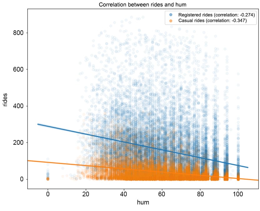
Figure 1.21: The correlation between rides and hum
The correlation between rides and windspeed can be visualized as follows:
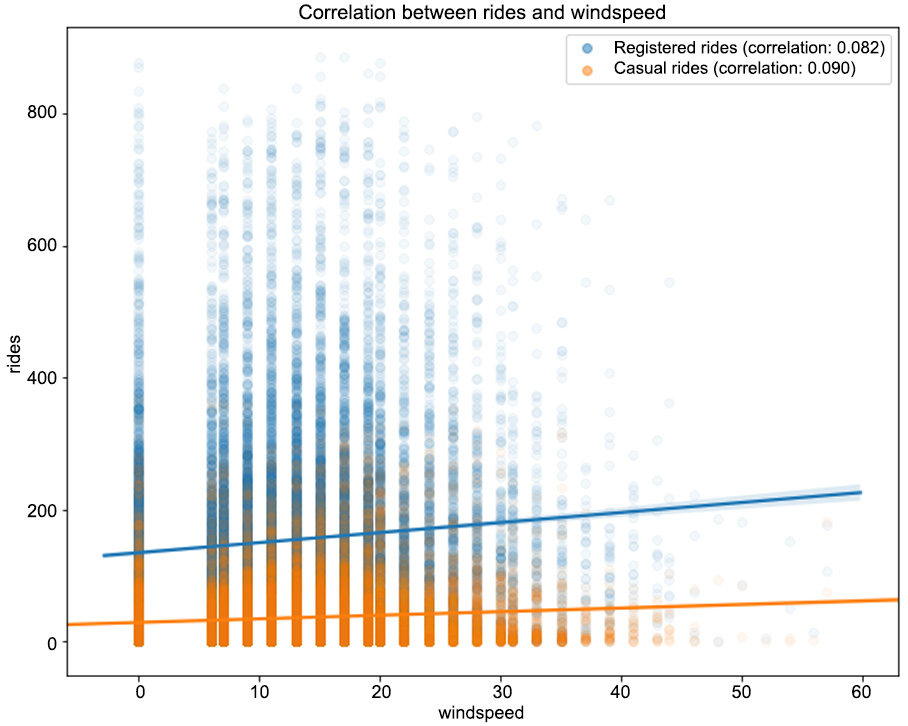
Figure 1.22: The correlation between the rides and windspeed features
From Figure 1.19, we can observe that higher temperatures have a positive impact on the number of rides (the correlation between registered/casual rides and temp is 0.335 and 0.46, respectively, and it's a similar case for atemp). Note that as the values in the registered column are widely spread with respect to the different values in temp, we have a lower correlation compared to the casual column. The same pattern can be observed in Figure 1.21, in which the humidity level has a negative correlation with both types of rides (-0.274 for registered and -0.347 for casual). This means that with a high level of humidity (mist or rain), customers will tend not to use the bike sharing service. From Figure 1.22, we can see that there is minimal correlation between the number of rides and the wind speed (a weak positive correlation).
One of the major drawbacks of the correlation coefficient is its assumption of a linear relationship between the two random variables. This is quite a strong assumption as, most of the time, relationships in nature are not linear. A measure that generalizes the Pearson's correlation to monotonic relationships between two variables is the Spearman rank correlation.
Let's illustrate the difference between the two measures in the following example.
Exercise 1.05: Evaluating the Difference between the Pearson and Spearman Correlations
In this exercise, you will investigate the difference between the Pearson correlation (in which a linear relationship between the two variables is assumed) and the Spearman correlation (in which only a monotonic relationship is required). This will help you to understand the difference between the two types of correlations, especially when the data does not satisfy the linear assumption. To better present the difference between the two measures, you will create synthetic data that will serve your purpose:
- Start by defining your random variables. Create an
Xvariable, which will represent your independent variable, and two dependent ones,Ylin andYmon, which can be expressed as follows:
Figure 1.23: Expression for the dependent variable Ylin

Figure 1.24: Expression for the dependent variable Ymon
Here,
εrepresents a noise component, which is normally distributed with a mean of 0 and a standard deviation of 0.1:# define random variables x = np.linspace(0,5, 100) y_lin = 0.5*x + 0.1*np.random.randn(100) y_mon = np.exp(x) + 0.1*np.random.randn(100)
- Compute the Pearson and Spearman correlations using the
pearsonr()andspearmanr()functions in thescipy.statsmodule:# compute correlations from scipy.stats import pearsonr, spearmanr corr_lin_pearson = pearsonr(x, y_lin)[0] corr_lin_spearman = spearmanr(x, y_lin)[0] corr_mon_pearson = pearsonr(x, y_mon)[0] corr_mon_spearman = spearmanr(x, y_mon)[0]
Note that both the
pearsonr()andspearmanr()functions return a two-dimensional array in which the first value is the respective correlation, while the second one is the p-value of a hypothesis test in which the null hypothesis assumes that the computed correlation is equal to zero. This is quite handy at times, as you not only compute the correlation, but also test its statistical significance against being zero. - Visualize both the data and the computed correlations:
# visualize variables
fig, (ax1, ax2) = plt.subplots(1, 2, figsize=(10,5))
ax1.scatter(x, y_lin)
ax1.set_title(f"Linear relationship\n \
Pearson: {corr_lin_pearson:.3f}, \
Spearman: {corr_lin_spearman:.3f}")
ax2.scatter(x, y_mon)
ax2.set_title(f"Monotonic relationship\n \
Pearson: {corr_mon_pearson:.3f}, \
Spearman: {corr_mon_spearman:.3f}")
fig.savefig('figs/exercise_1_05.png', format='png')
The output should be as follows:

Figure 1.25: The difference between the Pearson and Spearman correlations
As you can see from the preceding figure, when the relationship between the two variables is linear (the figure on the left), the two correlation coefficients are very similar. In the monotonic relationship (the figure on the right), the linear assumption of the Pearson correlation fails, and, although the correlation coefficient is still quite high (0.856), it is not capable of capturing the perfect relationship between the two variables. On the other hand, the Spearman correlation coefficient is 1, which means that it succeeds in capturing the almost perfect relationship between the two variables.
- Now return to the bike sharing data and investigate the relationship between the different variables in light of the difference between the two correlation measures. Define a function that, on the provided data and column, computes the Pearson and Spearman correlation coefficients with the
registeredandcasualrides:# define function for computing correlations def compute_correlations(data, col): pearson_reg = pearsonr(data[col], data["registered"])[0] pearson_cas = pearsonr(data[col], data["casual"])[0] spearman_reg = spearmanr(data[col], data["registered"])[0] spearman_cas = spearmanr(data[col], data["casual"])[0] return pd.Series({"Pearson (registered)": pearson_reg,\ "Spearman (registered)": spearman_reg,\ "Pearson (casual)": pearson_cas,\ "Spearman (casual)": spearman_cas})Note that the previously defined function returns a
pandas.Series()object, which will be used to create a new dataset containing the different correlations:# compute correlation measures between different features cols = ["temp", "atemp", "hum", "windspeed"] corr_data = pd.DataFrame(index=["Pearson (registered)", \ "Spearman (registered)",\ "Pearson (casual)", \ "Spearman (casual)"]) for col in cols: corr_data[col]=compute_correlations(preprocessed_data, col) corr_data.T
The output should be as follows:

Figure 1.26: The Pearson and Spearman correlation coefficients
Note
To access the source code for this specific section, please refer to https://packt.live/30OlyGW.
You can also run this example online at https://packt.live/3e7SmP2. You must execute the entire Notebook in order to get the desired result.
As we can observe, for most of the variables, the Pearson and Spearman correlation coefficient are close enough (some non-linearity is to be expected). The most striking difference between the two coefficients occurs when comparing the temp (and atemp) and casual columns. More precisely, the Spearman correlation is quite high, meaning that there is significant evidence for a nonlinear, relatively strong and positive relationship.
An interpretation of this result is that casual customers are far keener on using the bike sharing service when temperatures are higher. We have already seen from our previous analysis that casual customers ride mostly during the weekend, and they do not rely on bike sharing services for commuting to work. This conclusion is again confirmed by the strong relationship with temperature, as opposed to registered customers, whose rides have a weaker correlation with temperature.
Correlation Matrix Plot
A useful technique when performing a comparison between different continuous features is the correlation matrix plot. It allows the analyst to quickly visualize any possible relationships between the different features and identify potential clusters with highly correlated features.
The next code snippet does that:
# plot correlation matrix
cols = ["temp", "atemp", "hum", "windspeed", \
        "registered", "casual"]
plot_data = preprocessed_data[cols]
corr = plot_data.corr()
fig = plt.figure(figsize=(10,8))
plt.matshow(corr, fignum=fig.number)
plt.xticks(range(len(plot_data.columns)), plot_data.columns)
plt.yticks(range(len(plot_data.columns)), plot_data.columns)
plt.colorbar()
plt.ylim([5.5, -0.5])
fig.savefig('figs/correlations.png', format='png')
The output should be as follows:
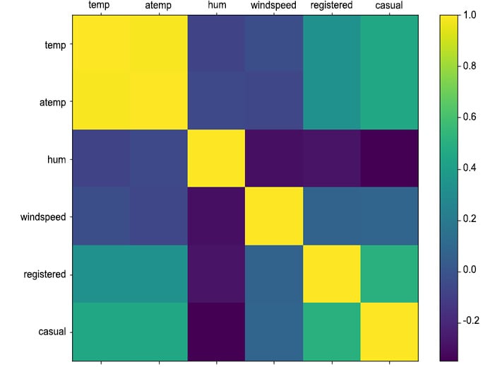
Figure 1.27: Correlation matrix between continuous weather features and rides
This concludes our analysis of the weather columns and their impact on the number of rides. In the next section, we will exploit more advanced techniques for time-dependent features, known as time series analysis.


