


Creating a waterfall chart
Waterfall charts look like bar charts, but these specifically show the aggregated effect of a series of positive and negative values. The final bar represents the net value of all the preceding values. Waterfall charts can be useful when the history as well as the final net value is important to be shown. This can be applied, for example, to showing beginning and ending inventory numbers, and showing how the ending inventory number came to be.
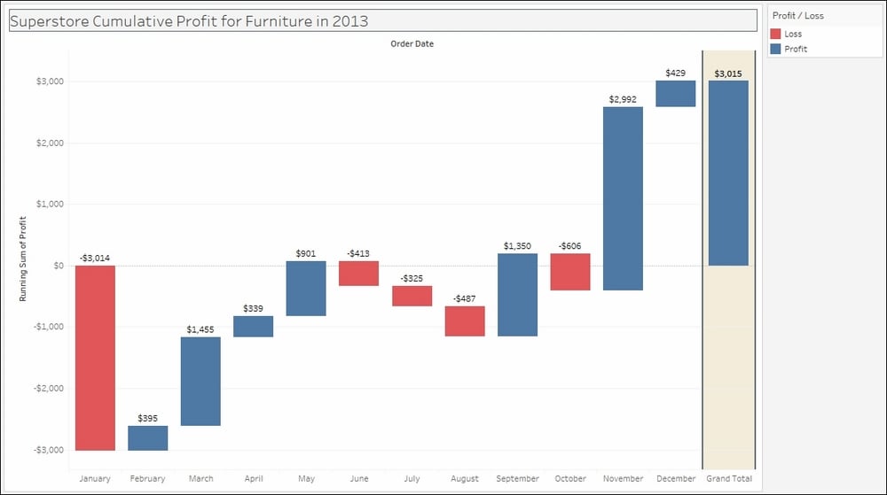
In this recipe, we will use the waterfall chart to show cumulative changes in profit for Furniture in the Superstore data set.
Getting ready
To follow this recipe, open B05527_02 – STARTER.twbx. Use the worksheet called Waterfall, and connect to the Orders (Sample – Superstore) data source.

How to do it...
The following are the steps to create a waterfall chart:
From Dimensions, drag Category to the Filters shelf.
In the next windows, under the General tab, select Furniture.
From Dimensions, drag Order Date to the Filters shelf.
When...


