Search icon CANCEL
Subscription
0
Cart icon
Your Cart (0 item)
Close icon
You have no products in your basket yet
Save more on your purchases! discount-offer-chevron-icon
Savings automatically calculated. No voucher code required.
Arrow left icon
Explore Products
Best Sellers
New Releases
Books
Videos
Audiobooks
Learning Hub
Free Learning
Arrow right icon
Arrow up icon
GO TO TOP
SAP BusinessObjects Dashboards 4.1 Cookbook

You're reading from   SAP BusinessObjects Dashboards 4.1 Cookbook Over 100 simple and incredibly effective recipes to help transform your static business data into exciting dashboards filled with dynamic charts and graphics

Arrow left icon
Product type Paperback
Published in Mar 2015
Publisher
ISBN-13 9781784391959
Length 452 pages
Edition 1st Edition
Concepts
Arrow right icon
Toc

Table of Contents (17) Chapters Close

Preface 1. Staying in Control FREE CHAPTER 2. Data Visualization 3. From a Static to an Interactive Dashboard 4. Dynamic Visibility 5. Using Alerts 6. Advanced Components 7. Dashboard Look and Feel 8. Dashboard Data Connectivity 9. Exporting and Publishing 10. Top Third-party Add-ons 11. Performance Tuning 12. Increasing Productivity A. Real-world Dashboard Case Studies B. Additional Resources – Supported Excel Functions and System/Software Requirements C. The Future of Dashboarding with SAP Design Studio Index

Using a pie chart


A pie chart is circular chart divided into one or more slices. Each slice represents the proportion of a value to the total of all values. Pie charts can be used to show the share of a value in contrast to other values or the grand total. However, it may be hard to compare the size of slices within a pie chart when there are more than three slices, or across other pie charts. Therefore, if you need to compare data, we recommend using a bar chart instead.

Getting ready

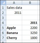
Open a new file in SAP BusinessObjects Dashboards and enter the data, as shown in the following screenshot, into the spreadsheet:
How to do it...

  1. Drag a Pie Chart component onto the canvas.

  2. Bind the Values field to spreadsheet cells B5 through B7.

  3. Bind the Labels field to cells A5 through A7.

  4. Bind the Chart field to cell A1 and the Subtitle field to cell B2:

  5. Preview the dashboard:

How it works...

We bound the fields from the General tab to the data in the spreadsheet, making this chart show the three labels and the...

lock icon The rest of the chapter is locked
Register for a free Packt account to unlock a world of extra content!
A free Packt account unlocks extra newsletters, articles, discounted offers, and much more. Start advancing your knowledge today.
Unlock this book and the full library FREE for 7 days
Get unlimited access to 7000+ expert-authored eBooks and videos courses covering every tech area you can think of
Renews at $19.99/month. Cancel anytime
Banner background image