Search icon CANCEL
Subscription
0
Cart icon
Your Cart (0 item)
Close icon
You have no products in your basket yet
Save more on your purchases now! discount-offer-chevron-icon
Savings automatically calculated. No voucher code required.
Arrow left icon
Explore Products
Best Sellers
New Releases
Books
Videos
Audiobooks
Learning Hub
Conferences
Free Learning
Arrow right icon
Arrow up icon
GO TO TOP
Python Data Analysis

You're reading from   Python Data Analysis Learn how to apply powerful data analysis techniques with popular open source Python modules

Arrow left icon
Product type Paperback
Published in Oct 2014
Publisher
ISBN-13 9781783553358
Length 348 pages
Edition 1st Edition
Languages
Tools
Arrow right icon
Author (1):
Arrow left icon
Ivan Idris Ivan Idris
Author Profile Icon Ivan Idris
Ivan Idris
Arrow right icon
View More author details
Toc

Table of Contents (17) Chapters Close

Preface 1. Getting Started with Python Libraries FREE CHAPTER 2. NumPy Arrays 3. Statistics and Linear Algebra 4. pandas Primer 5. Retrieving, Processing, and Storing Data 6. Data Visualization 7. Signal Processing and Time Series 8. Working with Databases 9. Analyzing Textual Data and Social Media 10. Predictive Analytics and Machine Learning 11. Environments Outside the Python Ecosystem and Cloud Computing 12. Performance Tuning, Profiling, and Concurrency A. Key Concepts
B. Useful Functions C. Online Resources
Index

Plotting in pandas


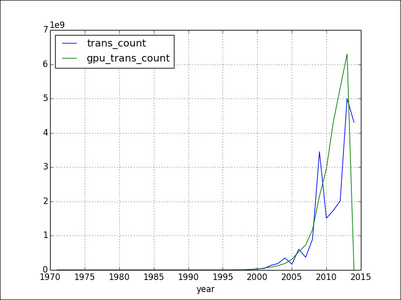
The plot() method in the pandas Series and DataFrame classes wraps around the related matplotlib functions. In its most basic form without any arguments, the plot() method displays the following plot for the dataset we have been using throughout this chapter:
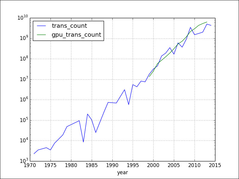
To create a semi-log plot, add the logy parameter:

df.plot(logy=True)

This results in the following plot for our data:
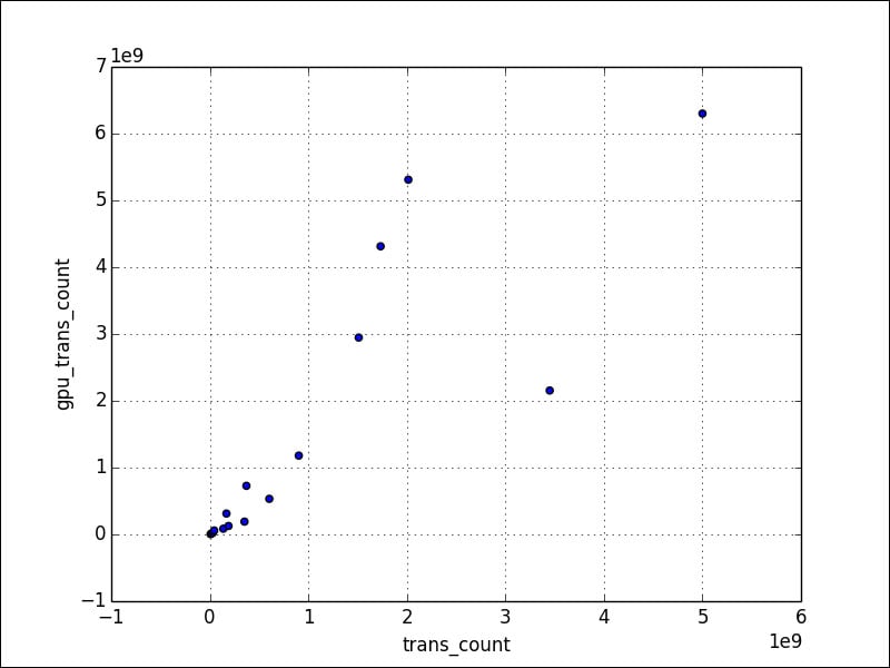
To create a scatter plot, specify the kind parameter to be scatter. We also need to specify two columns. Set the loglog parameter to True to produce a log-log graph (we need at least pandas 0.13.0 for this code):

df[df['gpu_trans_count'] > 0].plot(kind='scatter', x='trans_count', y='gpu_trans_count', loglog=True)

Refer to the following plot for the end result:
The following program is in the pd_plotting.py file in this book's code bundle:

import matplotlib.pyplot as plt
import numpy as np
import pandas as pd


df = pd.read_csv('transcount.csv')
df = df.groupby('year').aggregate(np.mean)

gpu = pd.read_csv...
lock icon The rest of the chapter is locked
Register for a free Packt account to unlock a world of extra content!
A free Packt account unlocks extra newsletters, articles, discounted offers, and much more. Start advancing your knowledge today.
Unlock this book and the full library FREE for 7 days
Get unlimited access to 7000+ expert-authored eBooks and videos courses covering every tech area you can think of
Renews at $19.99/month. Cancel anytime