Scientific visualization
At this point, we would like to introduce you to another resource that we will be using to generate graphs, namely the matplotlib libraries. It may be downloaded from its official web page, http://matplotlib.org/, and installed following the standard Python commands. There is a good online documentation in the official web page, and we encourage the reader to dig deeper than the few commands that we will use in this book. For instance, the excellent monograph Matplotlib for Python Developers, Sandro Tosi, Packt Publishing, provides all that we would need and more. Other plotting libraries are available (commercial or otherwise that aim to very different and specific applications. The degree of sophistication and ease of use of matplotlib makes it one of the best options to generate graphics in scientific computing.
Once installed, it may be imported using import matplotlib. Among all its modules, we will focus on pyplot that provides a comfortable interface with the plotting libraries. For example, if we desire to plot a cycle of the sine function, we could execute the following code snippet:
>>> import numpy
>>> import matplotlib.pyplot as plt
>>> x=numpy.linspace(0,2*numpy.pi,32)
>>> fig = plt.figure()
>>> plt.plot(x, numpy.sin(x))
>>> plt.show()
>>> fig.savefig('sine.png')
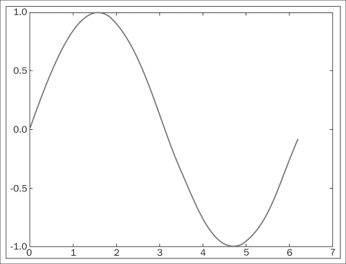
We obtain the following plot:

Let us explain each command from the previous session. The first two commands are used to import numpy and matplotlib.pyplot as usual. We define an array x of 32 uniformly spaced floating point values from 0 to 2π, and define y to be the array containing the sine of the values from x. The command figure creates space in the memory to store the subsequent plots and puts in place an object of the matplotlib.figure.Figure form. The plt.plot(x, numpy.sin(x)) command creates an object of the matplotlib.lines.Line2D form containing data with the plot of x against numpy.sin(x) together with a set of axes attached to it and labeled according to the ranges of the variables. This object is stored in the previous Figure object and is displayed on the screen via the plt.show()command. The last command in the session, fig.savefig(), saves the Figure object to whatever valid image format we desire (in this case, a Portable Network Graphics (PNG) image). From now on, in any code that deals with matplotlib commands, we will leave the option of showing/saving open.
There are, of course, commands that control the style of axes, aspect ratio between axes, labeling, colors, legends, the possibility of managing several figures at the same time (subplots), and many more features to display all sorts of data. We will be discovering these as we progress with examples throughout the book.


