Search icon CANCEL
Subscription
0
Cart icon
Your Cart (0 item)
Close icon
You have no products in your basket yet
Save more on your purchases now! discount-offer-chevron-icon
Savings automatically calculated. No voucher code required.
Arrow left icon
Explore Products
Best Sellers
New Releases
Books
Videos
Audiobooks
Learning Hub
Conferences
Free Learning
Arrow right icon
Arrow up icon
GO TO TOP
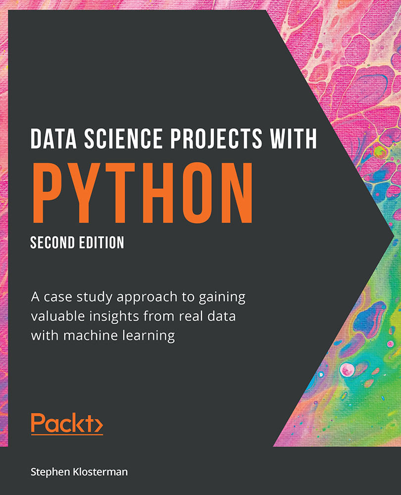
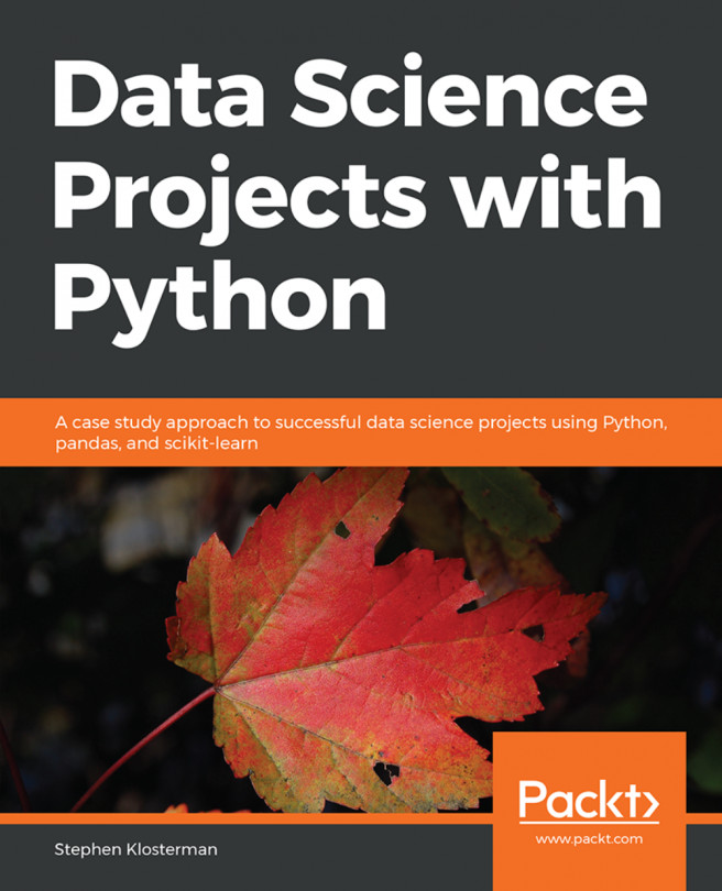
Data Science Projects with Python

You're reading from   Data Science Projects with Python A case study approach to gaining valuable insights from real data with machine learning

Arrow left icon
Product type Paperback
Published in Jul 2021
Publisher Packt
ISBN-13 9781800564480
Length 432 pages
Edition 2nd Edition
Languages
Arrow right icon
Author (1):
Arrow left icon
Stephen Klosterman Stephen Klosterman
Author Profile Icon Stephen Klosterman
Stephen Klosterman
Arrow right icon
View More author details
Toc

Table of Contents (9) Chapters Close

Preface
1. Data Exploration and Cleaning 2. Introduction to Scikit-Learn and Model Evaluation FREE CHAPTER 3. Details of Logistic Regression and Feature Exploration 4. The Bias-Variance Trade-Off 5. Decision Trees and Random Forests 6. Gradient Boosting, XGBoost, and SHAP Values 7. Test Set Analysis, Financial Insights, and Delivery to the Client Appendix

Data Quality Assurance and Exploration

So far, we remedied two data quality issues just by asking basic questions or by looking at the .info() summary. Let's now take a look at the first few columns of data. Before we get to the historical bill payments, we have the credit limits of the LIMIT_BAL accounts, and the SEX, EDUCATION, MARRIAGE, and AGE demographic features. Our business partner has reached out to us, to let us know that gender should not be used to predict credit-worthiness, as this is unethical by their standards. So we keep this in mind for future reference. Now we'll explore the rest of these columns, making any corrections that are necessary.

In order to further explore the data, we will use histograms. Histograms are a good way to visualize data that is on a continuous scale, such as currency amounts and ages. A histogram groups similar values into bins and shows the number of data points in these bins as a bar graph.

To plot histograms, we will start...

lock icon The rest of the chapter is locked
Register for a free Packt account to unlock a world of extra content!
A free Packt account unlocks extra newsletters, articles, discounted offers, and much more. Start advancing your knowledge today.
Unlock this book and the full library FREE for 7 days
Get unlimited access to 7000+ expert-authored eBooks and videos courses covering every tech area you can think of
Renews at $19.99/month. Cancel anytime