Building visualizations (Looks) from Explores
Explores are built by developers for creators so that creators don’t have to think about how to prepare the data, join tables, specify cache and so on. All they should do is choose their columns, and visualization types, add filters if needed, and save their work.
Looks are individual data visualizations or tables based on Explores that can be readily integrated into dashboards. Edits to a Look automatically update in all dashboards where it's included, ensuring consistent and accurate data. Note that it’s uncommon to save everything as a single Look and then add it to a dashboard. This approach makes folder organization difficult. Usually, you create a visualization within Explore and save it to a dashboard directly from Explore.
Getting ready
Make sure you are in the Explore environment (Figure 1.37). On the left, you have the columns available. They can be from one (in our case) or multiple tables joined. In the middle, you have three sections: Filters, Visualization, and Data. In the top-right corner, you have the gear icon and Run button. We’re currently in the Explore called Device Category Jan2021.
Let’s build our first Look.
How to do it...
The steps for this recipe are as follows:
- Make sure your columns are visible by clicking on the arrow to the right of Device Category Jan2021 to expand the list of columns (a field picker) in the left panel.
- Click on the Device Category column and you will see it appear in the Results panel in the middle of the screen (Figure 1.38).
- Expand the Session Date list of columns in the right panel and click on Date.
- Then, click on Nb of Sessions, and in the top-right corner, click on Run to send the request to your BigQuery data warehouse. You will then obtain the table with the results (Figure 1.38).
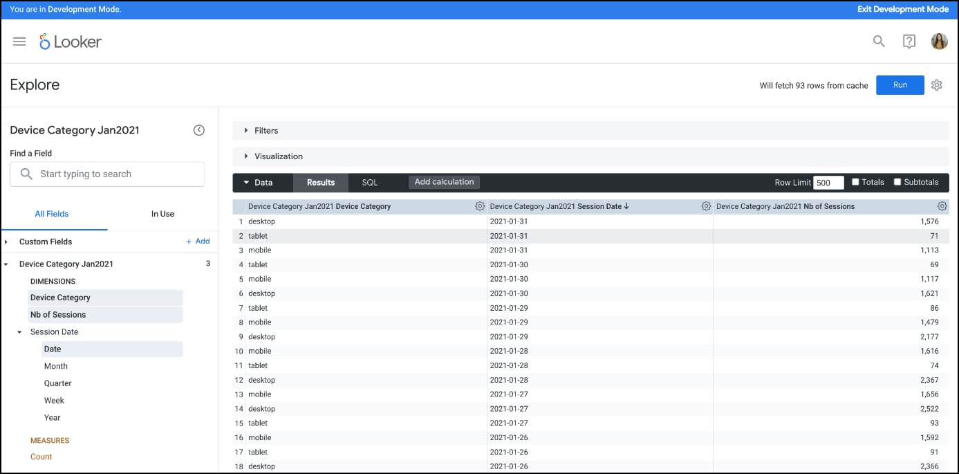
Figure 1.38 – Query results
- Expand the Visualization section by clicking on it. The visualization you’ll see probably will not make any sense; we’ll work on our columns and visualization to show something meaningful.
- At this stage, our Nb of Sessions column is located in DIMENSIONS and not MEASURES so Looker probably doesn’t read it as quantitative data. If you click on the three dots near your Nb of Sessions column, you will see available options to modify the column. Click on Aggregate and then on Sum (Figure 1.39). This will create a custom field called
Sum of Nb of Sessions. While Looker developers typically fill the field picker by creating dimensions and measures in the LookML project, custom fields let you create your own dimensions and measures in Explores. Custom fields you add won’t be saved permanently within the data model.
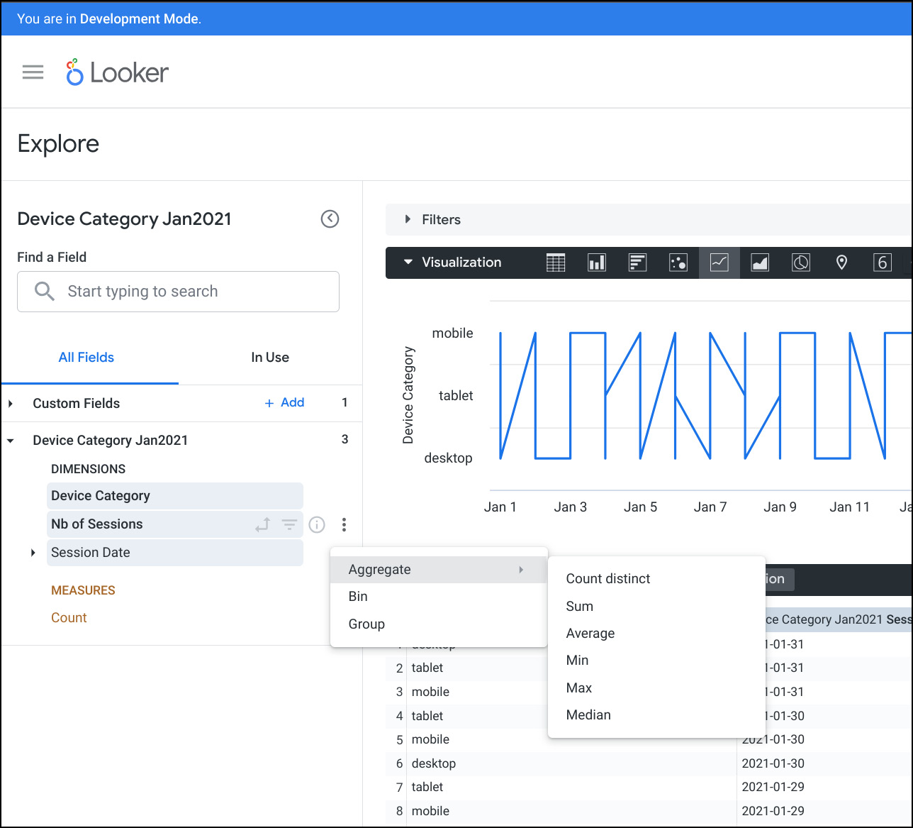
Figure 1.39 – Dimension to measure
- Let’s restart our Look (visualization) creation by first removing the columns we chose before. Click on the gear icon near your column name in the Results section, then click on Remove (Figure 1.40).
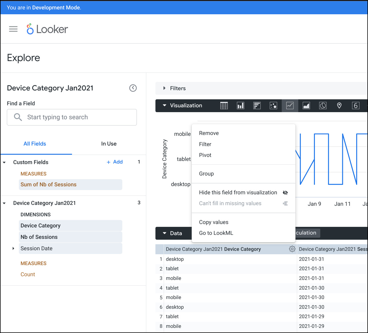
Figure 1.40 – Managing columns
- Once you have cleaned the Results table by removing the columns, click on the Device Category and Sum of Nb of Sessions columns in your left panel to make them appear in the Results table, and click on Run to populate the data.
- Once the data is there, in the Visualization panel in the Column visualization (the second icon after the word Visualization), you will see a column chart visualization appear on your screen (Figure 1.41).
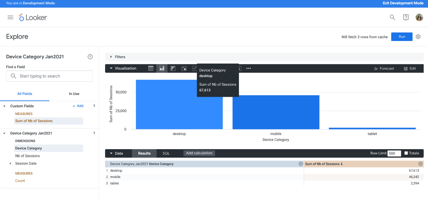
Figure 1.41 – Visualization
- Click on the gear icon near the Run button and choose Save… and As a Look (Figure 1.42). Give it the name
Nb of Sessions per Deviceand click on Save.
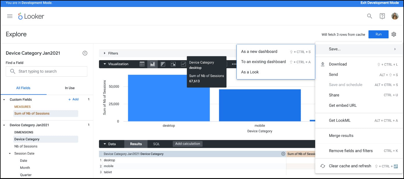
Figure 1.42 – Managing the created Look
- Now, let’s create another visualization (Look). Remove Device Category from the Results panel and click on Session Date and then Date. Our goal here is to see the evolution of the number of sessions per day. Once you have your two columns, Date and Sum Nb of Sessions, click on Run.
- In the Visualization panel, choose the Line visualization and you will see the evolution of the number of sessions per day in your graphic (Figure 1.43). As a reminder, sessions = visits to the website.
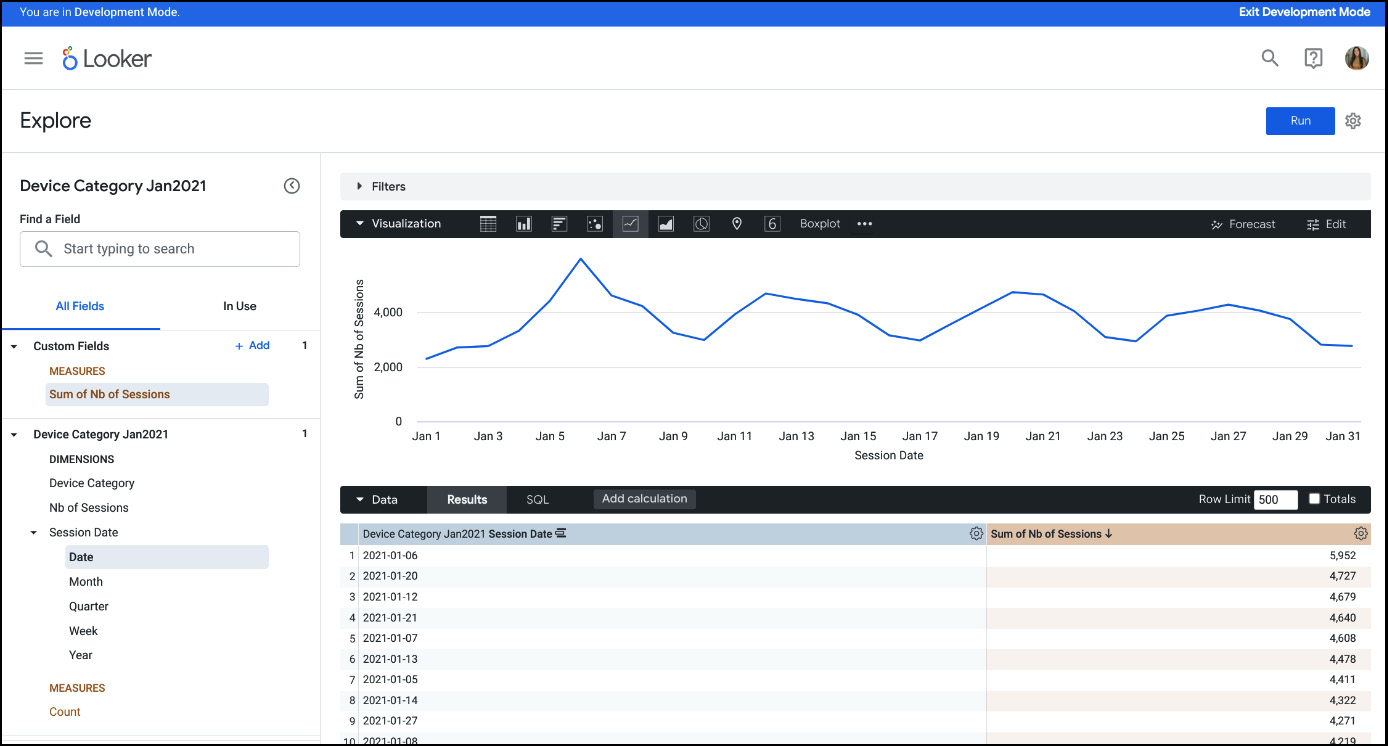
Figure 1.43 – Line visualization
- Save this visualization as a Look with the title
Nb of Sessionsper Day. - Go to the home page (by clicking on the Looker logo in the top-left corner).
- Click on Folders and then My folder in the left panel (Figure 1.44) to verify that your Looks were created.

Figure 1.44 – Folders
How it works...
Explores are usually created by the LookML developers (data engineers, Looker admin, and so on) so that analysts can build their dashboards using the available prepared columns in the Explore space. In this recipe, we created Looks (visualizations) from the columns that were available thanks to the work that has been done in the LookML space. Every time we choose a combination of columns and click Run, Looker, in the backend, launches an SQL query to our database or data warehouse. The way Looker connects to the data, reads the data, does the joins, and so on – all that is specified in our LookML project.


