Creating bar charts
Bar charts visually represent data in a way that makes comparisons of value across different categories easy. Length of the bar is the primary means by which you will visually understand the data. You may also incorporate color, size, stacking, and order to communicate additional attributes and values.
Creating bar charts in Tableau is quite easy. Simply drag and drop the measure you want to see on either the Rows or Columns shelf and the dimension that defines the categories onto the opposing Rows or Columns shelf.
As an analyst for the Superstore, you are ready to begin a discovery process focused on sales (especially the dollar value of sales). As you follow the examples, work your way through the sheets in the Chapter 01 Starter.twbx workbook. The Chapter 01 Complete.twbx workbook will contain the complete example, so you can compare your results at any time:
- Navigate to the
Sales by Departmentsheet (view). - Drag and drop the
Salesfield fromMeasuresin the data pane to theColumnsshelf. You now have a bar chart with a single bar representing the sum of sales for all the data in the data source. - Drag and drop the
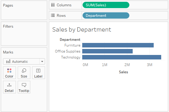
Departmentfield fromDimensionsin the data pane to theRowsshelf. This slices the data to give you three bars, representing the sum of sales for each department:

You now have a horizontal bar chart. This makes the comparison of sales between the departments easy. Notice how the mark type in the drop-down menu on the Marks card is set to Automatic and shows an indication that Tableau has determined that bars are the best visualization given the fields you have placed in the view. As a discrete dimension, the Department field defines row headers for each department in the data. As a continuous measure, the Sales field is defining an axis with the length of the bar extending from 0 to the value of the sum of sales for each department.
Note
Typically, Tableau draws a mark (bar, shape, circle, square, and so on.) for every intersection of dimensional values in the view. In this simple case, Tableau is drawing a single bar mark for each dimensional value (Furniture, Office Supplies, and Technology) of Department. The type of mark is indicated and can be changed in the drop-down-menu on the Marks card. The number of marks drawn in the view can be observed on the lower-left status bar. Tableau draws different marks in different ways. For example, bars are drawn from 0 (or the end of the previous bar, if stacked) along the axis. Circles and other shapes are drawn at locations defined by the value(s) of the field defining the axis. Take a moment to experiment with selecting different mark types from the dropdown on the Marks card. Having an understanding of how Tableau draws different mark types will help you master the tool.
Iterations of bar charts for deeper analysis
Using the preceding bar chart, you can easily see that the Technology department has more total sales than either Furniture or Office Supplies, which has fewer total sales compared to any other department. What if you want to further understand sales amounts for departments across various regions?
- Navigate to the
Bar Chart (two levels)sheet where you will find an initial view identical to the one you created previously.
- Drag the
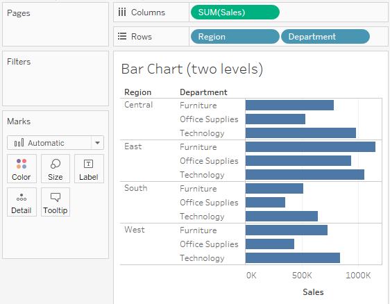
Regionfield fromDimensionsin the data pane to theRowsshelf and drop it to the left of theDepartmentfield already in the view, as shown:

You still have a horizontal bar chart. But now you've introduced Region as another dimension that changes the level of detail in the view and further slices the aggregate of the sum of Sales. By placing Region before Department, you will be able to easily compare sales for each department within a given region.
Now you are starting to make some discoveries. For example, the Technology department has the most sales in every region, except in the East where Furniture has higher sales. Office Supplies never has the highest sales in any region.
Let's take a look at a different view, using the same fields arranged differently:
- Navigate to the
Bar Chart (stacked)sheet where you will find an initial view identical to the one you created previously. - Drag the
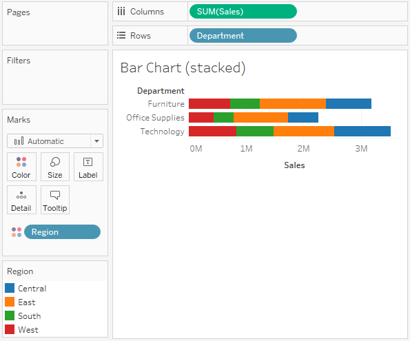
Regionfield from theRowsshelf and drop it on theColorshelf:

Instead of a side-by-side bar chart, you now have a stacked bar chart. Notice how each segment of the bar is color-coded by the Region field. Additionally, a color legend has been added to the workspace. You haven't changed the level of detail in the view, so sales is still summed for every combination of region and department.
Note
The Level of Detail or View Level of Detail is a key concept when working with Tableau. In the most basic visualizations, the combination of values of all the dimensions in the view defines the lowest level of detail for that view. All measures will be aggregated or sliced by the lowest level of detail. In the case of most basic views, the number of marks (indicated in the lower-left corner of the status bar) corresponds to the number of intersections of dimensional values. If Department is the only field used as a dimension, you will have a view at the department level of detail and all measures in the view will be aggregated as per the department. If Region is the only field used as a dimension, you will have a view at the region level of detail and all measures in the view will be aggregated as per the region. If you use both Department and Region as dimensions in the view, you will have a view at the level of department and region. All measures will be aggregated per the unique combination of department and region.
Stacked bars are useful when you want to understand part-to-whole relationships. It is now fairly easy to see what portion of the total sales of each department is made in each region. However, it is very difficult to compare sales for most of the regions across departments. For example, can you easily tell which department had the highest sales in the East region? It is difficult because, with the exception of West, every segment of the bar has a different starting place.
Now, take some time to experiment with the bar chart to see what variations you can create:
- Navigate to the
Bar Chart (experimentation)sheet. - Try dragging the
Regionfield fromColorto the other shelves on theMarkscard, such asSize,Label, andDetail. Observe that in each case, the bars remain stacked but are redrawn based on the visual encoding defined by theRegionfield. - Use the
Swapbutton on the toolbar to swap fields onRowsandColumns. This allows you to very easily change from a horizontal bar chart to a vertical bar chart (and vice versa):

- Drag and drop
Salesfrom theMeasuressection of the data pane on top of theRegionfield on theMarkscard to replace it. Drag theSalesfield toColorif necessary and notice how the color legend is a gradient for the continuous field. - Further experiment by dragging and dropping other fields onto various shelves. Note the behavior of Tableau for each action you take.
- From the
Filemenu, selectSave.
Note
At the time of writing of this book, Tableau does not have an autosave feature. You will want to get in the habit of saving the workbook early and then pressing Ctrl + S or selecting Save from the File menu often to avoid losing your work.


