Let's make some design tweaks before we jump into making our layout work for every device and start to get this app more polished.
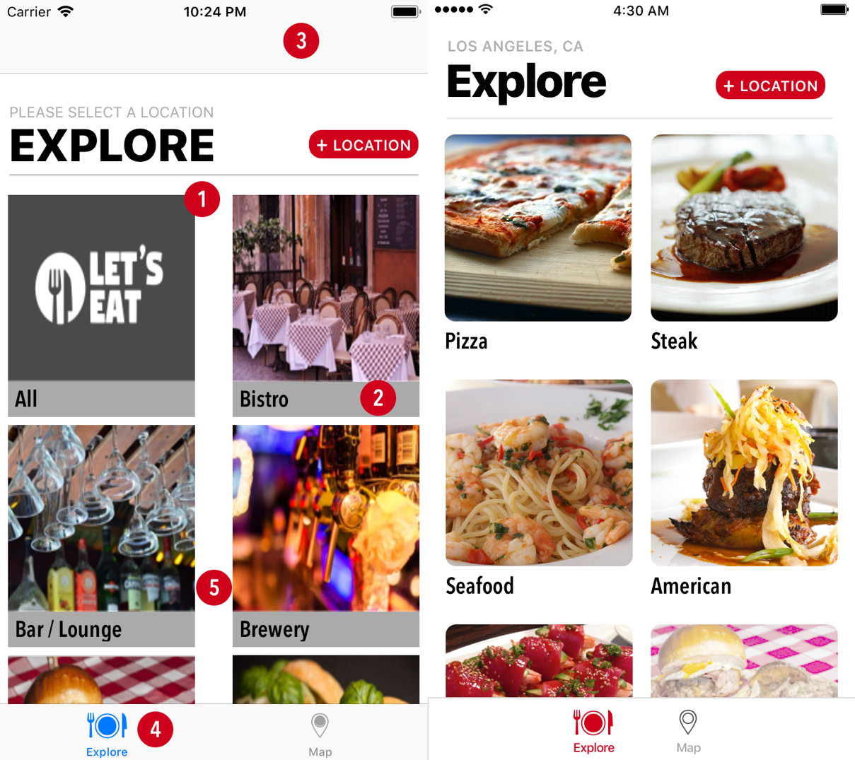
Let's compare what we can see on an iPhone 8 with the original design:

There are a few things we need to fix:
- Implement rounded corners
- Remove the gray background
- The navigation bar is being displayed
- Tab bar color
- Spacing
We will fix all of these, but we will focus on the first four right now. We have rounded corners in our photo filter list. We can implement these here. Open the ExploreCell.swift file by hitting command + shift + O, type ExploreCell, and hit enter. Add the following extension:
private extension ExploreCell {
    func roundedCorners() {
        imgExplore.layer.cornerRadius = 9
        imgExplore.layer.masksToBounds = true
    }
}
Add a roundedCorners() call inside the layoutSubviews method:
override func layoutSubviews...


