Search icon CANCEL
Subscription
0
Cart icon
Your Cart (0 item)
Close icon
You have no products in your basket yet
Arrow left icon
Explore Products
Best Sellers
New Releases
Books
Videos
Audiobooks
Learning Hub
Free Learning
Arrow right icon
Arrow up icon
GO TO TOP
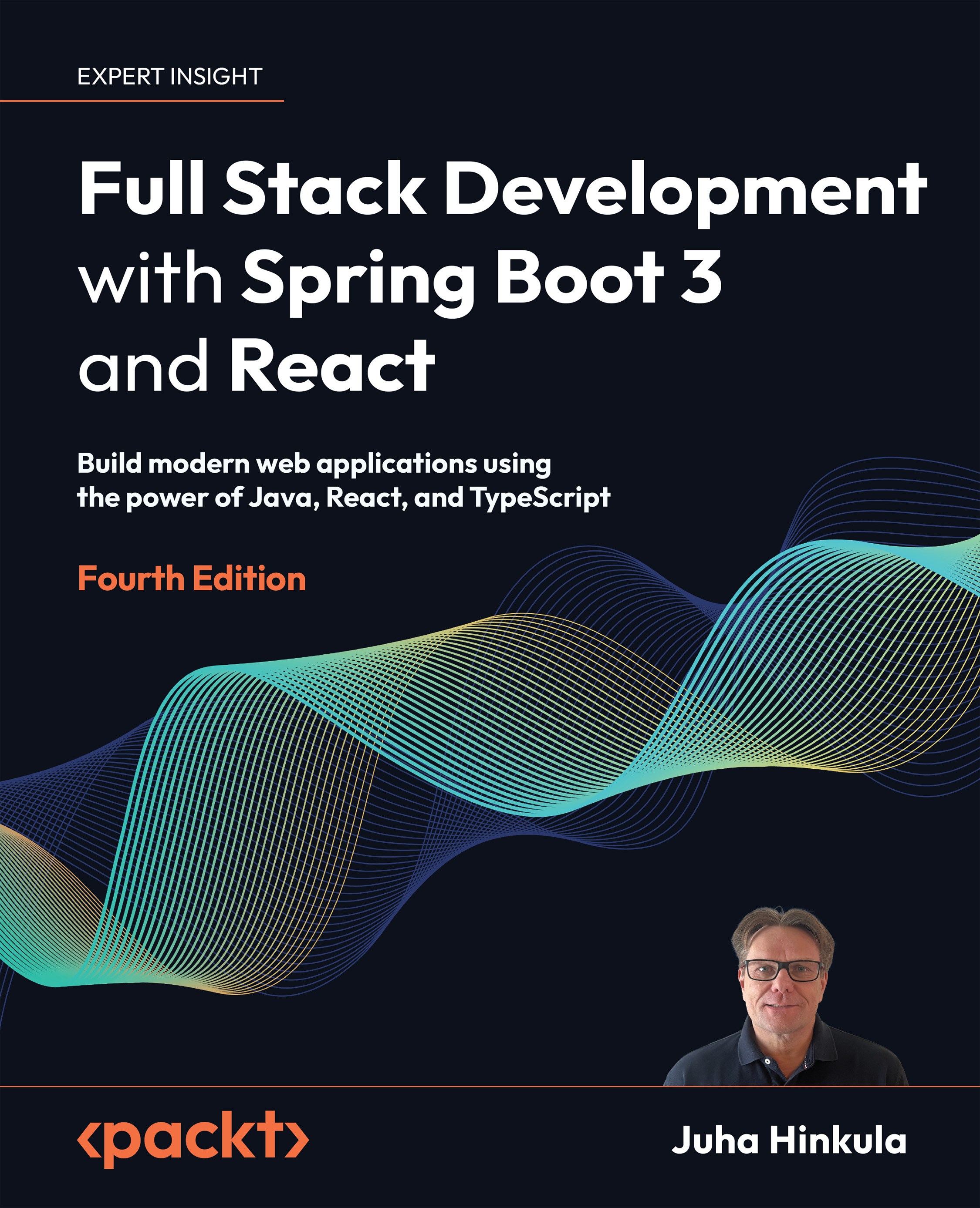
Full Stack Development with Spring Boot 3 and React

You're reading from   Full Stack Development with Spring Boot 3 and React Build modern web applications using the power of Java, React, and TypeScript

Arrow left icon
Product type Paperback
Published in Oct 2023
Publisher Packt
ISBN-13 9781805122463
Length 454 pages
Edition 4th Edition
Languages
Tools
Arrow right icon
Author (1):
Arrow left icon
Juha Hinkula Juha Hinkula
Author Profile Icon Juha Hinkula
Juha Hinkula
Arrow right icon
View More author details
Toc

Table of Contents (23) Chapters Close

Preface 1. Part I: Backend Programming with Spring Boot
2. Setting Up the Environment and Tools – Backend FREE CHAPTER 3. Understanding Dependency Injection 4. Using JPA to Create and Access a Database 5. Creating a RESTful Web Service with Spring Boot 6. Securing Your Backend 7. Testing Your Backend 8. Part II: Frontend Programming with React
9. Setting Up the Environment and Tools – Frontend 10. Getting Started with React 11. Introduction to TypeScript 12. Consuming the REST API with React 13. Useful Third-Party Components for React 14. Part III: Full Stack Development
15. Setting Up the Frontend for Our Spring Boot RESTful Web Service 16. Adding CRUD Functionalities 17. Styling the Frontend with MUI 18. Testing React Apps 19. Securing Your Application 20. Deploying Your Application 21. Other Books You May Enjoy
22. Index

Using the MUI Button component

Our frontend already uses some Material UI components, such as AppBar and Dialog, but we are still using a lot of HTML elements without any styling. First, we will replace HTML button elements with the Material UI Button component.

Execute the following steps to implement the Button component in our New car and Edit car modal forms:

  1. Import the MUI Button component into the AddCar.tsx and EditCar.tsx files:
    // AddCar.tsx & EditCar.tsx
    import Button from '@mui/material/Button';
    
  2. Change the buttons to use the Button component in the AddCar component. We are using 'text' buttons, which is the default Button type.

    If you want to use some other button type, such as 'outlined', you can change it by using the variant prop (https://mui.com/material-ui/api/button/#Button-prop-variant).

    The following code shows the AddCar component’s return statements with the changes...

lock icon The rest of the chapter is locked
Register for a free Packt account to unlock a world of extra content!
A free Packt account unlocks extra newsletters, articles, discounted offers, and much more. Start advancing your knowledge today.
Unlock this book and the full library FREE for 7 days
Get unlimited access to 7000+ expert-authored eBooks and videos courses covering every tech area you can think of
Renews at $19.99/month. Cancel anytime
Banner background image