Don’t Try to Depict a New Idea with an Existing Icon
Occasionally, you will need to invent a whole new icon. If the concept you’re trying to describe is novel, then your users will need an icon that doesn’t confuse them by referencing another idea. It needs to be new, yet recognizable, and mappable to a real-world example. If this sounds difficult to you, that’s because it is.
Thankfully, the need to create an entirely new icon is rare because most of the concepts in your app will be better served by existing UX patterns and UI conventions, but there may be a case where you have a new concept.
The middle ground here (using an existing icon to depict a new concept) is the worst of all worlds: it’s confusing for users who have seen the icon before in other products, with a different meaning behind it.

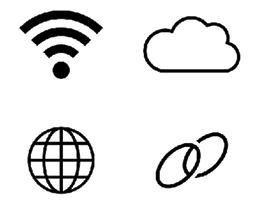
Figure 36.1: Spare a thought for these poor folks...
Some of the most misused icons in this category are:
- The WiFi &...


