For you beginners out there, we're going to take this chapter nice and slow, with more hand-holding than you'll get later in this book. Even if you already know Unity and have developed your own games, it may be worthwhile to revisit the fundamental concepts, since the rules are sometimes different when designing for virtual reality.
Exploring the Unity Editor
The Unity Editor consists of multiple nonoverlapping windows, or panels, that may be subdivided into panes. The following is a screenshot of a project with the default window layout, annotated to identify some of the panels: (1) Hierarchy, (2) Scene, (3) Inspector, and (4) Project:
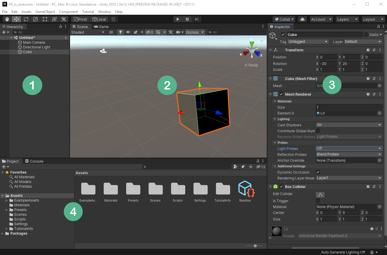
A Unity project consists of one or more scenes, containing a hierarchy of game objects. In the preceding screenshot, I have just created a new default empty scene (File | New Scene) and added a 3D cube (GameObject | 3D Object | Cube). The Hierarchywindow (1) shows the contents of the current scene in a hierarchical tree view. The current scene in the screenshot contains a Main Camera and a Directional Light, and we've added a Cube. As we'll see, objects can be nested with children objects to form nested parent–child object structures.
The Scene window (2) is a graphic rendering of this scene, where you can visually compose the 3D space of the current scene, including the placement of objects. There are interactive gizmos in this window for manipulating objects’ positions, rotations, and scales.
In the preceding screenshot, there are additional windows of interest, although we can only see their tabs. Behind theScenewindow (2) is a Game view, which displays what the in-game camera sees. When you pressPlay(the play triangle in the top-center toolbar), the running app is played in the Game view window.
Presently in this scene, the Cube is selected, permitting its properties to be examined in the Inspector window (3). Game objects can be given Components (such as Transform, MeshRenderer, and Box Collider, shown in the preceding screenshot) that define the behavior of the object. And each component has specific properties that can be edited in the Inspector. For example, our Cube is positioned at the origin (0, 0, 0) and rotated along the XYZ axes by (-20, 20, 0) degrees. These Transform properties are shown in the following screenshot:

TheProjectwindow (4) shows the asset files on your hard drive, in the project'sAssets/folder, which can be used in any of the project scenes. These include various reusable graphics, audio, scripts, and so on that, you've imported into the project, as well as those you'll create along the way.
Behind theProjectwindow (4) is aConsolewindow, which shows messages from Unity, including warnings and errors from code scripts. TheConsolewindow is very important during development, so you should try to arrange it so that it is always visible during development.
Note that each window (and each component in the Inspector window) has a three-dot-icon context menu with additional item-specific options—for example, in the Inspector's context menu you can choose between Normal and Debug views. In the Transform component's context menu, you can Reset the transform values, and in the Console window's context menu, you can access detailed player and editor log files, as shown in the following screenshot:

At the top is the main menu bar (on a Mac, this will be at the top of your screen, not at the top of the Unity window), and a toolbar area with various controls that we'll use later on, including the Play (triangle icon) button that starts Play mode.
In the main menu, the Assets menu lets you create, import, and manage assets in your ProjectAssets ( the same as the +create button atop the Project window). The GameObject menu lets you add new objects to the current scene (like the + create button atop the Hierarchy window). The Component menu lets you add component behaviors to the currently selected object (the same as the Add Component button in the Inspector window). From the menu bar's Window menu, you can open additional windows as needed. Go ahead—click and explore these now.
The editor's user interface is configurable—each window can be rearranged, resized, and tabbed by grabbing one of the panel tabs and dragging it or even completely undocking it from the editor itself. On the upper right-hand side is a Layout selector that lets you either choose between various default layouts or save your own preferences.
Like most professional design and development applications, the Unity editor has a lot to it. The key to not getting overwhelmed is to focus on justthe functions you are using at the moment and basically ignore the rest until you need them. That is how I'll present Unity throughout this book. Let's start by creating and reviewing a new, empty scene.
Understanding the default new scene
Start a new scene in Unity as follows:
- Using the main menu at the top of the editor, select File.
- Then, from the menu, select New Scene.
A default empty Unity scene consists of a Main Camera object and a single Directional Light object. These are listed in the Hierarchy window and depicted in the Scene window. The Scene window also shows a perspective of an infinite reference ground plane grid, like a piece of graph paper with nothing on it. The grid spans across the x (red) and z (blue) axes. The y axis (green) is the vertical axis.
The Inspector window shows the details of the currently selected item. Select the Directional Light with your mouse, either from the Hierarchy list or within the scene itself, and look at the Inspector window for each of the properties and components associated with the object, including its transform. An object's transform specifies its position, rotation, and scale in the 3D world space. For example, a Position of (0, 3, 0) is three units above (in the Y direction) the center of the ground plane (X = 0, Z = 0). A Rotation of (50, 330, 0) means that it's rotated 50 degrees around the x-axis and 330 degrees around the y-axis (the same as -30, since 360 is a full circle). As you'll see, you can change an object's Transform values numerically here or directly with the mouse in the Scene window.
Similarly, if you click on the Main Camera, it may be located at the (0, 1, -10) position with no rotation—that is, pointed straight ahead, towards the positive Z direction. If the Game window is visible, you'll see the camera view rendered there.
Unity provides a rich set of scene-editing tools, including built-in grid and snapping features, which we'll look at next.
Using grid and snap
Unity provides a grid system to visualize and snap. You have control over the grid displayed in the Scene view. It is for editing only, and so is not part of the Game view. It's accessed using the Grid Visibility button at the top of the Scene view. You can control which plane to grid (X, Y, or Z) and the opacity of the grid lines, as shown in the following screenshot:

The three-dot-icon menu opens the Grid and Snap settings window to show more controls:

You can see the default Grid and Snap settings in the preceding screenshot. The visual grid size is set to 1 unit (normally meters). When snap is enabled, moving an object will snap to 0.25 units on any axis, rotations will be snapped to 15 degrees, and scaling will be snapped in increments of 1.
To enable snapping, toggle theGrid Snappingbutton (the icon with a grid and magnet) so that it's enabled. Note that you'll also need to haveGlobal handlesenabled (the Global icon to the left of the Grid Snapping one), as shown in the following screenshot:

As you grow more familiar with Unity, you'll continue to configure and refine its settings to your liking.
A couple more options
Next, we'll add a couple of settings that I like for any new project. Consider these tips and suggestions. Among the settings I like for any new project are the following two:
- Personalized windows layout
- Play mode editor color
Personally, I prefer my editor layout to have the scene Hierarchy window adjacent to the Inspector window, and I like the Console window to be visible all the time. In the layout shown in the following screenshot, for example, there's a column on the left with the Scene, Game, and Console windows (top to bottom). The center column contains the Hierarchy and Project windows. On the right is the Inspector, with tabs for Lighting, Project Settings, and other less frequently used windows:

You can save the layout configuration using the Layout dropdown menu in the upper-right of the editor, as shown in the following screenshot. With this, you can readily switch between layouts:

In Unity, when you press Play and the scene is running, it's convenient to have visual feedback to show that you are in Play Mode. This is important because the changes you make to a GameObject in the Inspector are not preserved after you exit Play mode, so it's good to be reminded of the mode. Although the triangular Play button is highlighted, I like to use a more prominent reminder by changing the background color. You can set the editor play mode color as follows:
- Open the Preferences window (Edit | Preferences...).
- Select the Colors tab on the left.
- Modify the Playmode tint color—for example, I like a reddish tint, which is listed as #EAC4B2, as shown in the following screenshot:

Now that you have Unity installed and have walked through an introduction on how to use it to create and edit 3D scenes, let's build a simple diorama scene.


