Search icon CANCEL
Subscription
0
Cart icon
Your Cart (0 item)
Close icon
You have no products in your basket yet
Save more on your purchases! discount-offer-chevron-icon
Savings automatically calculated. No voucher code required.
Arrow left icon
Explore Products
Best Sellers
New Releases
Books
Videos
Audiobooks
Learning Hub
Newsletter Hub
Free Learning
Arrow right icon
timer SALE ENDS IN
0 Days
:
00 Hours
:
00 Minutes
:
00 Seconds
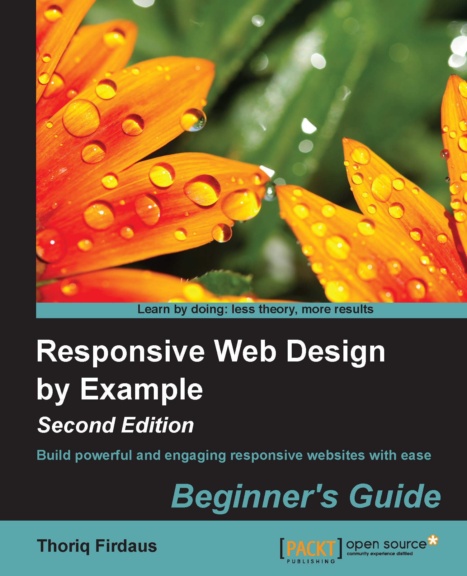
Responsive Web Design by Example : Beginner's Guide - Second Edition

Responsive Web Design by Example : Beginner's Guide - Second Edition: Build powerful and engaging responsive websites with ease , Second Edition

eBook
€8.99 €29.99
Paperback
€36.99
Subscription
Free Trial
Renews at €18.99p/m

What do you get with eBook?

Product feature icon Instant access to your Digital eBook purchase
Product feature icon Download this book in EPUB and PDF formats
Product feature icon Access this title in our online reader with advanced features
Product feature icon DRM FREE - Read whenever, wherever and however you want
OR
Modal Close icon
Payment Processing...
tick Completed

Billing Address

Table of content icon View table of contents Preview book icon Preview Book

Responsive Web Design by Example : Beginner's Guide - Second Edition

Chapter 1. Responsive Web Design

I still remember, back when I was a kid, a mobile phone came with a mere tiny size monochromatic screen. All we could do at that time was make a phone call, text, and play a simple game. Today, mobile devices have drastically advanced in many ways.

New mobile devices are built with varying screen sizes; some even come with higher DPI or resolution. Most new mobile devices are now equipped with a touch-enabled screen, allowing us to interact with the device conveniently using a tap or a swipe of fingers. The screen orientation is switchable between portrait and landscape. The software is also more capable compared to older devices. The mobile browser, in particular, is now able to render and display web pages that are as good as a browser in a desktop computer.

In addition, the number of mobile users has exploded in the last couple of years. We can now see many people around spending countless hours facing their mobile devices, a phone, or a tablet, doing things such as running their businesses on the go or simple Internet browsing. The number of mobile users is likely to grow in the years to come and may even outnumber the total number of desktop users.

That is to say, mobiles have changed the Web and changed the way people use the Internet and enjoy websites. These advancements in mobile devices and the increasing mobile Internet usage prompts questions on a new paradigm to build websites that are accessible and function well in varying circumstances. This is where Responsive Web Design comes in.

In this chapter, we will cover the following topics:

  • Glance at the basics of responsive web design, viewport meta tag, and CSS3 media queries
  • Take a look at the responsive frameworks that we will use to build responsive websites in the following chapters

Responsive web design in a nutshell

Responsive web design is one of the most discussed topics in the web design and development community. So, I believe many of you have heard about it to a certain extent.

Ethan Marcotte was the one who coined the term "responsive web design". He suggests in his article Responsive Web Design (http://alistapart.com/article/responsive-web-design/), that the Web should seamlessly adjust and adapt to the environment where the users view the website rather than addressing it exclusively for a specific platform. In other words, the website should be responsive, it should be presentable on any screen size, regardless of the platform on which it is viewed.

Take the Time website (http://time.com/) as an example. The web page fits nicely on a desktop browser with a large screen size and also on a mobile browser with a limited viewable area. The layout shifts and adapts as the viewport size changes. As you can see in the following screenshot, on the mobile browser, the background color of the header is dark grey, the image is scaled down proportionally, and the Tap bar appears where Time hides the latest news, magazine, and videos sections:

Responsive web design in a nutshell

There are two components to build responsive websites, namely, viewport meta tag and media queries.

Viewport meta tag

Before smartphones, such as the iPhone, became mainstream, every website was built to be around 1000 px in width or 980 px wide and it was zoomed out to fit into the mobile phone screen, which eventually made the website unreadable. Hence, the <meta name="viewport"> was created.

In a nutshell, the viewport meta tag is used to define the web page scale and its visible area (viewport) in the browser. The following code is an example of a viewport meta tag in action:

<meta name="viewport" content="width=device-width, initial-scale=1">

The preceding viewport meta tag specification defines the web page viewport width to follow the device. It also defines the web page scale upon opening the web page for the first time at 1:1, in a way that the sizes and the dimensions of the web page content should be persistent; they should not be scaled up or scaled down.

In favor of comprehending how the viewport meta tag would affect a web page layout, I have created two web pages for comparison; one with the viewport meta tag added in and the other one without it. You can see the difference in the following screenshot:

Viewport meta tag

The first website shown in the preceding image is issued with the viewport meta tag using the exact same specification as in our previous code example. As we have specified width=device-width, the browser acknowledges that the website viewport is at the same size as the device screen, so that it will not squish the web page to fit in the entire screen. The initial-scale=1 will retain the title and the paragraph in their original size.

In the second website's example, as we did not add the viewport meta tag, the browser assumed that the web page should be displayed entirely. So, the browser forced the whole website down to fit within the whole screen area, making the title and the text totally unreadable.

A word on screen size and viewport

You may have found on many web design forums or blogs that viewport and screen size are mentioned interchangeably quite often. But, as a matter of fact, they are two different things.

Screen size refers to the device's actual screen size. A 13-inch laptop, for example, commonly has a screen size of 1280*800 pixels. The viewport, on the other hand, describes the viewable area in the browser where it displays websites. The following diagram illustrates this:

A word on screen size and viewport

Media queries

The media types module in CSS enables us to target style rules to specific media. If you have created a print style sheet before, you certainly are familiar with the concept of media types. CSS3 introduced a new media type called media queries, which allow us to apply styles within the specified range of the viewport width, also known as breakpoints.

The following is one simple example; we decrease the p font size from 16px to 14px of the website when the website's viewport size is at 480px or lower.

p { 
font-size: 16px;
}
@media screen and (max-width: 480px) {
p {
    font-size: 14px;
}
} 

The following diagram illustrates the preceding code:

Media queries

We can also combine multiple ranges of viewport widths by using the and operator. Following our preceding example, we can set the p font size to 14px when the viewport size is between 480px and 320px in the following manner:

@media screen and (min-width: 320px) and (max-width: 480px) {
p {
font-size: 11px;
  }
}

Note

Viewport and media queries references

We will be dealing with viewport meta tag and media queries while building responsive websites. Packt Publishing has published a dedicated book, Responsive Web Design with HTML5 and CSS3, Ben Frein, Packt Publishing, which covers these two in greater detail. I would like to suggest reading it as a companion and complement to this book.

A look into responsive frameworks

Building a responsive website can be very tedious work. There are many measurements to be considered while building a responsive website, one of which would be creating the responsive grid.

The grid helps us build websites with proper alignment. If you have ever used 960.gs (http://960.gs/), which is one of the popular CSS frameworks, you would have experienced how easy it is to organize the web page layout by adding preset classes, such as grid_1 or push_1, in the elements.

However, the 960.gs grid is set in a fixed unit, namely, pixel (px), which is not applicable when it comes to building a responsive website. We need a framework with the grid set in percentage (%) unit to build responsive websites; we need a responsive framework.

A responsive framework provides the building blocks to build responsive websites. Generally, it includes the classes to assemble a responsive grid, the basic styles for typography and form inputs, and a few styles to address various browser quirks. Some frameworks even go further with a series of styles to create common design patterns and web user interfaces such as buttons, navigation bars, and image slider. These predefined styles allow us to develop responsive websites faster with less hassle. The following are a few other reasons why using a responsive framework is a favorable option to build responsive websites:

  • Browser compatibility: Assuring the consistency of a web page on different browsers is really painful and more distressing than developing the website itself. However, with a framework, we can minimize the work to address browser compatibility issues. The framework developers have most likely tested the framework on various desktop browsers and mobile browsers with the most constrained environment prior to releasing it publicly.
  • Documentation: A framework, in general, also comes with comprehensive documentation that records the bits and pieces on using the framework. The documentation will be very helpful for entry users to begin studying the framework. It is also a great advantage when we are working with a team. We can refer to the documentation to get everyone on the same page and follow the standard code of writing conventions.
  • Community and extensions: Some popular frameworks such as Bootstrap and Foundation have an active community that helps address the bugs in the framework and extends the functionality. The jQuery UI Bootstrap (http://jquery-ui-bootstrap.github.io/jquery-ui-bootstrap/) is perhaps a good example in this case. The jQuery UI Bootstrap is a collection styles for jQuery UI widgets to match the feel and look of Bootstrap's original theme. It's now common to find free WordPress and Joomla themes that are based on these frameworks.

Through the course of this book, we will be building three responsive websites by using three different responsive frameworks, namely Responsive.gs, Bootstrap, and Foundation.

The Responsive.gs framework

Responsive.gs (http://responsive.gs/) is a lightweight, responsive framework, which is merely 1 KB in size when compressed. Responsive.gs is based on a width of 940 px, and made in three variants of grids, that is, 12, 16, and 24 columns. What's more, Responsive.gs is shipped with box-sizing polyfill, which enables CSS3 box-sizing in Internet Explorer 6, 7, and 8, and makes it decently presentable in those browsers.

Note

Polyfill is a piece of code that enables certain web features and capabilities that are not built in the browser natively. Usually, it addresses the older versions of Internet Explorer. For example, you can use HTML5Shiv (https://github.com/aFarkas/html5shiv) so that new HTML5 elements, such as <header>, <footer>, and <nav>, are recognized in Internet Explorer 6, 7, and 8.

A word on CSS box model

HTML elements, which are categorized as block-level elements, are essentially boxes drawn with the content width, height, margin, padding, and border through CSS. Prior to CSS3, we were facing constraints when specifying a box. For instance, when we specify a <div> tag with a width and height of 100px, as follows:

div { 
  width: 100px;
  height: 100px;
}

The browser will render div as a 100px square box, as shown in the next diagram:

A word on CSS box model

However, this will only be true if the padding and border have not been added in. As a box has four sides, a padding of 10px (padding: 10px;) will actually add 20px to the width and height—10px for each side, as shown in the following diagram:

A word on CSS box model

While it takes up space on the page, the element's margin space is reserved outside the element rather than as part of the element itself; thus, if we give an element a background color, the margin area will not take that color.

CSS3 box sizing

CSS3 introduced a new property called box-sizing, which lets us specify how the browser should calculate the CSS box model. There are a couple of values that we can apply within the box-sizing property.

Value

Description

content-box

This is the default value of the box model. This value specifies the padding and the border-box's thickness outside the specified width and height of the content, as we have demonstrated in the preceding section.

border-box

This value will do the opposite of what the content-box does; it includes the padding and the border box as the width and height of the box.

padding-box

At the time of writing this book, this value is experimental and has just been added recently. This value specifies the box dimensions.

In each of the projects in this book, we will be using the border-box value so that we can determine the box dimensions with ease for the websites. Let's take our preceding example to understand this, but this time we will set the box-sizing model to border-box. As mentioned in the preceding table, the border-box value will retain the box's width and the height as 100px, regardless of the padding and border addition. The following illustration shows a comparison between the outputs of the two different values, content-box (the default value) and border-box:

CSS3 box sizing

In this book, we will use Responsive.gs and explore more of it in the next two chapters to build a simple responsive blog.

The Bootstrap framework

Bootstrap (http://getbootstrap.com/) was originally built by Mark Otto (http://markdotto.com/) and initially intended only for internal use on Twitter. In short, Bootstrap was then launched for free for public consumption.

Note

Bootstrap has long been associated with Twitter, but since the author has departed from Twitter and Bootstrap itself has grown beyond his expectations, Bootstrap now stands on its own brand (http://blog.getbootstrap.com/2012/09/29/onward/).

If you refer to the initial development, the responsive feature was not yet added. It was then added in Version 2 due to the increasing demand for creating responsive websites.

Bootstrap also comes with many more added features as compared to Responsive.gs. It is packed with preset user interface styles, which comprise common user interfaces used on websites such as buttons, navigation bars, pagination, and forms, so you don't have to create them from scratch again when starting a new project. On top of that, Bootstrap is also powered with some custom jQuery plugins such as image slider, carousel, popover, and modal box.

You can use and customize Bootstrap in many ways. You can directly customize the Bootstrap theme and its components directly through the CSS style sheets, the Bootstrap customize and download page (http://getbootstrap.com/customize/), or the Bootstrap LESS variables and mixins, which are used to generate the style sheets.

In this book, we will go into Bootstrap in Chapter 5, Developing a Portfolio Website with Bootstrap, and Chapter 6, Polishing the Responsive Portfolio Website with LESS, to build a responsive portfolio website.

The Foundation framework

Foundation (http://foundation.zurb.com/) is a framework created by ZURB, a design agency based in California. Similar to Bootstrap, Foundation is not just a responsive CSS framework; it is shipped with a preset grid, components, and a number of jQuery plugins to present interactive features.

Some high-profile brands, such as McAfee (http://www.mcafee.com/common/privacy/english/slide.html), which is one of the most respectable brands for computer antivirus, have built their websites using Foundation.

The Foundation style sheet is powered by Sass, a Ruby-based CSS preprocessor. We will be discussing more about Sass, along with the Foundation features in the last two chapters of this book; therein, we will be developing a responsive website for a startup company.

Tip

There are many complaints that the code in responsive frameworks is excessive; as a framework such as Bootstrap is used widely, it has to cover every design scenario and thus, it comes with some extra styles that you might not need for your website. Fortunately, we can easily minimize this issue by using the right tools, such as CSS preprocessors, and following a proper workflow.

Frankly, there isn't a perfect solution; and using a framework certainly isn't for everyone. It all comes down to your needs, your website's needs, and in particular, your client's needs and budgets. In reality, you will have to weigh these factors to decide whether you will go with a responsive framework or not. Jem Kremer has an extensive discussion in this regard in her article Responsive Design Frameworks: Just Because You Can, Should You? (http://www.smashingmagazine.com/2014/02/19/responsive-design-frameworks-just-because-you-can-should-you/)

A brief introduction to CSS preprocessors

Both Bootstrap and Foundation use CSS preprocessors to generate their style sheets. Bootstrap uses LESS (http://lesscss.org/)—though the official support for Sass has just been released recently. Foundation, on the contrary, uses Sass as the only way to generate its style sheets (http://sass-lang.com/).

CSS preprocessor is not an entirely new language. If you have known CSS, you should be accustomed to the CSS preprocessor immediately. The CSS preprocessor simply extends CSS by allowing the use of programming features such as variables, functions, and operations.

The following is an example of how we write CSS with the LESS syntax:

@color: #f3f3f3;

body {
  background-color: @color;
}
p {
  color: darken(@color, 50%);
}

Tip

Downloading the example code

You can download the example code files from your account at http://www.packtpub.com for all the Packt Publishing books you have purchased. If you purchased this book elsewhere, you can visit http://www.packtpub.com/support and register to have the files e-mailed directly to you.

When the preceding code is compiled, it takes the @color variable that we have defined and places the value in the output, as follows:

body {
  background-color: #f3f3f3;
}
p {
  color: #737373;
}

The variable is reusable throughout the style sheet and this enables us to retain style consistency and make the style sheet more maintainable.

We are going to use and explore CSS preprocessors, LESS, and Sass further during the course of building responsive websites with Bootstrap (Chapter 5, Developing a Portfolio Website with Bootstrap and Chapter 6, Polishing the Portfolio Website with LESS) and Foundation (Chapter 7, A Responsive Website for Business with Foundation, and Chapter 8, Extending Foundation).

Have a Go Hero — delve into responsive web design

Our discussion on responsive web design here, though essential, is merely the tip of the iceberg. There is so much more about responsive web design than what we have recently covered in the preceding sections. I would suggest that you take your time to get yourself more insight and remove any apprehension on responsive web design, including the concept, the technicalities, and some constraints.

The following are some of the best recommendations for references:

Pop Quiz — responsive web design main components

Q1. In his article, which we have referred to about two times in this chapter, Ethan Marcotte mentioned the main technical ingredients that formulate a responsive website. What are those main components?

  1. Viewport Meta Tag and CSS3 Media Queries.
  2. Fluid grids, flexible images, and media queries.
  3. Responsive images, breakpoints, and polyfills.

Q2. What is a viewport?

  1. The screen size of the device.
  2. The region where the web page is rendered.
  3. The meta tag to set the web page's viewport size.

Q3. Which one of these is the correct way to declare CSS3 Media Queries?

  1. @media (max-width: 320px) { p{ font-size:11px; }}
  2. @media screen and (max-device-ratio: 320px) { div{ color:white; }}
  3. <link rel="stylesheet" media="(max-width: 320px)" href="core.css" />

Responsive web design inspiration sources

Now, before we jump into the next chapters and start building responsive websites, it may be a good idea to spend some time looking for ideas and inspiration for responsive websites; to see how they are built and how the layout is organized on desktop browsers, as well as on mobile browsers.

It's a common thing for websites to be redesigned from time to time to stay fresh. So, instead of making a pile of website screenshots, which may no longer be relevant in the next several months because of the redesign, we're better going straight to the websites that curate websites, and the following are the places to go:

Summary

In this chapter, we glanced at the short story behind responsive web design, as well as the viewport meta tag and CSS3 media queries, which formulate responsive websites. This chapter also concluded that we are going to work on three projects by using the following frameworks: Responsive.gs, Bootstrap, and Foundation.

Using a framework is an easier and faster way to get responsive websites up and running, rather than building everything from scratch on our own. Alas, as mentioned, using a framework also has some negative aspects. If it is not done properly, the end result could all go wrong. The website could be stuffed and stuck with unnecessary styles and JavaScript, which at the end makes the website load slowly and hard to maintain.

We need to set up the right tools; not only will they facilitate the projects, but they will also help us in making the website more easy to maintain, and this is what we are going to do in the next chapter.

Left arrow icon Right arrow icon

Description

This is the ideal reference for both new and existing web developers who want to be able to augment their skills and showcase their content in a truly professional manner.

What you will learn

  • Use Responsive Grid System, Bootstrap, and Foundation frameworks for responsive web design
  • Build a semantic website structure with HTML5 elements
  • Determine the responsive website persona with CSS3
  • Harness the power of CSS preprocessor to compose programmable and more maintainable CSS
  • Customize and extend responsive design frameworks
  • Use Bower to organize website dependencies
  • Learn how to decide which framework best suits your project specification

Product Details

Country selected
Publication date, Length, Edition, Language, ISBN-13
Publication date : Nov 25, 2014
Length: 258 pages
Edition : 2nd
Language : English
ISBN-13 : 9781783553266
Languages :

What do you get with eBook?

Product feature icon Instant access to your Digital eBook purchase
Product feature icon Download this book in EPUB and PDF formats
Product feature icon Access this title in our online reader with advanced features
Product feature icon DRM FREE - Read whenever, wherever and however you want
OR
Modal Close icon
Payment Processing...
tick Completed

Billing Address

Product Details

Publication date : Nov 25, 2014
Length: 258 pages
Edition : 2nd
Language : English
ISBN-13 : 9781783553266
Languages :

Packt Subscriptions

See our plans and pricing
Modal Close icon
€18.99 billed monthly
Feature tick icon Unlimited access to Packt's library of 7,000+ practical books and videos
Feature tick icon Constantly refreshed with 50+ new titles a month
Feature tick icon Exclusive Early access to books as they're written
Feature tick icon Solve problems while you work with advanced search and reference features
Feature tick icon Offline reading on the mobile app
Feature tick icon Simple pricing, no contract
€189.99 billed annually
Feature tick icon Unlimited access to Packt's library of 7,000+ practical books and videos
Feature tick icon Constantly refreshed with 50+ new titles a month
Feature tick icon Exclusive Early access to books as they're written
Feature tick icon Solve problems while you work with advanced search and reference features
Feature tick icon Offline reading on the mobile app
Feature tick icon Choose a DRM-free eBook or Video every month to keep
Feature tick icon PLUS own as many other DRM-free eBooks or Videos as you like for just €5 each
Feature tick icon Exclusive print discounts
€264.99 billed in 18 months
Feature tick icon Unlimited access to Packt's library of 7,000+ practical books and videos
Feature tick icon Constantly refreshed with 50+ new titles a month
Feature tick icon Exclusive Early access to books as they're written
Feature tick icon Solve problems while you work with advanced search and reference features
Feature tick icon Offline reading on the mobile app
Feature tick icon Choose a DRM-free eBook or Video every month to keep
Feature tick icon PLUS own as many other DRM-free eBooks or Videos as you like for just €5 each
Feature tick icon Exclusive print discounts

Frequently bought together


Stars icon
Total 120.97
Responsive Web Design with HTML5 and CSS3, Second Edition
€41.99
AngularJS Web Application Development Blueprints
€41.99
Responsive Web Design by Example : Beginner's Guide - Second Edition
€36.99
Total 120.97 Stars icon
Banner background image

Table of Contents

10 Chapters
1. Responsive Web Design Chevron down icon Chevron up icon
2. Web Development Tools Chevron down icon Chevron up icon
3. Constructing a Simple Responsive Blog with Responsive.gs Chevron down icon Chevron up icon
4. Enhancing the Blog Appearance Chevron down icon Chevron up icon
5. Developing a Portfolio Website with Bootstrap Chevron down icon Chevron up icon
6. Polishing the Responsive Portfolio Website with LESS Chevron down icon Chevron up icon
7. A Responsive Website for Business with Foundation Chevron down icon Chevron up icon
8. Extending Foundation Chevron down icon Chevron up icon
A. Pop Quiz Answers Chevron down icon Chevron up icon
Index Chevron down icon Chevron up icon

Customer reviews

Rating distribution
Full star icon Full star icon Full star icon Full star icon Half star icon 4.7
(3 Ratings)
5 star 66.7%
4 star 33.3%
3 star 0%
2 star 0%
1 star 0%
A. Zubarev Feb 16, 2015
Full star icon Full star icon Full star icon Full star icon Full star icon 5
As a data practitioner and BI person I am always looking for ways to present my data more visually appealing and yet easy to share. With the advance of the internet technologies and the introduction of the HTML5 standard in particular it became increasingly easier to create sophisticated,professionally looking single page websites rich in content delivering insights in realtime.Responsive Web Design by Example book met my expectations in my attempts to grasp with and build some foundation to delivering 21st Century web experience to my users. This relatively long book for beginners is actually covering a lot of ground. From setting your web development shop tools to embarking on enterprise grade Foundation Framework which is used by the most prominent companies, to using Koala and compiled CSS.The journey though was not without some small hiccups where bower would not function on my Ubuntu (https://github.com/joyent/node/issues/3911 provides the workaround), nevertheless, going through the book was pure fun. Thoriq does provide excellent support to his readers. The tools selection was tasteful and carefully chosen. The reader will build several stunning websites the author calls simple (well for me it was pure art).The most important aspects of the book I realize are the old IE polyfills and the use of Koala, the second most important item would be minimized/compressed JavaScript libraries and then LESS (CSS enhancers). The book also covers all the needed nuances to when it comes to building portable/mobile device friendly web sites, this is a must nowadays to account for small viewports. Bower, NodeJS are covered, but I would take courage to say not deep enough, but hey it is a beginner’s book, besides, Packt has a number of books on the latter. Let me stress that out: I suggest extra reading on NodeJS because it is the cornerstone of many single page web applications.The book does not stop at implementing the basics, but shows how to extend a framework. I suggest the reader should concentrate on the Foundation Framework the most because out of all it looks like being the most likely used at your next project or be in demand on the market.Good book for those starting in the enterprise web development.Excellent job Thoriq and Packt Publishing, I am giving this book a 5 out of 5!
Amazon Verified review Amazon
Philip Arad Feb 06, 2015
Full star icon Full star icon Full star icon Full star icon Full star icon 5
Responsive web design is one of the most important topics in web development nowadays.Due to the huge volume of different device sizes and resolutions, any website is expected to be responsive in order to make it presentable on any screen size, on desktop, phones and tablets.If you want to learn the principles of responsive web design, the new book'Responsive Web Design by Example : Beginner's Guide' by Thoriq Firdaus from Packt Publishing is the book you are looking for.This book will teach you how to build presentable, responsive websites through examples, tips, and best practices of code writing and project organization.You will learn to:* Use Responsive Grid System, Bootstrap, and Foundation for responsive web design* Build a semantic website structure with HTML5 elements* Determine the responsive website persona with CSS3* Harness the power of CSS preprocessor to compose CSS* Customize and extend responsive design frameworks* Use Bower to organize website dependencies* Learn how to decide which framework best suits your project specification in DetailBy following the detailed step-by-step instructions in this book, you can elevate your web site to adapt it to the new era of mobile.
Amazon Verified review Amazon
john cable Jun 01, 2015
Full star icon Full star icon Full star icon Full star icon Empty star icon 4
Worthwhile update to the original - now using Responsive.js instead of Skeleton for the intro stuff. Unfortunately, suffers from same issue as original: some of the steps are missing to make the code work, particularly with Responsive.jsStill a good intro to responsive web design and the examples have been freshened up from the first edition.
Amazon Verified review Amazon
Get free access to Packt library with over 7500+ books and video courses for 7 days!
Start Free Trial

FAQs

How do I buy and download an eBook? Chevron down icon Chevron up icon

Where there is an eBook version of a title available, you can buy it from the book details for that title. Add either the standalone eBook or the eBook and print book bundle to your shopping cart. Your eBook will show in your cart as a product on its own. After completing checkout and payment in the normal way, you will receive your receipt on the screen containing a link to a personalised PDF download file. This link will remain active for 30 days. You can download backup copies of the file by logging in to your account at any time.

If you already have Adobe reader installed, then clicking on the link will download and open the PDF file directly. If you don't, then save the PDF file on your machine and download the Reader to view it.

Please Note: Packt eBooks are non-returnable and non-refundable.

Packt eBook and Licensing When you buy an eBook from Packt Publishing, completing your purchase means you accept the terms of our licence agreement. Please read the full text of the agreement. In it we have tried to balance the need for the ebook to be usable for you the reader with our needs to protect the rights of us as Publishers and of our authors. In summary, the agreement says:

  • You may make copies of your eBook for your own use onto any machine
  • You may not pass copies of the eBook on to anyone else
How can I make a purchase on your website? Chevron down icon Chevron up icon

If you want to purchase a video course, eBook or Bundle (Print+eBook) please follow below steps:

  1. Register on our website using your email address and the password.
  2. Search for the title by name or ISBN using the search option.
  3. Select the title you want to purchase.
  4. Choose the format you wish to purchase the title in; if you order the Print Book, you get a free eBook copy of the same title. 
  5. Proceed with the checkout process (payment to be made using Credit Card, Debit Cart, or PayPal)
Where can I access support around an eBook? Chevron down icon Chevron up icon
  • If you experience a problem with using or installing Adobe Reader, the contact Adobe directly.
  • To view the errata for the book, see www.packtpub.com/support and view the pages for the title you have.
  • To view your account details or to download a new copy of the book go to www.packtpub.com/account
  • To contact us directly if a problem is not resolved, use www.packtpub.com/contact-us
What eBook formats do Packt support? Chevron down icon Chevron up icon

Our eBooks are currently available in a variety of formats such as PDF and ePubs. In the future, this may well change with trends and development in technology, but please note that our PDFs are not Adobe eBook Reader format, which has greater restrictions on security.

You will need to use Adobe Reader v9 or later in order to read Packt's PDF eBooks.

What are the benefits of eBooks? Chevron down icon Chevron up icon
  • You can get the information you need immediately
  • You can easily take them with you on a laptop
  • You can download them an unlimited number of times
  • You can print them out
  • They are copy-paste enabled
  • They are searchable
  • There is no password protection
  • They are lower price than print
  • They save resources and space
What is an eBook? Chevron down icon Chevron up icon

Packt eBooks are a complete electronic version of the print edition, available in PDF and ePub formats. Every piece of content down to the page numbering is the same. Because we save the costs of printing and shipping the book to you, we are able to offer eBooks at a lower cost than print editions.

When you have purchased an eBook, simply login to your account and click on the link in Your Download Area. We recommend you saving the file to your hard drive before opening it.

For optimal viewing of our eBooks, we recommend you download and install the free Adobe Reader version 9.