Grid flow
So far, we’ve seen elements being placed by CSS Grid with the same rule: it starts from the top left and fills the grid with elements, row by row, to the bottom right. However, there’s a way that we can control how CSS Grid places new items within the grid, which is called grid-auto-flow.
The possible values for this function are set out here:
row(the default value): This fills elements row by row, from left to right. If an element does not have enough space to be placed in a row, it is moved to the next one.column: Behaves the same asrow, except for the direction—it will fill columns first, top to bottom, and move to the next column once the previous one is full.dense: Tries to fill in any holes in the grid, no matter their placement. This is interesting if we have many different-sized elements that need no particular order, such as randomized mood images on restaurant websites.row denseandcolumn dense: These values are combinations of the previous three. They will first try to fill in rows and columns, respectively, and then fill any resulting holes. Sincerowis the default value,row denseis equivalent to just usingdense.
Let’s inspect how the different values behave. For that, we’ll have a look at this code:
<style>  .container {
    display: grid;
    grid-template-columns: 100px 100px 100px 100px 100px;
    grid-template-rows: 100px 100px 100px 100px
      100px 100px;
  }
  .container > div {
    background-color: darkblue;
    display: flex;
    justify-content: center;
    align-items: center;
    color: #ffffff;
    font-size: 24px;
    font-weight: bold;
  }
  .large {
    grid-column-end: span 2;
    grid-row-end: span 2;
  }
</style>
<div class="container">
  <div class="small">1</div>
  <div class="large">2</div>
  <div class="large">3</div>
  <div class="large">4</div>
  <div class="large">5</div>
  <div class="small">6</div>
  <div class="small">7</div>
  <div class="small">8</div>
  <div class="small">9</div>
  <div class="small">10</div>
  <div class="small">11</div>
  <div class="small">12</div>
  <div class="small">13</div>
</div>
This code will create a 5x6 grid with equally sized, quadratic cells. This contains thirteen squares, composed of nine small (1x1) and four large (2x2) squares. Because of the lack of space, we use an extra row for any spill-over grid cells we might have.
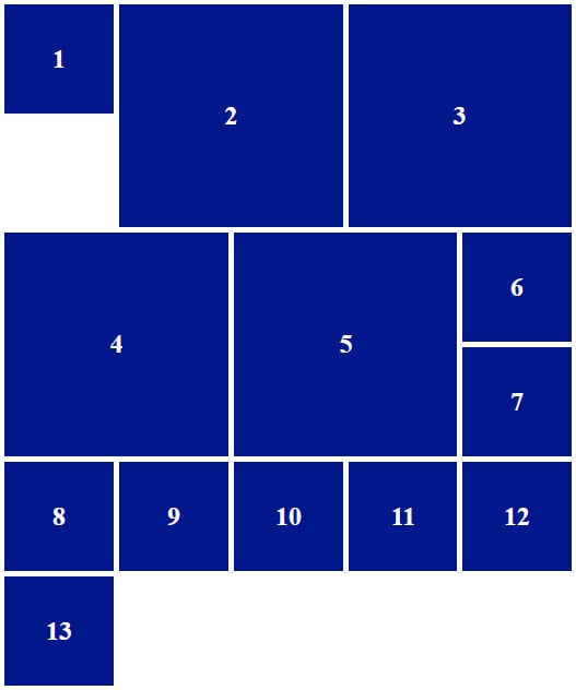
We told CSS Grid to first add a small square, then add four large ones, and then add the other eight small ones. We have not defined the grid-auto-flow property for now, so it defaults to row. Therefore, CSS Grid will start with the first row, add the small square, then two large ones, and then go to the second row, notice that there’s not enough space, move on to the third row, add two more large ones, and then fill the rest up with small ones. And indeed, it does:

Figure 1.15 – CSS Grid arranging squares by rows
There is a noticeable gap in the top left of the grid. Also, the extra row we’ve added has proven useful by housing the extra square.
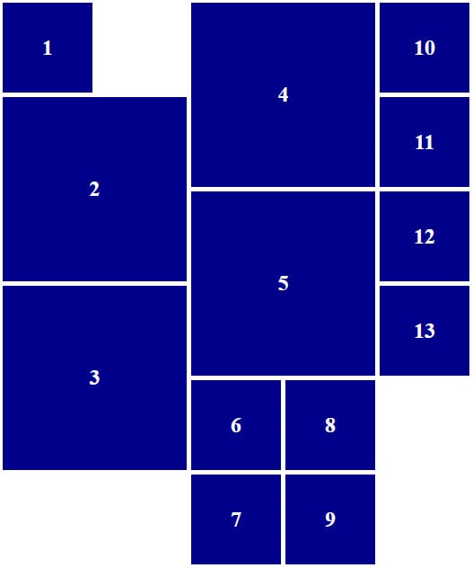
We can expect roughly the same behavior if we swap the value of grid-auto-flow from rows to columns:

Figure 1.16 – CSS Grid arranging squares by columns
Now, we’ve ended up with three gaps. Since CSS Grid cannot fit the third large square, it moves to the second column and repeats the filling process.
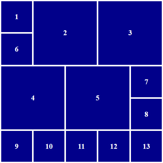
Those gaps are annoying, though, aren’t they? With dense, we can tell CSS Grid to fill these gaps. The plain value of dense is only a short form of row dense, so we don’t need to differentiate those cases. However, it will produce a—well, dense layout:

Figure 1.17 – CSS Grid arranging squares in a dense grid by rows
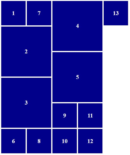
A dense column layout, achieved by using column dense, works the same way:

Figure 1.18 – CSS Grid arranging squares in a dense grid by columns
The layout is similar: some parts are rotated and mirrored, and the rest is filled up, column by column. Thinking about it, we can get pretty artsy with grids. Maybe there’s some pixel art made with CSS Grid out there—who knows?
Grid flow gives us even more control over how a grid behaves, should we not know its content in advance. Think of user-generated content or randomly selected items. Grid flow fills any resulting gaps for us and guarantees a pretty grid.


