Search icon CANCEL
Subscription
0
Cart icon
Your Cart (0 item)
Close icon
You have no products in your basket yet
Save more on your purchases! discount-offer-chevron-icon
Savings automatically calculated. No voucher code required.
Arrow left icon
Explore Products
Best Sellers
New Releases
Books
Videos
Audiobooks
Learning Hub
Newsletter Hub
Free Learning
Arrow right icon
timer SALE ENDS IN
0 Days
:
00 Hours
:
00 Minutes
:
00 Seconds
Arrow up icon
GO TO TOP
Learn Chart.js

You're reading from   Learn Chart.js Create interactive visualizations for the Web with Chart.js 2

Arrow left icon
Product type Paperback
Published in Feb 2019
Publisher
ISBN-13 9781789342482
Length 284 pages
Edition 1st Edition
Languages
Tools
Arrow right icon
Author (1):
Arrow left icon
Helder da Rocha Helder da Rocha
Author Profile Icon Helder da Rocha
Helder da Rocha
Arrow right icon
View More author details
Toc

Table of Contents (9) Chapters Close

Preface 1. Introduction FREE CHAPTER 2. Technology Fundamentals 3. Chart.js - Quick Start 4. Creating Charts 5. Scales and Grid Configuration 6. Configuring Styles and Interactivity 7. Advanced Chart.js 8. Other Books You May Enjoy

Data visualization

Visual representations provide data with contexts that stimulate the viewer's brain, revealing information that is usually not obvious from tabular data. It's normally much more natural to capture the substantive content of data using visual artifacts. Charts and maps are a powerful, clear, and effective means to tell stories through data. They can pack huge quantities of information in small spaces and make it easier to compare data, provide insights, and reveal trends, relationships, causality, and other patterns hidden in the numbers.

Charts reveal and emphasize data by attracting the viewer's attention. They can simplify complex data sets to foster discovery and comprehension, helping viewers to analyze and reason about data in different contexts. But they can also exaggerate, mislead, and even lie. A visually attractive chart is important, but designers should discover how to achieve a balance between form and function.

Data visualization is both an art and a science. A chart does not need to explain everything. It doesn't always have to be precise. It may be directed toward a specific audience, which should provide the context necessary to understand and decode it.

Chart types

Data visualization usually refers to the visual display of quantitative information, as in statistical and information charts, plots, data maps, and so on. but it can include any kind of visual representation of data, such as mathematical graphics, path networks (subway systems, roads, electronic circuit diagrams), word clouds, musical and sound representations, timelines, geographical information systems, chemical and atomic diagrams, or any other way of coding of data using visual artifacts.

You can create any type of visualization if you use a data-driven library such as D3.js. A charting library such as Chart.js, which comes with a set of pre-configured formats, is more limited, but much easier to use.

Chart.js supports eight basic types of chart:

  • Bar (horizontal and vertical)
  • Line/area (including stacked)
  • Radar (radial line)
  • Polar area (radial bar)
  • Scatter
  • Bubble
  • Pie
  • Doughnut

It doesn't offer support for network diagrams, trees, or geographical maps, but you can create Chart.js visualizations that share data with other graphics. In Chapter 4, Creating Charts, we will create a bubble chart, representing populations of cities around the world, and plot them on a map with Chart.js.

Choosing a chart

Choosing a chart requires knowing your data. Charts are a means of communication aimed at revealing information, so the main question is: what do you want to show? Once you've answered that question, you should analyze your data and discover what kind of data you have. Data values used in visualizations can usually be classified as one of these three types:

  • Quantitative: A value that can be measured or counted (a number, a length, an area, an angle)
  • Ordinal: A value can be ranked or compared (color saturation, area, angle, length, words)
  • Nominal: A category (a name)

What is the purpose of you chart? Do you wish to reveal relationships, trends, or causality? What kind of relationship do you wish to emphasize? Do your variables relate to time or space?

Visualizations can be organized into categories, which make it easier to choose the kind of chart you need. Most charts and maps can be placed in one of these categories:

  • Time-series (plots a single variable over a period of time). For example, a line chart that demonstrates a trend.
  • Temporal/linear (categories placed in a time-line). For example, a series of events.
  • Spatial/planar/volumetric (categories distributed in a spatial map). For example, a cartogram or choropleth with data distributed on a geographical map.
  • Comparison (categories associated with quantities are compared and ranked during a single period). For example, a bar chart that compares values.
  • Part-to-whole (categorical subdivisions as ratio to a whole). For example, a pie chart with slices as percentages.
  • Correlation (comparing two or more variables). For example, a scatterplot comparing two variables, or a bubble chart comparing three.

In his classic book, The Visual Display of Quantitative Information, Edward Tufte defines some aspects that can be used to measure the quality and integrity of visualizations. They are the following:

  • Data-ink ratio: The amount of ink (or pixels) dedicated to the data shown
  • Chartjunk: Visual garbage that is irrelevant to the data shown (and that frequently get in the way)
  • Lie factor: A number that measures the integrity of a visualization; for example, charts that lie by not representing proportions and lengths with enough precision

The data-ink ratio can be improved by removing chart-junk such as unnecessary lines and labels from charts. Sometimes the lines are important for context, but in interactive Web visualizations you can be very minimalistic. You can always provide details of demand with tooltips or other interactive resources.

Communication is deeply affected by the way humans perceive graphics, and may be improved or distorted by optical illusions. There are no charts with a lie factor of zero, but an adequate choice can improve it significantly. A bad choice increases the lie factor and can induce viewers to false perceptions.

Position and length are best for representing quantitative information. Direction and angles come next, then area, volume, curvature, and finally shadows, saturation, and color. Since lengths and positions are easier to perceive and compare than angles and areas, data in a bar chart is perceived with greater accuracy than the same data in a pie chart. Consider the following pie chart, which compares the areas of continents:
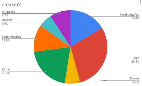
A pie chart comparing areas of continents
Now look at the exact same data represented in a bar chart:
A bar chart comparing areas of continents

Which one is clearer? While the pie chart is good for showing proportions, angles are much harder to compare. Differences in length are much easier to compare and a bar chart is better in this case. But it would probably be clearer to use a pie chart to compare two values as part of a whole, such as the area of one continent compared to the remaining area, to reveal the proportion of land it occupies compared to the rest of the planet.

To have both proportions and lengths, you might be tempted to try a single stacked bar chart, but it still rates worse than the simple bar chart, since stacked bars aren't as easy to compare as when they are placed side-by-side:
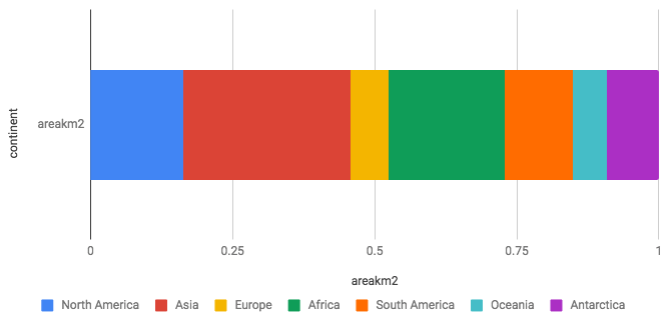
A stacked bar chart comparing areas of continents

Of course, you can choose a chart for other reasons, but it's important to know what you lose and gain in each case. Analytic and exploratory visualizations require a high degree of accuracy, but you might want to use a more attractive visualization at the price of losing some accuracy if you need to capture the attention of your audience.

Web-based visualizations

When Edward Tufte wrote his classic books on data visualization, most of it was intended for printed media. Today, you can create visualizations that use data that can be updated in real time, with dynamic interfaces that allows interaction by the user. The design guidelines for web-based visualizations are different. They can and should be dynamic and interactive. Interactive charts can pack in much more information by hiding the details, which can be requested by the user on demand. Charts are sometimes rendered as overviews or sparklines, only revealing details through strategies such as zooming and brushing.

You have been reading a chapter from
Learn Chart.js
Published in: Feb 2019
Publisher:
ISBN-13: 9781789342482
Register for a free Packt account to unlock a world of extra content!
A free Packt account unlocks extra newsletters, articles, discounted offers, and much more. Start advancing your knowledge today.
Unlock this book and the full library FREE for 7 days
Get unlimited access to 7000+ expert-authored eBooks and videos courses covering every tech area you can think of
Renews at $19.99/month. Cancel anytime
Banner background image