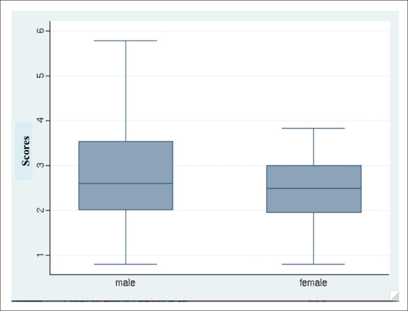
Box plots
Another way to look at data is box plots; they are also called box and whiskers plots.
In box plots, a box ranges from a quartile in the lower range, which is also 25th percentile of data, to a quartile in the upper range, which is the 75th percentile. It also contains a line in the median value, which is the 50th percentile.
Then, you have whiskers plots. Whiskers generally range from the quartile with a low value and a low adjacent value to the quartile in the upper range and upper adjacent value.
Lower Adjacent Value = lower quartile – 3/ 2 IQR
Upper Adjacent Value = upper quartile + 3/2 IQR
Observations after the lower and upper adjacent value are plotted in terms of points; for example, take a look at the following:
graph box scores
The output of this command is shown in the following figure:

You can divide these graphs by categorical variables; for example, take a look at the following:
–graph box scores, over(sex)