Adding layouts within layouts
The solution to laying out some elements with a different orientation to others is to nest layouts within layouts. Here is how to do it.
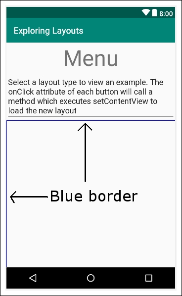
From the Layouts category of the palette, drag a LinearLayout (Horizontal) onto the design, placing it just below the Multiline Text. Notice that there is a blue border occupying all the space below the Multiline Text:

This indicates that our new LinearLayout (Horizontal) is filling the space. Keep this blue border area in mind, as it is where we will put the next item on our UI.
Now, go back to the Text category of the palette and drag a TextView onto the new LinearLayout we just added. Notice how the TextView sits snuggly in the top left-hand corner of the new LinearLayout:

At first, this seems no different to what happened with the previous vertical LinearLayout that was part of our UI from the start. But watch what happens when we add our next piece of the UI.
Note
The term used to refer to adding layouts within layouts is...


